CT LISTNBOX: Difference between revisions
Lou Montana (talk | contribs) m (spaces → tab) |
m (Minor adjustments) |
||
| (4 intermediate revisions by 2 users not shown) | |||
| Line 455: | Line 455: | ||
== Other Examples == | == Other Examples == | ||
<syntaxhighlight lang="cpp">class RscListNBox | <syntaxhighlight lang="cpp"> | ||
class RscListNBox | |||
{ | { | ||
access = 0; | access = 0; | ||
type = CT_LISTNBOX;// 102; | type = CT_LISTNBOX;// 102; | ||
style =ST_MULTI; | style =ST_MULTI; | ||
w = 0.4; h = 0.4; | w = 0.4; h = 0.4; | ||
font = "TahomaB"; | font = "TahomaB"; | ||
sizeEx = 0.04; | sizeEx = 0.04; | ||
colorText[] = {0.8784, 0.8471, 0.651, 1}; | colorText[] = {0.8784, 0.8471, 0.651, 1}; | ||
colorBackground[] = {0, 0, 0, 1}; | colorBackground[] = {0, 0, 0, 1}; | ||
autoScrollSpeed = -1; | autoScrollSpeed = -1; | ||
autoScrollDelay = 5; | autoScrollDelay = 5; | ||
autoScrollRewind = 0; | autoScrollRewind = 0; | ||
arrowEmpty = "#(argb,8,8,3)color(1,1,1,1)"; | arrowEmpty = "#(argb,8,8,3)color(1,1,1,1)"; | ||
arrowFull = "#(argb,8,8,3)color(1,1,1,1)"; | arrowFull = "#(argb,8,8,3)color(1,1,1,1)"; | ||
columns[] = {0.3, 0.6, 0.7}; | columns[] = {0.3, 0.6, 0.7}; | ||
color[] = {1, 1, 1, 1}; | color[] = {1, 1, 1, 1}; | ||
colorScrollbar[] = {0.95, 0.95, 0.95, 1}; | colorScrollbar[] = {0.95, 0.95, 0.95, 1}; | ||
colorSelect[] = {0.95, 0.95, 0.95, 1}; | colorSelect[] = {0.95, 0.95, 0.95, 1}; | ||
colorSelect2[] = {0.95, 0.95, 0.95, 1}; | colorSelect2[] = {0.95, 0.95, 0.95, 1}; | ||
colorSelectBackground[] = {0, 0, 0, 1}; | colorSelectBackground[] = {0, 0, 0, 1}; | ||
colorSelectBackground2[] = {0.8784, 0.8471, 0.651, 1}; | colorSelectBackground2[] = {0.8784, 0.8471, 0.651, 1}; | ||
drawSideArrows = 0; | drawSideArrows = 0; | ||
idcLeft = -1; | idcLeft = -1; | ||
idcRight = -1; | idcRight = -1; | ||
maxHistoryDelay = 1; | maxHistoryDelay = 1; | ||
rowHeight = 0; | rowHeight = 0; | ||
soundSelect[] = {"", 0.1, 1}; | soundSelect[] = {"", 0.1, 1}; | ||
period = 1; | period = 1; | ||
shadow = 2; | shadow = 2; | ||
class ScrollBar | class ScrollBar | ||
{ | { | ||
| Line 495: | Line 496: | ||
thumb = "#(argb,8,8,3)color(1,1,1,1)"; | thumb = "#(argb,8,8,3)color(1,1,1,1)"; | ||
}; | }; | ||
};</syntaxhighlight> | }; | ||
</syntaxhighlight> | |||
== Scripting Example == | == Scripting Example == | ||
| Line 516: | Line 518: | ||
! Code !! Pictures | ! Code !! Pictures | ||
|- | |- | ||
| <code>[_CT_LISTNBOX] [[spawn]] | | <div><code>[_CT_LISTNBOX] [[spawn]] { | ||
{ | |||
[[disableSerialization]]; | [[disableSerialization]]; | ||
[[params]] ["_CT_LISTNBOX"]; | [[params]] ["_CT_LISTNBOX"]; | ||
| Line 532: | Line 533: | ||
[[sleep]] 1; | [[sleep]] 1; | ||
[[lnbClear]] _CT_LISTNBOX; {{cc|Clear all items but control still remains just invisible}} | [[lnbClear]] _CT_LISTNBOX; {{cc|Clear all items but control still remains just invisible}} | ||
};</code> | };</code></div> | ||
| | | | ||
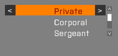
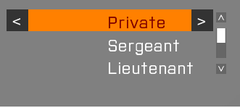
[[Image:WuChaoRen_000.png|200px]] <br><br> | [[Image:WuChaoRen_000.png|200px]] <br><br> | ||
| Line 539: | Line 540: | ||
[[Image:WuChaoRen_003.png|200px]] <br> | [[Image:WuChaoRen_003.png|200px]] <br> | ||
|} | |} | ||
== BIS_fnc_initListNBoxSorting Example == | |||
[[BIS_fnc_initListNBoxSorting]] can be used to create a sortable [[CT_LISTNBOX]]. To that end, two seperate [[CT_LISTNBOX]] controls are required: One filter control and one content control. The filter control becomes the header of the sortable [[CT_LISTNBOX]]. | |||
[[Image:A3_BIS_fnc_initListNBoxSorting_example.jpg|thumb|center|A GUI using [[BIS_fnc_initListNBoxSorting]]]] | |||
This example demonstrates the basic steps and components needed to create a sortable [[CT_LISTNBOX]]. See [[BIS_fnc_initListNBoxSorting]] to learn more about additional features of that function. | |||
<syntaxhighlight lang="cpp"> | |||
import ctrlListNBox; //This base class comes with vanilla Arma 3 and is of type CT_LISTNBOX. | |||
class ExampleDialog { | |||
idd = 12345; | |||
onLoad = "_this call TAG_fnc_initListNBoxCtrls;"; | |||
//... | |||
class ControlsBackground { | |||
//... | |||
}; | |||
class Controls { | |||
class Filter: ctrlListNBox { | |||
idc = 100; | |||
x = 0; | |||
y = 0.045; | |||
w = 1; | |||
h = 0.04; | |||
}; | |||
class Content: ctrlListNBox { | |||
idc = 101; | |||
disableOverflow = 1; | |||
tooltipPerColumn = 1; | |||
x = 0; | |||
y = 0.085; | |||
w = 1; | |||
h = 0.87; | |||
}; | |||
//... | |||
}; | |||
}; | |||
</syntaxhighlight> | |||
The {{ic|TAG_fnc_initListNBoxCtrls}} function (called from the [[User Interface Event Handlers#onLoad|onLoad]] UI Event Handler): | |||
[[disableSerialization]]; | |||
[[params]] ["_parentDisplay"]; | |||
[[private]] _filterCtrl = _parentDisplay [[displayCtrl]] 100; | |||
[[private]] _contentCtrl = _parentDisplay [[displayCtrl]] 101; | |||
{{cc|Add columns:}} | |||
{ | |||
_x [[lnbAddColumn]] 0.5; | |||
} [[forEach]] [_filterCtrl, _contentCtrl]; | |||
{{cc|Add column headers:}} | |||
_filterCtrl [[lnbAddRow]] ["Name", "Group"]; | |||
{{cc|Add content rows:}} | |||
{ | |||
_contentCtrl [[lnbAddRow]] [<nowiki/>[[name]] _x, [[groupId]] [[group]] _x]; | |||
} [[forEach]] [[allUnits]]; | |||
[_filterCtrl, _contentCtrl] [[call]] [[BIS_fnc_initListNBoxSorting]]; | |||
[[ctrlSetFocus]] _contentCtrl; {{cc|Without this line, the user has to click _contentCtrl first in order to use the sorting buttons.}} | |||
[[Category: Control Types]] | [[Category: Control Types]] | ||
Revision as of 16:44, 17 August 2021
| Control Types / MACRO (TYPE VALUE) | |
|---|---|
| Text/Image/Video |
CT_STATIC (0) | CT_EDIT (2) | CT_HTML (9) | CT_STRUCTURED_TEXT (13) |
| Buttons |
CT_BUTTON (1) | CT_ACTIVETEXT (11) | CT_SHORTCUTBUTTON (16) | CT_CHECKBOX (77) | CT_XBUTTON (41) |
| Lists |
CT_COMBO (4) | CT_TOOLBOX (6) | CT_CHECKBOXES (7) | CT_TREE (12) | CT_CONTROLS_TABLE (19) | CT_XCOMBO (44) | CT_LISTBOX (5) | CT_LISTNBOX (102) | CT_LISTNBOX_CHECKABLE (104) CT_XLISTBOX (45) |
| 3D Objects |
CT_OBJECT (80) | CT_OBJECT_ZOOM (81) | CT_OBJECT_CONTAINER (82) | CT_OBJECT_CONT_ANIM (83) |
| Maps |
CT_MAP (100) | CT_MAP_MAIN (101) |
| Meta |
CT_SLIDER (3) | CT_XSLIDER (43) | CT_PROGRESS (8) | CT_CONTROLS_GROUP (15) |
| Menu |
CT_CONTEXT_MENU (14) | CT_MENU (46) | CT_MENU_STRIP (47) |
| Unknown |
CT_STATIC_SKEW (10) | CT_HITZONES (17) | CT_VEHICLETOGGLES (18) | CT_XKEYDESC (40) | CT_ANIMATED_TEXTURE (45) | CT_LINEBREAK (98) | CT_USER (99) | CT_ITEMSLOT (103) | CT_VEHICLE_DIRECTION (105) |
Introduction
Similar to CT_LISTBOX. Additionally this control supports multiple columns which all have their own text, data and value. Another feature is the ability to define idcLeft and idcRight to add buttons to the currently selected row.
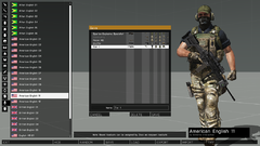
The Arsenal uses CT_LISTNBOX for example.
This Arsenal control utilizes the abbility of CT_LISTNBOX to add buttons to rows.
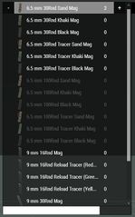
Example for a CT_LISTNBOX with an image as the first column.
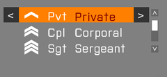
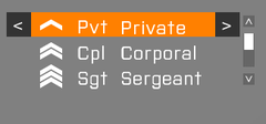
CT_LISTNBOX with a column that is moved to the middle of the control.


Related commands & functions
- Commands: General
- Commands: UI Eventhandlers
- Commands: ListNBox
- Commands: Listbox
- BIS_fnc_initListNBoxSorting
Related User Interface Eventhandlers
Alphabetical Order
#define CT_LISTNBOX 102
A
arrowEmpty
- Type
- String
- Description
- n/a
arrowEmpty = "#(argb,8,8,3)color(1,1,1,1)";
arrowFull
- Type
- String
- Description
- n/a
arrowFull = "#(argb,8,8,3)color(1,1,1,1)";
autoScrollDelay
- Type
- Number
- Description
- n/a
autoScrollDelay = 5;
autoScrollRewind
- Type
- Number
- Description
- n/a
autoScrollRewind = 0;
autoScrollSpeed
- Type
- Number
- Description
- n/a
autoScrollSpeed = -1;
C
canDrag
- Type
- Number
- Description
- n/a
canDrag = 1;
color
- Type
- Array
- Description
- n/a
color[] = {0.95,0.95,0.95,1};
colorPicture
- Type
- Array
- Description
- n/a
colorPicture[] = {1,1,1,1};
colorPictureDisabled
- Type
- Array
- Description
- n/a
colorPictureDisabled[] = {1,1,1,0.25};
colorPictureSelected
- Type
- Array
- Description
- n/a
colorPictureSelected[] = {1,1,1,1};
colorPlayerItem
- Type
- Array
- Description
- n/a
colorPlayerItem[] = {1,1,1,1};
colorScrollbar
- Type
- Array
- Description
- n/a
colorScrollbar[] = {0.95,0.95,0.95,1};
colorSelect
- Type
- Array
- Description
- n/a
colorSelect[] = {1,1,1,1};
colorSelect2
- Type
- Array
- Description
- n/a
colorSelect2[] = {0,0,0,1};
colorSelect2Right
- Type
- Array
- Description
- n/a
colorSelect2Right[] = {1,1,1,1};
colorSelectBackground
- Type
- Array
- Description
- n/a
colorSelectBackground[] = {1,1,1,0.25};
colorSelectBackground2
- Type
- Array
- Description
- n/a
colorSelectBackground2[] = {1,1,1,0.3};
colorSelectRight
- Type
- Array
- Description
- n/a
colorSelectRight[] = {1,1,1,1};
colorShadow
- Type
- Array
- Description
- n/a
colorShadow[] = {0,0,0,0.5};
columns
- Type
- Array
- Description
- Define the left starting position of each column. The values are offsets ratios (not spacing ratios). Tip: Use {-0.01} in first column to fix unwanted offset, if desired.
columns[] = {"7.2 * (((safezoneW / safezoneH) min 1.2) / 40) + (safezoneX)","15.8 * (((safezoneW / safezoneH) min 1.2) / 40) + (safezoneX)"};
D
disableOverflow
- Type
- Number
- Description
- Don't allow text to continue in next column.
disableOverflow = 1;
drawSideArrows
- Type
- Number
- Description
- Each row can be linked to 2 arrow buttons which are shown on the left and right of the row.
drawSideArrows = 1;
I
idcLeft
- Type
- Number
- Description
- The IDC of the control to be used for the left control that shows up in the selected row.
idcLeft = 24468;
idcRight
- Type
- Number
- Description
- The IDC of the control to be used for the right control that shows up in the selected row.
idcRight = 24469;
idcx
- Type
- Number
- Description
- Used in the Arsenal, can be ignored.
idcx = 984;
Items
- Type
- Class
- Description
- List of default items. See CT_COMBO#Items for more details.
class Items
{
	class Presence
	{
		text = "";
		value = 1;
		data = "value";
	};
	class Name
	{
		text = "Name";
		value = -1;
	};
	class Author
	{
		text = "Author";
		value = -1;
	};
};
L
ListScrollBar
- Type
- Class
- Description
- n/a
class ListScrollBar
{
	color[] = {1,1,1,0.6};
	colorActive[] = {1,1,1,1};
	colorDisabled[] = {1,1,1,0.3};
	thumb = "\A3\ui_f\data\gui\cfg\scrollbar\thumb_ca.paa";
	arrowEmpty = "\A3\ui_f\data\gui\cfg\scrollbar\arrowEmpty_ca.paa";
	arrowFull = "\A3\ui_f\data\gui\cfg\scrollbar\arrowFull_ca.paa";
	border = "\A3\ui_f\data\gui\cfg\scrollbar\border_ca.paa";
	shadow = 0;
	scrollSpeed = 0.06;
	width = 0;
	height = 0;
	autoScrollEnabled = 0;
	autoScrollSpeed = -1;
	autoScrollDelay = 5;
	autoScrollRewind = 0;
};
M
maxHistoryDelay
- Type
- Number
- Description
- n/a
maxHistoryDelay = 1;
MuteCheckBoxTemplate
- Type
- Class
- Description
- n/a
class MuteCheckBoxTemplate
{
	x = 0;
	y = 0;
	w = "0.8 * (((safezoneW / safezoneH) min 1.2) / 40)";
	h = "0.8 * ((((safezoneW / safezoneH) min 1.2) / 1.2) / 25)";
	textureChecked = "\A3\Ui_f\data\IGUI\RscIngameUI\RscDisplayChannel\MuteVON_ca.paa";
	textureUnchecked = "\A3\Ui_f\data\IGUI\RscIngameUI\RscDisplayChannel\MuteVON_crossed_ca.paa";
	textureFocusedChecked = "\A3\Ui_f\data\IGUI\RscIngameUI\RscDisplayChannel\MuteVON_ca.paa";
	textureFocusedUnchecked = "\A3\Ui_f\data\IGUI\RscIngameUI\RscDisplayChannel\MuteVON_crossed_ca.paa";
	textureHoverChecked = "\A3\Ui_f\data\IGUI\RscIngameUI\RscDisplayChannel\MuteVON_ca.paa";
	textureHoverUnchecked = "\A3\Ui_f\data\IGUI\RscIngameUI\RscDisplayChannel\MuteVON_crossed_ca.paa";
	texturePressedChecked = "\A3\Ui_f\data\IGUI\RscIngameUI\RscDisplayChannel\MuteVON_ca.paa";
	texturePressedUnchecked = "\A3\Ui_f\data\IGUI\RscIngameUI\RscDisplayChannel\MuteVON_crossed_ca.paa";
	textureDisabledChecked = "\A3\Ui_f\data\IGUI\RscIngameUI\RscDisplayChannel\MuteVON_ca.paa";
	textureDisabledUnchecked = "\A3\Ui_f\data\IGUI\RscIngameUI\RscDisplayChannel\MuteVON_crossed_ca.paa";
	idc = -1;
	type = 77;
	deletable = 0;
	style = 0;
	checked = 0;
	color[] = {1,1,1,0.7};
	colorFocused[] = {1,1,1,1};
	colorHover[] = {1,1,1,1};
	colorPressed[] = {1,1,1,1};
	colorDisabled[] = {1,1,1,0.2};
	colorBackground[] = {0,0,0,0};
	colorBackgroundFocused[] = {0,0,0,0};
	colorBackgroundHover[] = {0,0,0,0};
	colorBackgroundPressed[] = {0,0,0,0};
	colorBackgroundDisabled[] = {0,0,0,0};
	tooltipColorText[] = {1,1,1,1};
	tooltipColorBox[] = {1,1,1,1};
	tooltipColorShade[] = {0,0,0,0.65};
	soundEnter[] = {"",0.1,1};
	soundPush[] = {"",0.1,1};
	soundClick[] = {"",0.1,1};
	soundEscape[] = {"",0.1,1};
};
P
padding
- Type
- Number
- Description
- n/a
padding = 0.004;
period
- Type
- Number
- Description
- Time it takes to pulsate between the select colors.
period = 1.2;
R
rowHeight
Number example:
rowHeight = 0;
String example:
rowHeight = "((((safezoneW / safezoneH) min 1.2) / 1.2) / 25)";
rows
- Type
- Number
- Description
- n/a
rows = 25;
S
selectWithRMB
- Type
- Number
- Description
- Enable row selection with the right mouse button. {{Feature|arma3|Since Arma 3 v2.00.}}
selectWithRMB = 0;
shadowPictureLeft
- Type
- Number
- Description
- n/a
shadowPictureLeft = 0;
shadowPictureRight
- Type
- Number
- Description
- n/a
shadowPictureRight = 0;
shadowTextLeft
- Type
- Number
- Description
- n/a
shadowTextLeft = 0;
shadowTextRight
- Type
- Number
- Description
- n/a
shadowTextRight = 0;
soundSelect
- Type
- Array
- Description
- n/a
soundSelect[] = {"",0.1,1};
soundSelect
- Type
- Array
- Description
- n/a
soundSelect[] = {"",0.1,1};
T
tooltipPerColumn
- Type
- Boolean
- Description
- If set to true, each cell can have a different tooltip. (Optional - default: false)
tooltipPerColumn = true;
Default Classes
RscListNBox
class RscListNBox
{
	deletable = 0;
	fade = 0;
	access = 0;
	type = CT_LISTNBOX;
	rowHeight = 0;
	colorText[] = {1,1,1,1};
	colorScrollbar[] = {0.95,0.95,0.95,1};
	colorSelect[] = {0,0,0,1};
	colorSelect2[] = {0,0,0,1};
	colorSelectBackground[] = {0.95,0.95,0.95,1};
	colorSelectBackground2[] = {1,1,1,0.5};
	colorBackground[] = {0,0,0,1};
	maxHistoryDelay = 1;
	soundSelect[] =
	{
		"",
		0.1,
		1
	};
	autoScrollSpeed = -1;
	autoScrollDelay = 5;
	autoScrollRewind = 0;
	arrowEmpty = "#(argb,8,8,3)color(1,1,1,1)";
	arrowFull = "#(argb,8,8,3)color(1,1,1,1)";
	drawSideArrows = 0;
	columns[] = {0.3,0.6,0.7};
	idcLeft = -1;
	idcRight = -1;
	class ListScrollBar: ScrollBar
	{
	};
	style = ST_MULTI;
	shadow = 0;
	font = "RobotoCondensed";
	sizeEx = GUI_TEXT_SIZE_MEDIUM;
	color[] = {0.95,0.95,0.95,1};
	colorDisabled[] = {1,1,1,0.25};
	colorPicture[] = {1,1,1,1};
	colorPictureSelected[] = {1,1,1,1};
	colorPictureDisabled[] = {1,1,1,1};
	period = 1.2;
	x = 0;
	y = 0;
	w = 0.3;
	h = 0.3;
	class ScrollBar: ScrollBar
	{
	};
};
Other Examples
class RscListNBox
{
  access = 0;
  type = CT_LISTNBOX;// 102;
  style =ST_MULTI;
  w = 0.4;   h = 0.4;
  font = "TahomaB";
  sizeEx = 0.04;
  colorText[] = {0.8784, 0.8471, 0.651, 1};
  colorBackground[] = {0, 0, 0, 1};
  autoScrollSpeed = -1;
  autoScrollDelay = 5;
  autoScrollRewind = 0;
  arrowEmpty = "#(argb,8,8,3)color(1,1,1,1)";
  arrowFull = "#(argb,8,8,3)color(1,1,1,1)";
  columns[] = {0.3, 0.6, 0.7};
  color[] = {1, 1, 1, 1};
  colorScrollbar[] = {0.95, 0.95, 0.95, 1};
  colorSelect[] = {0.95, 0.95, 0.95, 1};
  colorSelect2[] = {0.95, 0.95, 0.95, 1};
  colorSelectBackground[] = {0, 0, 0, 1};
  colorSelectBackground2[] = {0.8784, 0.8471, 0.651, 1};
  drawSideArrows = 0;
  idcLeft = -1;
  idcRight = -1;
  maxHistoryDelay = 1;
  rowHeight = 0;
  soundSelect[] = {"", 0.1, 1};
  period = 1;
  shadow = 2;
  class ScrollBar
  {
	arrowEmpty = "#(argb,8,8,3)color(1,1,1,1)";
	arrowFull = "#(argb,8,8,3)color(1,1,1,1)";
	border = "#(argb,8,8,3)color(1,1,1,1)";
	color[] = {1,1,1,0.6};
	colorActive[] = {1,1,1,1};
	colorDisabled[] = {1,1,1,0.3};
	thumb = "#(argb,8,8,3)color(1,1,1,1)";
  };
};
Scripting Example
As for invisible data processing, lnbAddArray, lnbAddColumn, lnbData, lnbGetColumnsPosition, lnbSetColumnsPos, lnbSetData, lnbSetText, lnbSetValue, lnbText and lnbValue store data types into exact position of the CT_LISTNBOX with different spaces. Accessing data with coordinate command at nearly the same syntax:
// Set same value to one position of a Control
_ctrl lnbSetData [[0,0],"#1"];
lnbSetColumnsPos [102,[0,1],1];
_ctrl lnbSetText [[0,1], "#1"];
_ctrl lnbSetValue [ [0,0],1];
// Accessing the value disregard affecting one another
_ctrl lnbData [0,0]; // "#1"
lnbGetColumnsPosition _ctrl; // [1];
_ctrl lnbText [0,0]; // "#1"
_ctrl lnbValue [0,0]; // 1
For a direct visible control over CT_LISTNBOX:
| Code | Pictures |
|---|---|
[_CT_LISTNBOX] spawn {
|
|
BIS_fnc_initListNBoxSorting Example
BIS_fnc_initListNBoxSorting can be used to create a sortable CT_LISTNBOX. To that end, two seperate CT_LISTNBOX controls are required: One filter control and one content control. The filter control becomes the header of the sortable CT_LISTNBOX.

This example demonstrates the basic steps and components needed to create a sortable CT_LISTNBOX. See BIS_fnc_initListNBoxSorting to learn more about additional features of that function.
import ctrlListNBox; //This base class comes with vanilla Arma 3 and is of type CT_LISTNBOX.

class ExampleDialog {
	idd = 12345;
	onLoad = "_this call TAG_fnc_initListNBoxCtrls;";
	//...

	class ControlsBackground {
		//...
	};

	class Controls {
		class Filter: ctrlListNBox {
			idc = 100;
			x = 0;
			y = 0.045;
			w = 1;
			h = 0.04;
		};

		class Content: ctrlListNBox {
			idc = 101;
			disableOverflow = 1;
			tooltipPerColumn = 1;
			x = 0;
			y = 0.085;
			w = 1;
			h = 0.87;
		};

		//...
	};
};
The TAG_fnc_initListNBoxCtrls function (called from the onLoad UI Event Handler):
disableSerialization;

params ["_parentDisplay"];

private _filterCtrl = _parentDisplay displayCtrl 100;
private _contentCtrl = _parentDisplay displayCtrl 101;

// Add columns:
{
	_x lnbAddColumn 0.5;
} forEach [_filterCtrl, _contentCtrl];

// Add column headers:
_filterCtrl lnbAddRow ["Name", "Group"];

// Add content rows:
{
	_contentCtrl lnbAddRow [name _x, groupId group _x];
} forEach allUnits;

[_filterCtrl, _contentCtrl] call BIS_fnc_initListNBoxSorting;

ctrlSetFocus _contentCtrl; // Without this line, the user has to click _contentCtrl first in order to use the sorting buttons.