CT_LISTNBOX
| Control Types / MACRO (TYPE VALUE) | |
|---|---|
| Text/Image/Video |
CT_STATIC (0) | CT_EDIT (2) | CT_HTML (9) | CT_STRUCTURED_TEXT (13) |
| Buttons |
CT_BUTTON (1) | CT_ACTIVETEXT (11) | CT_SHORTCUTBUTTON (16) | CT_CHECKBOX (77) | CT_XBUTTON (41) |
| Lists |
CT_COMBO (4) | CT_TOOLBOX (6) | CT_CHECKBOXES (7) | CT_TREE (12) | CT_CONTROLS_TABLE (19) | CT_XCOMBO (44) | CT_LISTBOX (5) | CT_LISTNBOX (102) | CT_LISTNBOX_CHECKABLE (104) CT_XLISTBOX (45) |
| 3D Objects |
CT_OBJECT (80) | CT_OBJECT_ZOOM (81) | CT_OBJECT_CONTAINER (82) | CT_OBJECT_CONT_ANIM (83) |
| Maps |
CT_MAP (100) | CT_MAP_MAIN (101) |
| Meta |
CT_SLIDER (3) | CT_XSLIDER (43) | CT_PROGRESS (8) | CT_CONTROLS_GROUP (15) |
| Menu |
CT_CONTEXT_MENU (14) | CT_MENU (46) | CT_MENU_STRIP (47) |
| Unknown |
CT_STATIC_SKEW (10) | CT_HITZONES (17) | CT_VEHICLETOGGLES (18) | CT_XKEYDESC (40) | CT_ANIMATED_TEXTURE (45) | CT_LINEBREAK (98) | CT_USER (99) | CT_ITEMSLOT (103) | CT_VEHICLE_DIRECTION (105) |
Introduction
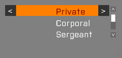
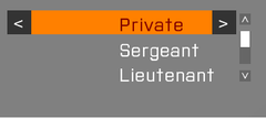
Similar to CT_LISTBOX. Additionally this control supports multiple columns which all have their own text, data and value. Another feature is the ability to define idcLeft and idcRight to add buttons to the currently selected row.
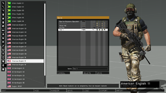
The Arsenal uses CT_LISTNBOX for example.
This Arsenal control utilizes the abbility of CT_LISTNBOX to add buttons to rows.
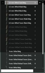
Example for a CT_LISTNBOX with an image as the first column.
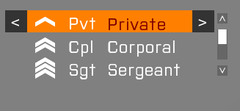
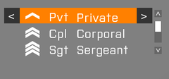
CT_LISTNBOX with a column that is moved to the middle of the control.


Related commands & functions
- Commands: General
- Commands: UI Eventhandlers
- Commands: ListNBox
- Commands: Listbox
- BIS_fnc_initListNBoxSorting
Related User Interface Eventhandlers
Alphabetical Order
#define CT_LISTNBOX 102
A
arrowEmpty
- Type
- String
- Description
- n/a
arrowEmpty = "#(argb,8,8,3)color(1,1,1,1)";
arrowFull
- Type
- String
- Description
- n/a
arrowFull = "#(argb,8,8,3)color(1,1,1,1)";
autoScrollDelay
- Type
- Number
- Description
- n/a
autoScrollDelay = 5;
autoScrollRewind
- Type
- Number
- Description
- n/a
autoScrollRewind = 0;
autoScrollSpeed
- Type
- Number
- Description
- n/a
autoScrollSpeed = -1;
C
canDrag
- Type
- Number
- Description
- n/a
canDrag = 1;
color
- Type
- Array
- Description
- n/a
color[] = {0.95,0.95,0.95,1};
colorPicture
- Type
- Array
- Description
- n/a
colorPicture[] = {1,1,1,1};
colorPictureDisabled
- Type
- Array
- Description
- n/a
colorPictureDisabled[] = {1,1,1,0.25};
colorPictureSelected
- Type
- Array
- Description
- n/a
colorPictureSelected[] = {1,1,1,1};
colorPlayerItem
- Type
- Array
- Description
- n/a
colorPlayerItem[] = {1,1,1,1};
colorScrollbar
- Type
- Array
- Description
- n/a
colorScrollbar[] = {0.95,0.95,0.95,1};
colorSelect
- Type
- Array
- Description
- n/a
colorSelect[] = {1,1,1,1};
colorSelect2
- Type
- Array
- Description
- n/a
colorSelect2[] = {0,0,0,1};
colorSelect2Right
- Type
- Array
- Description
- n/a
colorSelect2Right[] = {1,1,1,1};
colorSelectBackground
- Type
- Array
- Description
- n/a
colorSelectBackground[] = {1,1,1,0.25};
colorSelectBackground2
- Type
- Array
- Description
- n/a
colorSelectBackground2[] = {1,1,1,0.3};
colorSelectRight
- Type
- Array
- Description
- n/a
colorSelectRight[] = {1,1,1,1};
colorShadow
- Type
- Array
- Description
- n/a
colorShadow[] = {0,0,0,0.5};
columns
- Type
- Array
- Description
- Define the left starting position of each column. The values are offsets ratios (not spacing ratios). Tip: Use {-0.01} in first column to fix unwanted offset, if desired.
columns[] = {"7.2 * (((safezoneW / safezoneH) min 1.2) / 40) + (safezoneX)","15.8 * (((safezoneW / safezoneH) min 1.2) / 40) + (safezoneX)"};
D
disableOverflow
- Type
- Number
- Description
- Don't allow text to continue in next column.
disableOverflow = 1;
drawSideArrows
- Type
- Number
- Description
- Each row can be linked to 2 arrow buttons which are shown on the left and right of the row.
drawSideArrows = 1;
I
idcLeft
- Type
- Number
- Description
- The IDC of the control to be used for the left control that shows up in the selected row.
idcLeft = 24468;
idcRight
- Type
- Number
- Description
- The IDC of the control to be used for the right control that shows up in the selected row.
idcRight = 24469;
idcx
- Type
- Number
- Description
- Used in the Arsenal, can be ignored.
idcx = 984;
Items
- Type
- Class
- Description
- List of default items. See CT_COMBO#Items for more details.
class Items
{
	class Presence
	{
		text = "";
		value = 1;
		data = "value";
	};
	class Name
	{
		text = "Name";
		value = -1;
	};
	class Author
	{
		text = "Author";
		value = -1;
	};
};
L
ListScrollBar
- Type
- Class
- Description
- n/a
class ListScrollBar
{
	color[] = {1,1,1,0.6};
	colorActive[] = {1,1,1,1};
	colorDisabled[] = {1,1,1,0.3};
	thumb = "\A3\ui_f\data\gui\cfg\scrollbar\thumb_ca.paa";
	arrowEmpty = "\A3\ui_f\data\gui\cfg\scrollbar\arrowEmpty_ca.paa";
	arrowFull = "\A3\ui_f\data\gui\cfg\scrollbar\arrowFull_ca.paa";
	border = "\A3\ui_f\data\gui\cfg\scrollbar\border_ca.paa";
	shadow = 0;
	scrollSpeed = 0.06;
	width = 0;
	height = 0;
	autoScrollEnabled = 0;
	autoScrollSpeed = -1;
	autoScrollDelay = 5;
	autoScrollRewind = 0;
};
M
maxHistoryDelay
- Type
- Number
- Description
- n/a
maxHistoryDelay = 1;
MuteCheckBoxTemplate
- Type
- Class
- Description
- n/a
class MuteCheckBoxTemplate
{
	x = 0;
	y = 0;
	w = "0.8 * (((safezoneW / safezoneH) min 1.2) / 40)";
	h = "0.8 * ((((safezoneW / safezoneH) min 1.2) / 1.2) / 25)";
	textureChecked = "\A3\Ui_f\data\IGUI\RscIngameUI\RscDisplayChannel\MuteVON_ca.paa";
	textureUnchecked = "\A3\Ui_f\data\IGUI\RscIngameUI\RscDisplayChannel\MuteVON_crossed_ca.paa";
	textureFocusedChecked = "\A3\Ui_f\data\IGUI\RscIngameUI\RscDisplayChannel\MuteVON_ca.paa";
	textureFocusedUnchecked = "\A3\Ui_f\data\IGUI\RscIngameUI\RscDisplayChannel\MuteVON_crossed_ca.paa";
	textureHoverChecked = "\A3\Ui_f\data\IGUI\RscIngameUI\RscDisplayChannel\MuteVON_ca.paa";
	textureHoverUnchecked = "\A3\Ui_f\data\IGUI\RscIngameUI\RscDisplayChannel\MuteVON_crossed_ca.paa";
	texturePressedChecked = "\A3\Ui_f\data\IGUI\RscIngameUI\RscDisplayChannel\MuteVON_ca.paa";
	texturePressedUnchecked = "\A3\Ui_f\data\IGUI\RscIngameUI\RscDisplayChannel\MuteVON_crossed_ca.paa";
	textureDisabledChecked = "\A3\Ui_f\data\IGUI\RscIngameUI\RscDisplayChannel\MuteVON_ca.paa";
	textureDisabledUnchecked = "\A3\Ui_f\data\IGUI\RscIngameUI\RscDisplayChannel\MuteVON_crossed_ca.paa";
	idc = -1;
	type = 77;
	deletable = 0;
	style = 0;
	checked = 0;
	color[] = {1,1,1,0.7};
	colorFocused[] = {1,1,1,1};
	colorHover[] = {1,1,1,1};
	colorPressed[] = {1,1,1,1};
	colorDisabled[] = {1,1,1,0.2};
	colorBackground[] = {0,0,0,0};
	colorBackgroundFocused[] = {0,0,0,0};
	colorBackgroundHover[] = {0,0,0,0};
	colorBackgroundPressed[] = {0,0,0,0};
	colorBackgroundDisabled[] = {0,0,0,0};
	tooltipColorText[] = {1,1,1,1};
	tooltipColorBox[] = {1,1,1,1};
	tooltipColorShade[] = {0,0,0,0.65};
	soundEnter[] = {"",0.1,1};
	soundPush[] = {"",0.1,1};
	soundClick[] = {"",0.1,1};
	soundEscape[] = {"",0.1,1};
};
P
padding
- Type
- Number
- Description
- n/a
padding = 0.004;
period
- Type
- Number
- Description
- Time it takes to pulsate between the select colors.
period = 1.2;
R
rowHeight
Number example:
rowHeight = 0;
String example:
rowHeight = "((((safezoneW / safezoneH) min 1.2) / 1.2) / 25)";
rows
- Type
- Number
- Description
- n/a
rows = 25;
S
selectWithRMB
- Type
- Number
- Description
- Enable row selection with the right mouse button (Since Arma 3 v2.00).
selectWithRMB = 0;
shadowPictureLeft
- Type
- Number
- Description
- n/a
shadowPictureLeft = 0;
shadowPictureRight
- Type
- Number
- Description
- n/a
shadowPictureRight = 0;
shadowTextLeft
- Type
- Number
- Description
- n/a
shadowTextLeft = 0;
shadowTextRight
- Type
- Number
- Description
- n/a
shadowTextRight = 0;
soundSelect
- Type
- Array
- Description
- n/a
soundSelect[] = {"",0.1,1};
Default Classes
RscExample
class RscListNBox
{
	deletable = 0;
	fade = 0;
	access = 0;
	type = CT_LISTNBOX;
	rowHeight = 0;
	colorText[] = {1,1,1,1};
	colorScrollbar[] = {0.95,0.95,0.95,1};
	colorSelect[] = {0,0,0,1};
	colorSelect2[] = {0,0,0,1};
	colorSelectBackground[] = {0.95,0.95,0.95,1};
	colorSelectBackground2[] = {1,1,1,0.5};
	colorBackground[] = {0,0,0,1};
	maxHistoryDelay = 1;
	soundSelect[] =
	{
		"",
		0.1,
		1
	};
	autoScrollSpeed = -1;
	autoScrollDelay = 5;
	autoScrollRewind = 0;
	arrowEmpty = "#(argb,8,8,3)color(1,1,1,1)";
	arrowFull = "#(argb,8,8,3)color(1,1,1,1)";
	drawSideArrows = 0;
	columns[] = {0.3,0.6,0.7};
	idcLeft = -1;
	idcRight = -1;
	class ListScrollBar: ScrollBar
	{
	};
	style = ST_MULTI;
	shadow = 0;
	font = "RobotoCondensed";
	sizeEx = GUI_TEXT_SIZE_MEDIUM;
	color[] = {0.95,0.95,0.95,1};
	colorDisabled[] = {1,1,1,0.25};
	colorPicture[] = {1,1,1,1};
	colorPictureSelected[] = {1,1,1,1};
	colorPictureDisabled[] = {1,1,1,1};
	period = 1.2;
	x = 0;
	y = 0;
	w = 0.3;
	h = 0.3;
	class ScrollBar: ScrollBar
	{
	};
};
Other Examples
class RscListNBox
{
  access = 0;
  type = CT_LISTNBOX;// 102;
  style =ST_MULTI;
  w = 0.4;   h = 0.4;
  font = "TahomaB";
  sizeEx = 0.04;
  colorText[] = {0.8784, 0.8471, 0.651, 1};
  colorBackground[] = {0, 0, 0, 1};
  autoScrollSpeed = -1;
  autoScrollDelay = 5;
  autoScrollRewind = 0;
  arrowEmpty = "#(argb,8,8,3)color(1,1,1,1)";
  arrowFull = "#(argb,8,8,3)color(1,1,1,1)";
  columns[] = {0.3, 0.6, 0.7};
  color[] = {1, 1, 1, 1};
  colorScrollbar[] = {0.95, 0.95, 0.95, 1};
  colorSelect[] = {0.95, 0.95, 0.95, 1};
  colorSelect2[] = {0.95, 0.95, 0.95, 1};
  colorSelectBackground[] = {0, 0, 0, 1};
  colorSelectBackground2[] = {0.8784, 0.8471, 0.651, 1};
  drawSideArrows = 0;
  idcLeft = -1;
  idcRight = -1;
  maxHistoryDelay = 1;
  rowHeight = 0;
  soundSelect[] = {"", 0.1, 1};
  period = 1;
  shadow = 2;
  class ScrollBar
  {
    arrowEmpty = "#(argb,8,8,3)color(1,1,1,1)";
    arrowFull = "#(argb,8,8,3)color(1,1,1,1)";
    border = "#(argb,8,8,3)color(1,1,1,1)";
    color[] = {1,1,1,0.6};
    colorActive[] = {1,1,1,1};
    colorDisabled[] = {1,1,1,0.3};
    thumb = "#(argb,8,8,3)color(1,1,1,1)";
  };
};