CT XCOMBO: Difference between revisions
m (Text replacement - "{{CT|intro" to "Category: Control Types {{CT|intro ") |
Lou Montana (talk | contribs) m (spaces → tab) |
||
| Line 1: | Line 1: | ||
{{CT|intro | {{CT|intro | ||
| Line 63: | Line 61: | ||
|value1=class List | |value1=class List | ||
{ | { | ||
x = "22 * | x = "22 * (((safezoneW / safezoneH) min 1.2) / 40) + (safezoneX + (safezoneW - ((safezoneW / safezoneH) min 1.2))/2)"; | ||
y = "22 * | y = "22 * ((((safezoneW / safezoneH) min 1.2) / 1.2) / 25) + (safezoneY + (safezoneH - (((safezoneW / safezoneH) min 1.2) / 1.2))/2)"; | ||
w = "10 * | w = "10 * (((safezoneW / safezoneH) min 1.2) / 40)"; | ||
h = "5 * | h = " 5 * ((((safezoneW / safezoneH) min 1.2) / 1.2) / 25)"; | ||
colorBackground[] = {0.2,0.2,0.2,1}; | colorBackground[] = {0.2,0.2,0.2,1}; | ||
colorSelectBackground[] = {1,0.5,0,1}; | colorSelectBackground[] = {1,0.5,0,1}; | ||
colorBorder[] = {1,1,1,1}; | colorBorder[] = {1,1,1,1}; | ||
rowHeight = "1 * | rowHeight = "1 * ((((safezoneW / safezoneH) min 1.2) / 1.2) / 25)"; | ||
sizeEx = "( | sizeEx = "((((safezoneW / safezoneH) min 1.2) / 1.2) / 25)"; | ||
colorText[] = {1,1,1,1}; | colorText[] = {1,1,1,1}; | ||
colorSelect[] = {1,1,1,1}; | colorSelect[] = {1,1,1,1}; | ||
| Line 107: | Line 105: | ||
{ | { | ||
text = "CT_XCOMBO"; | text = "CT_XCOMBO"; | ||
x = "12 * | x = "12 * (((safezoneW / safezoneH) min 1.2) / 40) + (safezoneX + (safezoneW - ((safezoneW / safezoneH) min 1.2)) / 2)"; | ||
y = "21 * | y = "21 * ((((safezoneW / safezoneH) min 1.2) / 1.2) / 25) + (safezoneY + (safezoneH - (((safezoneW / safezoneH) min 1.2) / 1.2)) / 2)"; | ||
w = "10 * | w = "10 * (((safezoneW / safezoneH) min 1.2) / 40)"; | ||
h = "1 * | h = " 1 * ((((safezoneW / safezoneH) min 1.2) / 1.2) / 25)"; | ||
colorBackground[] = {0.2,0.2,0.2,1}; | colorBackground[] = {0.2,0.2,0.2,1}; | ||
colorSelectBackground[] = {1,0.5,0,1}; | colorSelectBackground[] = {1,0.5,0,1}; | ||
| Line 117: | Line 115: | ||
colorDisabledBorder[] = {1,1,1,1}; | colorDisabledBorder[] = {1,1,1,1}; | ||
font = "RobotoCondensed"; | font = "RobotoCondensed"; | ||
size = "( | size = "((((safezoneW / safezoneH) min 1.2) / 1.2) / 25)"; | ||
colorText[] = {1,1,1,1}; | colorText[] = {1,1,1,1}; | ||
colorSelect[] = {1,1,1,1}; | colorSelect[] = {1,1,1,1}; | ||
| Line 129: | Line 127: | ||
{{CT|examples}} | {{CT|examples}} | ||
None | None | ||
== Other examples == | == Other examples == | ||
<syntaxhighlight lang="cpp">class _CT_XCOMBO // Xbox combo box, cannot be controlled with mouse | |||
<syntaxhighlight lang="cpp"> | |||
class _CT_XCOMBO // Xbox combo box, cannot be controlled with mouse | |||
{ | { | ||
access = 0; // Control access (0 - ReadAndWrite, 1 - ReadAndCreate, 2 - ReadOnly, 3 - ReadOnlyVerified) | |||
idc = CT_XCOMBO; // Control identification (without it, the control won't be displayed) | |||
type = CT_XCOMBO; // Type is 44 | |||
style = ST_LEFT + LB_TEXTURES; // Style | |||
default = 0; // Control selected by default (only one within a display can be used) | |||
blinkingPeriod = 0; // Time in which control will fade out and back in. Use 0 to disable the effect. | |||
x = 12 * GUI_GRID_CENTER_W + GUI_GRID_CENTER_X; // Horizontal coordinates | |||
y = 22 * GUI_GRID_CENTER_H + GUI_GRID_CENTER_Y; // Vertical coordinates | |||
w = 10 * GUI_GRID_CENTER_W; // Width | |||
h = 1 * GUI_GRID_CENTER_H; // Height | |||
colorSelectBackground2[] = {0,0,0,1}; // Selected fill color (oscillates between this and List >> colorSelectBackground) | |||
colorBorder[] = {1,0,1,1}; // arrow color | |||
colorSelectBorder[] = {1,1,1,1}; // Selected arrow color | |||
colorDisabledBorder[] = {0,1,1,1}; // arrow color when disabled | |||
sizeEx = GUI_GRID_CENTER_H; // Text size | |||
font = GUI_FONT_NORMAL; // Font from CfgFontFamilies | |||
shadow = 0; // Shadow (0 - none, 1 - N/A, 2 - black outline) | |||
colorText[] = {1,1,1,1}; // Text color | |||
colorSelect[] = {1,1,1,1}; // Selected text color | |||
colorSelect2[] = {1,1,1,1}; // Selected text color (oscillates between this and colorSelect) | |||
colorDisabled[] = {1,1,1,0.5}; // Disabled text color | |||
tooltip = "CT_XCOMBO"; // Tooltip text | |||
tooltipColorShade[] = {0,0,0,1}; // Tooltip background color | |||
tooltipColorText[] = {1,1,1,1}; // Tooltip text color | |||
tooltipColorBox[] = {1,1,1,1}; // Tooltip frame color | |||
soundExpand[] = {"\A3\ui_f\data\sound\RscCombo\soundExpand",0.1,1}; // Sound played when the list is expanded | |||
soundCollapse[] = {"\A3\ui_f\data\sound\RscCombo\soundCollapse",0.1,1}; // Sound played when the list is collapsed | |||
soundSelect[] = {"\A3\ui_f\data\sound\RscCombo\soundSelect",0.1,1}; // Sound played when an item is selected | |||
// List title (not moved when display is dragged) | |||
class Title | |||
{ | |||
text = "CT_XCOMBO"; | |||
x = 12 * GUI_GRID_CENTER_W + GUI_GRID_CENTER_X; // Horizontal coordinates | |||
y = 21 * GUI_GRID_CENTER_H + GUI_GRID_CENTER_Y; // Vertical coordinates | |||
w = 10 * GUI_GRID_CENTER_W; // Width | |||
h = 1 * GUI_GRID_CENTER_H; // Height | |||
colorBackground[] = {0.2,0.2,0.2,1}; // Fill color | |||
colorSelectBackground[] = {1,0.5,0,1}; // Selected item fill color | |||
colorBorder[] = {0,0,0,1}; // Border color | |||
colorSelectBorder[] = {0,0,0,1}; // Selected border color | |||
colorDisabledBorder[] = {1,1,1,1}; // Disabled border color | |||
font = GUI_FONT_NORMAL; // Font from CfgFontFamilies | |||
size = GUI_GRID_CENTER_H; // Text size | |||
colorText[] = {1,1,1,1}; // Text color | |||
colorSelect[] = {1,1,1,1}; // Selected text color | |||
colorDisabled[] = {1,1,1,0.5}; // Disabled text color | |||
}; | |||
// Item list displayed when arrow right is pressed while the control is in focus (not moved when display is dragged) | |||
class List | |||
{ | |||
x = 22 * GUI_GRID_CENTER_W + GUI_GRID_CENTER_X; // Horizontal coordinates | |||
y = 22 * GUI_GRID_CENTER_H + GUI_GRID_CENTER_Y; // Vertical coordinates | |||
w = 10 * GUI_GRID_CENTER_W; // Width | |||
h = 5 * GUI_GRID_CENTER_H; // Height | |||
colorBackground[] = {0.2,0.2,0.2,1}; // List fill color | |||
colorSelectBackground[] = {1,0.5,0,1}; // Selected item fill color (oscillates between this and colorSelectBackground2 in control root) | |||
colorBorder[] = {1,1,1,1}; // List scrollbar color (combined with Scrollbar >> color) | |||
rowHeight = 1 * GUI_GRID_CENTER_H; // Row height | |||
sizeEx = GUI_GRID_CENTER_H; // Text size | |||
colorText[] = {1,1,1,1}; // Text color | |||
colorSelect[] = {1,1,1,1}; // Selected text color (oscillates between this and colorSelect2 in control root) | |||
}; | |||
// Scrollbar configuration (applied only when LB_TEXTURES style is used) | |||
class ScrollBar | |||
{ | |||
width = 0; // width of scrollBar | |||
height = 0; // height of scrollbar | |||
scrollSpeed = 0.01; // speed of scroll bar | |||
arrowEmpty = "\A3\ui_f\data\gui\cfg\scrollbar\arrowEmpty_ca.paa"; // Arrow | |||
arrowFull = "\A3\ui_f\data\gui\cfg\scrollbar\arrowFull_ca.paa"; // Arrow when clicked on | |||
border = "\A3\ui_f\data\gui\cfg\scrollbar\border_ca.paa"; // Slider background (stretched vertically) | |||
thumb = "\A3\ui_f\data\gui\cfg\scrollbar\thumb_ca.paa"; // Dragging element (stretched vertically) | |||
color[] = {1,1,1,1}; // Scrollbar color (combined with List >> colorBorder) | |||
}; | |||
onCanDestroy = "systemChat str ['onCanDestroy',_this]; true"; | |||
onDestroy = "systemChat str ['onDestroy',_this]; false"; | |||
onMouseEnter = "systemChat str ['onMouseEnter',_this]; false"; | |||
onMouseExit = "systemChat str ['onMouseExit',_this]; false"; | |||
onSetFocus = "systemChat str ['onSetFocus',_this]; false"; | |||
onKillFocus = "systemChat str ['onKillFocus',_this]; false"; | |||
onKeyDown = "systemChat str ['onKeyDown',_this]; false"; | |||
onKeyUp = "systemChat str ['onKeyUp',_this]; false"; | |||
onMouseButtonDown = "systemChat str ['onMouseButtonDown',_this]; false"; | |||
onMouseButtonUp = "systemChat str ['onMouseButtonUp',_this]; false"; | |||
onMouseButtonClick = "systemChat str ['onMouseButtonClick',_this]; false"; | |||
onMouseButtonDblClick = "systemChat str ['onMouseButtonDblClick',_this]; false"; | |||
onMouseZChanged = "systemChat str ['onMouseZChanged',_this]; false"; | |||
onMouseMoving = ""; | |||
onMouseHolding = ""; | |||
onLBSelChanged = "systemChat str ['onLBSelChanged',_this]; false"; | |||
onLBDblClick = "systemChat str ['onLBDblClick',_this]; false"; | |||
onLBListSelChanged = "systemChat str ['onLBListSelChanged',_this]; false"; | |||
}; | |||
</syntaxhighlight> | |||
[[Category: Control Types]] | |||
Latest revision as of 21:58, 24 April 2021
| Control Types / MACRO (TYPE VALUE) | |
|---|---|
| Text/Image/Video |
CT_STATIC (0) | CT_EDIT (2) | CT_HTML (9) | CT_STRUCTURED_TEXT (13) |
| Buttons |
CT_BUTTON (1) | CT_ACTIVETEXT (11) | CT_SHORTCUTBUTTON (16) | CT_CHECKBOX (77) | CT_XBUTTON (41) |
| Lists |
CT_COMBO (4) | CT_TOOLBOX (6) | CT_CHECKBOXES (7) | CT_TREE (12) | CT_CONTROLS_TABLE (19) | CT_XCOMBO (44) | CT_LISTBOX (5) | CT_LISTNBOX (102) | CT_LISTNBOX_CHECKABLE (104) CT_XLISTBOX (45) |
| 3D Objects |
CT_OBJECT (80) | CT_OBJECT_ZOOM (81) | CT_OBJECT_CONTAINER (82) | CT_OBJECT_CONT_ANIM (83) |
| Maps |
CT_MAP (100) | CT_MAP_MAIN (101) |
| Meta |
CT_SLIDER (3) | CT_XSLIDER (43) | CT_PROGRESS (8) | CT_CONTROLS_GROUP (15) |
| Menu |
CT_CONTEXT_MENU (14) | CT_MENU (46) | CT_MENU_STRIP (47) |
| Unknown |
CT_STATIC_SKEW (10) | CT_HITZONES (17) | CT_VEHICLETOGGLES (18) | CT_XKEYDESC (40) | CT_ANIMATED_TEXTURE (45) | CT_LINEBREAK (98) | CT_USER (99) | CT_ITEMSLOT (103) | CT_VEHICLE_DIRECTION (105) |
Introduction
Sideways CT_COMBO.
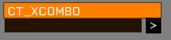
A CT_XCOMBO control.

Related commands & functions
Related User Interface Eventhandlers
Alphabetical Order
#define CT_XCOMBO 44
C
colorBorder
- Type
- Array
- Description
- n/a
colorBorder[] = {1,0,1,1};
colorDisabledBorder
- Type
- Array
- Description
- n/a
colorDisabledBorder[] = {0,1,1,1};
colorSelect
- Type
- Array
- Description
- n/a
colorSelect[] = {1,1,1,1};
colorSelect2
- Type
- Array
- Description
- n/a
colorSelect2[] = {1,1,1,1};
colorSelectBackground2
- Type
- Array
- Description
- n/a
colorSelectBackground2[] = {0,0,0,1};
colorSelectBorder
- Type
- Array
- Description
- n/a
colorSelectBorder[] = {1,1,1,1};
L
List
- Type
- Class
- Description
- n/a
class List
{
	x = "22 * (((safezoneW  / safezoneH) min 1.2) / 40) + (safezoneX + (safezoneW - ((safezoneW / safezoneH) min 1.2))/2)";
	y = "22 * ((((safezoneW / safezoneH) min 1.2) / 1.2) / 25) + (safezoneY + (safezoneH - (((safezoneW / safezoneH) min 1.2) / 1.2))/2)";
	w = "10 * (((safezoneW  / safezoneH) min 1.2) / 40)";
	h = " 5 * ((((safezoneW / safezoneH) min 1.2) / 1.2) / 25)";
	colorBackground[] = {0.2,0.2,0.2,1};
	colorSelectBackground[] = {1,0.5,0,1};
	colorBorder[] = {1,1,1,1};
	rowHeight = "1 * ((((safezoneW / safezoneH) min 1.2) / 1.2) / 25)";
	sizeEx = "((((safezoneW / safezoneH) min 1.2) / 1.2) / 25)";
	colorText[] = {1,1,1,1};
	colorSelect[] = {1,1,1,1};
};
S
soundCollapse
- Type
- Array
- Description
- n/a
soundCollapse[] = {"\A3\ui_f\data\sound\RscCombo\soundCollapse",0.1,1};
soundExpand
- Type
- Array
- Description
- n/a
soundExpand[] = {"\A3\ui_f\data\sound\RscCombo\soundExpand",0.1,1};
soundSelect
- Type
- Array
- Description
- n/a
soundSelect[] = {"\A3\ui_f\data\sound\RscCombo\soundSelect",0.1,1};
T
Title
- Type
- Class
- Description
- n/a
class Title
{
	text = "CT_XCOMBO";
	x = "12 * (((safezoneW  / safezoneH) min 1.2) / 40) + (safezoneX + (safezoneW - ((safezoneW / safezoneH) min 1.2)) / 2)";
	y = "21 * ((((safezoneW / safezoneH) min 1.2) / 1.2) / 25) + (safezoneY + (safezoneH - (((safezoneW / safezoneH) min 1.2) / 1.2)) / 2)";
	w = "10 * (((safezoneW  / safezoneH) min 1.2) / 40)";
	h = " 1 * ((((safezoneW / safezoneH) min 1.2) / 1.2) / 25)";
	colorBackground[] = {0.2,0.2,0.2,1};
	colorSelectBackground[] = {1,0.5,0,1};
	colorBorder[] = {0,0,0,1};
	colorSelectBorder[] = {0,0,0,1};
	colorDisabledBorder[] = {1,1,1,1};
	font = "RobotoCondensed";
	size = "((((safezoneW / safezoneH) min 1.2) / 1.2) / 25)";
	colorText[] = {1,1,1,1};
	colorSelect[] = {1,1,1,1};
	colorDisabled[] = {1,1,1,0.5};
};
Default Classes
None
Other examples
class _CT_XCOMBO // Xbox combo box, cannot be controlled with mouse
{
	access = 0; // Control access (0 - ReadAndWrite, 1 - ReadAndCreate, 2 - ReadOnly, 3 - ReadOnlyVerified)
	idc = CT_XCOMBO; // Control identification (without it, the control won't be displayed)
	type = CT_XCOMBO; // Type is 44
	style = ST_LEFT + LB_TEXTURES; // Style
	default = 0; // Control selected by default (only one within a display can be used)
	blinkingPeriod = 0; // Time in which control will fade out and back in. Use 0 to disable the effect.

	x = 12 * GUI_GRID_CENTER_W + GUI_GRID_CENTER_X; // Horizontal coordinates
	y = 22 * GUI_GRID_CENTER_H + GUI_GRID_CENTER_Y; // Vertical coordinates
	w = 10 * GUI_GRID_CENTER_W; // Width
	h = 1 * GUI_GRID_CENTER_H; // Height

	colorSelectBackground2[] = {0,0,0,1}; // Selected fill color (oscillates between this and List >> colorSelectBackground)

	colorBorder[] = {1,0,1,1}; // arrow color
	colorSelectBorder[] = {1,1,1,1}; // Selected arrow color
	colorDisabledBorder[] = {0,1,1,1}; // arrow color when disabled

	sizeEx = GUI_GRID_CENTER_H; // Text size
	font = GUI_FONT_NORMAL; // Font from CfgFontFamilies
	shadow = 0; // Shadow (0 - none, 1 - N/A, 2 - black outline)
	colorText[] = {1,1,1,1}; // Text color
	colorSelect[] = {1,1,1,1}; // Selected text color
	colorSelect2[] = {1,1,1,1}; // Selected text color (oscillates between this and colorSelect)
	colorDisabled[] = {1,1,1,0.5}; // Disabled text color

	tooltip = "CT_XCOMBO"; // Tooltip text
	tooltipColorShade[] = {0,0,0,1}; // Tooltip background color
	tooltipColorText[] = {1,1,1,1}; // Tooltip text color
	tooltipColorBox[] = {1,1,1,1}; // Tooltip frame color

	soundExpand[] = {"\A3\ui_f\data\sound\RscCombo\soundExpand",0.1,1}; // Sound played when the list is expanded
	soundCollapse[] = {"\A3\ui_f\data\sound\RscCombo\soundCollapse",0.1,1}; // Sound played when the list is collapsed
	soundSelect[] = {"\A3\ui_f\data\sound\RscCombo\soundSelect",0.1,1}; // Sound played when an item is selected

	// List title (not moved when display is dragged)
	class Title
	{
		text = "CT_XCOMBO";
		x = 12 * GUI_GRID_CENTER_W + GUI_GRID_CENTER_X; // Horizontal coordinates
		y = 21 * GUI_GRID_CENTER_H + GUI_GRID_CENTER_Y; // Vertical coordinates
		w = 10 * GUI_GRID_CENTER_W; // Width
		h = 1 * GUI_GRID_CENTER_H; // Height

		colorBackground[] = {0.2,0.2,0.2,1}; // Fill color
		colorSelectBackground[] = {1,0.5,0,1}; // Selected item fill color

		colorBorder[] = {0,0,0,1}; // Border color
		colorSelectBorder[] = {0,0,0,1}; // Selected border color
		colorDisabledBorder[] = {1,1,1,1}; // Disabled border color

		font = GUI_FONT_NORMAL; // Font from CfgFontFamilies
		size = GUI_GRID_CENTER_H; // Text size
		colorText[] = {1,1,1,1}; // Text color
		colorSelect[] = {1,1,1,1}; // Selected text color
		colorDisabled[] = {1,1,1,0.5}; // Disabled text color
	};
	// Item list displayed when arrow right is pressed while the control is in focus (not moved when display is dragged)
	class List
	{
		x = 22 * GUI_GRID_CENTER_W + GUI_GRID_CENTER_X; // Horizontal coordinates
		y = 22 * GUI_GRID_CENTER_H + GUI_GRID_CENTER_Y; // Vertical coordinates
		w = 10 * GUI_GRID_CENTER_W; // Width
		h = 5 * GUI_GRID_CENTER_H; // Height

		colorBackground[] = {0.2,0.2,0.2,1}; // List fill color
		colorSelectBackground[] = {1,0.5,0,1}; // Selected item fill color (oscillates between this and colorSelectBackground2 in control root)

		colorBorder[] = {1,1,1,1}; // List scrollbar color (combined with Scrollbar >> color)

		rowHeight = 1 * GUI_GRID_CENTER_H; // Row height
		sizeEx = GUI_GRID_CENTER_H; // Text size
		colorText[] = {1,1,1,1}; // Text color
		colorSelect[] = {1,1,1,1}; // Selected text color (oscillates between this and colorSelect2 in control root)
	};
	// Scrollbar configuration (applied only when LB_TEXTURES style is used)
	class ScrollBar
	{
		width = 0; // width of scrollBar
		height = 0; // height of scrollbar
		scrollSpeed = 0.01; // speed of scroll bar

		arrowEmpty = "\A3\ui_f\data\gui\cfg\scrollbar\arrowEmpty_ca.paa";	// Arrow
		arrowFull = "\A3\ui_f\data\gui\cfg\scrollbar\arrowFull_ca.paa";		// Arrow when clicked on
		border = "\A3\ui_f\data\gui\cfg\scrollbar\border_ca.paa";			// Slider background (stretched vertically)
		thumb = "\A3\ui_f\data\gui\cfg\scrollbar\thumb_ca.paa";				// Dragging element (stretched vertically)

		color[] = {1,1,1,1}; // Scrollbar color (combined with List >> colorBorder)
	};

	onCanDestroy = "systemChat str ['onCanDestroy',_this]; true";
	onDestroy = "systemChat str ['onDestroy',_this]; false";
	onMouseEnter = "systemChat str ['onMouseEnter',_this]; false";
	onMouseExit = "systemChat str ['onMouseExit',_this]; false";
	onSetFocus = "systemChat str ['onSetFocus',_this]; false";
	onKillFocus = "systemChat str ['onKillFocus',_this]; false";
	onKeyDown = "systemChat str ['onKeyDown',_this]; false";
	onKeyUp = "systemChat str ['onKeyUp',_this]; false";
	onMouseButtonDown = "systemChat str ['onMouseButtonDown',_this]; false";
	onMouseButtonUp = "systemChat str ['onMouseButtonUp',_this]; false";
	onMouseButtonClick = "systemChat str ['onMouseButtonClick',_this]; false";
	onMouseButtonDblClick = "systemChat str ['onMouseButtonDblClick',_this]; false";
	onMouseZChanged = "systemChat str ['onMouseZChanged',_this]; false";
	onMouseMoving = "";
	onMouseHolding = "";

	onLBSelChanged = "systemChat str ['onLBSelChanged',_this]; false";
	onLBDblClick = "systemChat str ['onLBDblClick',_this]; false";
	onLBListSelChanged = "systemChat str ['onLBListSelChanged',_this]; false";
};