Custom UI - Edit layout – Ylands
| Line 6: | Line 6: | ||
Layout widgets can be added and stacked on each other (with top widget in the list being on the bottom layer) or organized in a parent-child manner by dragging and dropping one widget on top of the other. The player can create multiple levels of widgets this way. Child widget's position and rotation are relative to it's parent in layout editor as well as in scripting. | Layout widgets can be added and stacked on each other (with top widget in the list being on the bottom layer) or organized in a parent-child manner by dragging and dropping one widget on top of the other. The player can create multiple levels of widgets this way. Child widget's position and rotation are relative to it's parent in layout editor as well as in scripting. | ||
<gallery> | <gallery> | ||
Image: | Image:gl_customwindowhud_widgets_list.png|Parent-child structure example | ||
Image: | Image:gl_customwindowhud_widgets_dnd.png|Widget list drag-and-drop reorder example | ||
</gallery> | </gallery> | ||
==Transform properties== | ==Transform properties== | ||
Revision as of 15:56, 30 April 2021
Overview
Edit Layout GUI allows the player to design their own Custom Window or Custom HUD game logics.

Layout widgets
Layout widgets can be added and stacked on each other (with top widget in the list being on the bottom layer) or organized in a parent-child manner by dragging and dropping one widget on top of the other. The player can create multiple levels of widgets this way. Child widget's position and rotation are relative to it's parent in layout editor as well as in scripting.
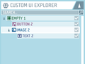
Parent-child structure example
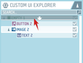
Widget list drag-and-drop reorder example


Transform properties
Apart from manually setting the position, size and rotation of a widget, you can also use a set of preset alignments and resize models by clicking on the Align & Stretch option. These allow for quick adjustments in the space of widgets parent element.
Empty
Works primarily as a border for other widgets. It is by itself not visible to the player.
Image
Add an image to the layout canvas. This can be either one of the default shapes or an imported image via Image Library game logic.
- Image properties
- Image - select an available image from the list
- Native size - set the original size of the image
- Color - set color of the image from the color palette
- Type - select the fill type of the image area.
- Simple - stretches the image over the entire image area.
- Sliced - preserves the original aspect of the border areas of the image if applicable.
- Tiled - fills the image area with tiles made of the original sized image
- Filled - the player can define how much of the image is shown in the image area with the value in a range of 0-1. The player may utilize this in creation of, for example, custom loading and health bars.
Text
- Text properties
- Align horizontal - select whether the text should be aligned in the left, center or right of the text area
- Align vertical - select whether the text should be aligned in the top, center or bottom of the text area
- Size - size of the text
- Color - color of the text
- Text - text to be displayed in the text area
Button
Custom Window game logic only.
- Button properties
- Image - select the shape of the button from the list
- Color normal - select the color and alpha of the button in normal state
- Color highlighted - select the color and alpha of the button when on-hover
- Color pressed - select the color and alpha of the button while pressed down
- Color disabled - select the color and alpha of the button in the disabled state
- Event data - script data for the parameter of the event tile On Button Clicked
Input
Custom Window game logic only.
- Color normal - select the color and alpha of the input widget in normal state
- Color highlighted - select the color and alpha of the input widget when on-hover
- Color pressed - select the color and alpha of the input widget while pressed down
- Color disabled - select the color and alpha of the input widget in the disabled state
- Input text - text used as the input. Can be set in the layout editor as a default answer and later changed by the player on interaction
- Placeholder text - text displayed while the Input text is empty
See also
For details on use in regards to either Custom HUD or Custom Window, please check their respective Wiki pages: