7erra/Sandbox – User
Example
![]() 1.66
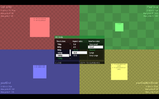
You can check some of the grid systems on an interactive test menu ingame:
1.66
You can check some of the grid systems on an interactive test menu ingame:
- Open Eden Editor
- Open debug console (Tools > Debug Console)
- Execute this code:
findDisplay 313 createDisplay "RscTestGrids";
A menu where you can see how all grid systems react to specific resolutions, aspect ratios and interface sizes.
- Hovering over each grid will show a detailed description in tooltip.
- Data for each grid shows the current size and max number of grids horizontally and vertically. Useful for making sure your menu proportions will work in all combinations.
- Click COPY TO CLIPBOARD button to copy a code with an example that can be used directly in Config.cpp or Description.ext.
Grids
Absolute
![]() 1.00
The absolute grid refers to a 4:3 screen with UI size "Very Large". It is the oldest of the three grids (absolute, safeZone and pixelGrid). Because of this it is never advisable to use it. Config example:
1.00
The absolute grid refers to a 4:3 screen with UI size "Very Large". It is the oldest of the three grids (absolute, safeZone and pixelGrid). Because of this it is never advisable to use it. Config example:
class TextAbsolute: RscText
{
	text = "Absolute grid";
	x = 0;
	y = 0.5;
	w = 0.15;
	h = 0.028;
};
SafeZone
To keep the dialog on screen the safeZone values were introduced. For more information there is a dedicated page for the safeZone system. Here is a quick overview over the six commands:
| Command | Explanation |
|---|---|
| safeZoneX | The left edge of the screen on SINGLE monitor settings. |
| safeZoneXAbs | The left edge of the screen on MULTIPLE monitors (Triple Head, three screens). |
| safeZoneY | The top edge of the screen. |
| safeZoneW | The width of of the screen in a SINGLE monitor setup (or the center one in case of triple head). |
| safeZoneWAbs | The width of a triple head setup. In case of a single monitor this is equal to safeZoneW. |
| safeZoneH | The height of the screen |
//--- Text box which covers the top right quarter of the (center) screen
class TextboxTopRightQuarter: RscText
{
	x = safezoneX + 0.5 * safeZoneW;
	y = safezoneY;
	w = 0.5 * safezoneW;
	h = 0.5 * safezoneH;
};
//--- Textbox which covers the entire screen on a triple head setup
class TextboxFullTripleScreen: RscText
{
	x = safeZoneXAbs;
	y = safeZoneY;
	w = safeZoneWAbs;
	h = safeZoneH;
};
GUI_GRID
The GUI_GRID is based on the safeZone grid and is used by the majority of the game's dialogs. The additional functionality is the possibility to stay on screen even with different user settings such as aspect ratio or UI scale. It also helps to keep a uniform style between dialogs. If you are using the base classes starting with "Rsc" then it is advisable to use this grid as some attributes (eg. fonts) will only scale correctly with this grid. The defines for use in configs and scripts can be accessed by adding this line to your config:
#include "\a3\ui_f\hpp\definecommongrids.inc"
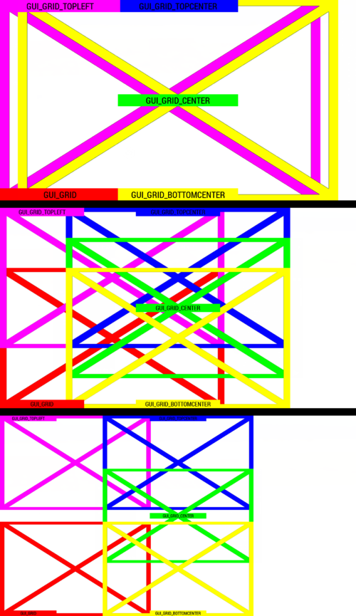
The following table will list the most commonly used grids which are defined in said file. To use them add the appropiate suffix _X, _Y, _W or _H to the variable name, eg GUI_GRID includes GUI_GRID_X, GUI_GRID_Y, GUI_GRID_W and GUI_GRID_H. The second and third column refer to where the dialog will originate from on other UI sizes.
| #define | Horizontal | Vertical | Notes |
|---|---|---|---|
| GUI_GRID | Left | Bottom | Example: Escape menu (RscDisplayInterrupt) |
| GUI_GRID_CENTER | Center | Middle | Example: RscDisplayTeamSwitch |
| GUI_GRID_TOPCENTER | Center | Top | |
| GUI_GRID_BOTTOMCENTER | Center | Bottom | Example: Revive UI |
| GUI_GRID_CENTER_BOTTOM | Center | Bottom | Same as GUI_GRID_BOTTOMCENTER |
| GUI_GRID_TOPLEFT | Left | Top | Diary (the top left part of the map) |
The GUI_GRID divides the screen into 40 parts on the horizontal axis and into 25 vertically. Therefore no content should have negative x or y values nor should it exceed a width of 40 or a height of 25. Using a height of 25 or width of 40 is not the same as using screen height or width because the GUI_GRID will get smaller with smaller UI sizes as it should be. Examples:
//--- Okay, will use entire available space:
x = GUI_GRID_CENTER_X + 0 * GUI_GRID_CENTER_W;
y = GUI_GRID_CENTER_Y + 0 * GUI_GRID_CENTER_H;
w = 40 * GUI_GRID_CENTER_W;
h = 25 * GUI_GRID_CENTER_H;
//--- NOT okay:
x = GUI_GRID_CENTER_X - 1 * GUI_GRID_CENTER_W;
y = GUI_GRID_CENTER_Y - 1 * GUI_GRID_CENTER_H;
w = 50 * GUI_GRID_CENTER_W;
h = 30 * GUI_GRID_CENTER_H;
The second example will dissapear on certain settings on the left and top edge as well as exceed the screen's width and height.
Here is a copy paste example:
#include "\a3\ui_f\hpp\definecommongrids.inc"
#define GUI_TEXT_SIZE_SMALL 	(GUI_GRID_H * 0.8)
#define GUI_TEXT_SIZE_MEDIUM 	(GUI_GRID_H * 1)
#define GUI_TEXT_SIZE_LARGE 	(GUI_GRID_H * 1.2)
class RscStructuredText
{
	deletable = 0;
	fade = 0;
	access = 0;
	type = CT_STRUCTURED_TEXT;
	idc = -1;
	style = ST_LEFT;
	colorText[] = {1,1,1,1};
	class Attributes
	{
		font = "RobotoCondensed";
		color = "#ffffff";
		colorLink = "#D09B43";
		align = "left";
		shadow = 1;
	};
	x = 0;
	y = 0;
	h = 0;
	w = 0;
	text = "";
	size = GUI_TEXT_SIZE_MEDIUM;
	shadow = 1;
};
class MyDialog
{
	idd = -1;
	class controls
	{
		class TextGUIGRID: RscStructuredText
		{
			text = "Text on the left bottom";
			x = GUI_GRID_X + 0 * GUI_GRID_W;
			y = GUI_GRID_Y + 24 * GUI_GRID_H;
			w = 40 * GUI_GRID_W;
			h = 1 * GUI_GRID_H;
		};
		class TextGUIGRIDCENTER: RscStructuredText
		{
			text = "<t align='center'>Text in the middle</t>";
			x = GUI_GRID_CENTER_X + 0 * GUI_GRID_CENTER_W;
			y = GUI_GRID_CENTER_Y + 12.5 * GUI_GRID_CENTER_H;
			w = 40 * GUI_GRID_CENTER_W;
			h = 1 * GUI_GRID_CENTER_H;
		};
		class TextGUIGRIDTOPCENTER: RscStructuredText
		{
			text = "<t align='center'>Text in the top center</t>";
			x = GUI_GRID_TOPCENTER_X + 0 * GUI_GRID_TOPCENTER_W;
			y = GUI_GRID_TOPCENTER_Y + 0 * GUI_GRID_TOPCENTER_H;
			w = 40 * GUI_GRID_TOPCENTER_W;
			h = 1 * GUI_GRID_TOPCENTER_H;
		};
		class TextGUIGRIDBOTTOMCENTER: RscStructuredText
		{
			text = "<t align='center'>Text bottom center</t>";
			x = GUI_GRID_BOTTOMCENTER_X + 0 * GUI_GRID_BOTTOMCENTER_W;
			y = GUI_GRID_BOTTOMCENTER_Y + 24 * GUI_GRID_BOTTOMCENTER_H;
			w = 40 * GUI_GRID_BOTTOMCENTER_W;
			h = 1 * GUI_GRID_BOTTOMCENTER_H;
		};
		class TextGUIGRIDTOPLEFT: TextGUIGRID
		{
			text = "Text on the left top";
			x = GUI_GRID_TOPLEFT_X + 0 * GUI_GRID_TOPLEFT_W;
			y = GUI_GRID_TOPLEFT_Y + 0 * GUI_GRID_TOPLEFT_H;
			// w and h are inherited from TextGUIGRID
			// GUI_GRID_name_W and GUI_GRID_name_H are the same for every define
		};
	};
};
Pixel Grid
![]() 1.60
1.60 ![]() 1.62
The pixel grid system was introduced to resolve issues with UI elements which appeared not as they should be because of the fact that the computer can't draw inbetween pixels. For a more indepth explanation of the grid go to the dedicated BIKI page. The base controls from which to inherit from usually start with ctrl, eg. ctrlPicture, ctrlStrucuturedText, etc.. Mixing controls with different grids on the same dialog might lead to undesired visuals.
1.62
The pixel grid system was introduced to resolve issues with UI elements which appeared not as they should be because of the fact that the computer can't draw inbetween pixels. For a more indepth explanation of the grid go to the dedicated BIKI page. The base controls from which to inherit from usually start with ctrl, eg. ctrlPicture, ctrlStrucuturedText, etc.. Mixing controls with different grids on the same dialog might lead to undesired visuals.
Commands
| Command | Explanation |
|---|---|
| pixelW | Width of one pixel. On displays with too fine resolution (e.g., 4K), it can get too small for practical use. |
| pixelH | Height of one pixel. On displays with too fine resolution (e.g., 4K), it can get too small for practical use. |
| pixelGrid | Multiplier based on resolution, interface size and some config values. It can be divided by up to 4 and still be a whole number. Due to this rounding, some interface sizes may use the same value. |
| pixelGridBase | Multiplier only based on the screen resolution. |
| pixelGridNoUIScale | Similar to pixelGrid, but affected only by resolution, not interface size. Usually used to keep some important elements, e.g., spotlight buttons in the main menu. |
Includes
#include "\a3\3DEN\UI\macros.inc"
#include "\a3\3DEN\UI\macroexecs.inc"
| #define | Explanation |
|---|---|
| GRID_W | Width of one grid |
| GRID_H | Height of one grid |
| CENTER_X | Vertical screen center |
| CENTER_Y | Horizontal screen center |
Examples
#include "\a3\3DEN\UI\macros.inc"
#include "\a3\3DEN\UI\macroexecs.inc"
class ctrlDefaultText: ctrlDefault
{
	sizeEx = "4.32 * (1 / (getResolution select 3)) * pixelGrid * 0.5";
	font = "RobotoCondensedLight";
	shadow = 1;
};
class ctrlStructuredText: ctrlDefaultText
{
	type = CT_STRUCTURED_TEXT;
	colorBackground[] = {0,0,0,0};
	size = "4.32 * (1 / (getResolution select 3)) * pixelGrid * 0.5";
	text = "";
	class Attributes
	{
		align = "left";
		color = "#ffffff";
		colorLink = "";
		size = 1;
		font = "RobotoCondensedLight";
	};
	onCanDestroy = "";
	onDestroy = "";
};
class MyPixelGridDialog
{
	idd = -1;
	class controls
	{
		class TextLeftTop: ctrlStructuredText
		{
			text = "Left top";
			x = safeZoneX + 0 * GRID_W;
			y = safeZoneY + 0 * GRID_H;
			w = 50 * GRID_W;
			h = 5 * GRID_H;
			colorBackground[] = {1,0,0,1};
		};
		class TextCenterMiddle: TextLeftTop
		{
			text = "Center middle";
			x = CENTER_X - 25 * GRID_W;
			y = CENTER_Y - 2.5 * GRID_H;
		};
		class TextRightBottom: TextLeftTop
		{
			text = "Left bottom";
			x = safeZoneX + safeZoneW - 50 * GRID_W;
			y = safeZoneY + safeZoneH - 5 * GRID_H;
		};
	};
};
The size/sizeEx attribute
Some controls make use of the size or sizeEx attribute. These attributes set the fontsize of the control. They expect a number in the format of UI coordinates, therefore you should use the same coordinates as the one you used for the h attribute, eg:
class TextControl: RscText
{
	text = "Large text";
	x = GUI_GRID_CENTER_X + 1 * GUI_GRID_CENTER_W;
	y = GUI_GRID_CENTER_Y + 0 * GUI_GRID_CENTER_H;
	w = 23 * GUI_GRID_CENTER_W;
	h = 1 * GUI_GRID_CENTER_H;
	sizeEx = 2 * GUI_GRID_CENTER_H;
};
You can also use the following defines for GUI_GRIDs:
#define GUI_TEXT_SIZE_SMALL (GUI_GRID_H * 0.8)
#define GUI_TEXT_SIZE_MEDIUM (GUI_GRID_H * 1)
#define GUI_TEXT_SIZE_LARGE (GUI_GRID_H * 1.2)
And for the pixelGrid:
class TextControl: ctrlStructuredText
{
	text = "Large text";
	x = CENTER_X - 20 * GRID_W;
	y = CENTER_Y - 5 * GRID_H;
	w = 40 * GRID_W;
	h = 10 * GRID_H;
	size = 10 * GRID_H;
};
With the defines from macroexecs.inc and macros.inc:
Template:AnswerMe
class TextControl: RscText
{
	text = "Large text";
	x = CENTER_X - 20 * GRID_W;
	y = CENTER_Y - 5 * GRID_H;
	w = 40 * GRID_W;
	h = 10 * GRID_H;
	sizeEx = SIZEEX_PURISTA(SIZE_M); // A macro used to easy set the font size according to some predefined size values and a coefficient. The macro gets the size nearest to the one which was inputted.
};
List of available pixelGrid font sizes:
| sizeEx | size | |||
|---|---|---|---|---|
| #define | Value | #define | Value | |
| SIZEEX_XS | 3.0 | SIZE_XS | 3.5 | |
| SIZEEX_S | 4.0 | SIZE_S | 4 | |
| SIZEEX_M | 4.5 | SIZE_M | 5 | |
| SIZEEX_L | 5.0 | SIZE_L | 5 | |
| SIZEEX_XL | 6.0 | SIZE_XL | 6 | |


