DialogControls-Toolbox: Difference between revisions
Jump to navigation
Jump to search
Killzone Kid (talk | contribs) (example) |
Killzone Kid (talk | contribs) (properties) |
||
| Line 12: | Line 12: | ||
! bgcolor="#ddddff" | Remark | ! bgcolor="#ddddff" | Remark | ||
|- | |- | ||
| ''' | | '''colorText''' | ||
| color array | | color array | ||
| | | color of the unchecked checkbox text | ||
|- | |- | ||
| '''colorTextSelect''' | | '''colorTextSelect''' | ||
| color array | | color array | ||
| | | color of the checked checkbox text | ||
|- | |- | ||
| ''' | | '''colorBackground''' | ||
| color array | | color array | ||
| | | color of the background when checkbox is not in focus (doesn't matter if checked or not) | ||
|- | |- | ||
| ''' | | '''colorSelectedBg''' | ||
| color array | | color array | ||
| | | color of the background when checkbox is in focus (doesn't matter if checked or not) | ||
|- | |- | ||
| ''' | | '''font''' | ||
| | | float | ||
| | | the font to use. See the list of [[Fonts#Available_Fonts|available fonts]] for possible values | ||
|- | |||
| '''sizeEx''' | |||
| float | |||
| the font size of text (0 to 1) | |||
|- | |- | ||
| '''rows''' | | '''rows''' | ||
| integer | | integer | ||
| | | amount of rows to arrange checkboxes into | ||
|- | |- | ||
| '''columns''' | | '''columns''' | ||
| integer | | integer | ||
| | | amount of columns to arrange checkboxes into | ||
|- | |- | ||
| ''' | | '''strings''' | ||
| | | string array | ||
| | | checkboxes texts to display | ||
|- | |- | ||
| ''' | | '''checked_strings''' | ||
| string array | | string array | ||
| | | checkboxes texts to display when checkboxes are checked | ||
|- | |- | ||
| '''values''' | | '''values''' | ||
| float array | | float array | ||
| | | Numerical values associated with items. Can be retrieved or set with [[lbValue]] and [[lbSetValue]] | ||
|- | |||
| '''tooltips''' | |||
| string array | |||
| Tooltips for each checkbox | |||
|- | |- | ||
|}<br clear="all"> | |}<br clear="all"> | ||
Revision as of 20:34, 21 May 2019
CT_TOOLBOX Type=6
TokenNames common to most controls, such as x,y,w,h,text,idc... are not listed here.
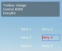
A Toolbox is a set of buttons, ordered by columns and rows. Only one can be active at a time and one is always selected (the first one by default). For Toolbox with multiple selections see CT_CHECKBOXES.
| Properties | ||
|---|---|---|
| Name | Type | Remark |
| colorText | color array | color of the unchecked checkbox text |
| colorTextSelect | color array | color of the checked checkbox text |
| colorBackground | color array | color of the background when checkbox is not in focus (doesn't matter if checked or not) |
| colorSelectedBg | color array | color of the background when checkbox is in focus (doesn't matter if checked or not) |
| font | float | the font to use. See the list of available fonts for possible values |
| sizeEx | float | the font size of text (0 to 1) |
| rows | integer | amount of rows to arrange checkboxes into |
| columns | integer | amount of columns to arrange checkboxes into |
| strings | string array | checkboxes texts to display |
| checked_strings | string array | checkboxes texts to display when checkboxes are checked |
| values | float array | Numerical values associated with items. Can be retrieved or set with lbValue and lbSetValue |
| tooltips | string array | Tooltips for each checkbox |
- Example:
class MyRscToolbox
{
	onLoad = "_this select 0 lbSetCurSel 4;";

	idc = -1;
	type = 6; // CT_TOOLBOX
	style = 2; // ST_CENTER

	x = 0.25;
	y = 0.25;
	w = 0.5;
	h = 0.1;

	colorText[] = {0, 1, 0, 1};
	colorTextSelect[] = {1, 0, 0, 1};

	colorBackground[] = {0, 0, 1, 0.3};
	colorSelectedBg[] = {0, 0, 0, 0.2};

	font = "RobotoCondensed";
	sizeEx = 0.04;

	onToolBoxSelChanged = "hint str _this";

	columns = 3;
	rows = 2;

	strings[] = {"Entry 1","Entry 2","Entry 3","Entry 4","Entry 5","Entry 6"};
	checked_strings[] = {"[Entry 1]","[Entry 2]","[Entry 3]","[Entry 4]","[Entry 5]","[Entry 6]"};
	tooltips[] = {"Entry 1 tip","Entry 2 tip","Entry 3 tip","Entry 4 tip","Entry 5 tip","Entry 6 tip"};
	values[] = {1,2,3,4,5,6};
};
Notice: As you see in the example image, the returned entry number from the onToolBoxSelChanged event handler starts at zero (0)! So if you have 6 toolbox entrys, the first is 0 and the last is 5!
