DialogControls-CheckBoxes: Difference between revisions
Jump to navigation
Jump to search
Killzone Kid (talk | contribs) (more info) |
Killzone Kid (talk | contribs) (correct arttributes) |
||
| Line 18: | Line 18: | ||
| color array | | color array | ||
| color of the checked checkbox text | | color of the checked checkbox text | ||
|- | |||
| '''colorBackground''' | |||
| color array | |||
| color of the background when checkbox is not in focus (doesn't matter if checked or not) | |||
|- | |||
| '''colorSelectedBg''' | |||
| color array | |||
| color of the background when checkbox is in focus (doesn't matter if checked or not) | |||
|- | |- | ||
| '''font''' | | '''font''' | ||
| Line 26: | Line 34: | ||
| float | | float | ||
| the font size of text (0 to 1) | | the font size of text (0 to 1) | ||
|- | |- | ||
| '''rows''' | | '''rows''' | ||
| Line 74: | Line 78: | ||
h = 0.5; | h = 0.5; | ||
colorText[] = {0, 1, 0, 1}; | |||
colorTextSelect[] = {1, 0, 0, 1}; | |||
colorText[] = {0, 1, 0, 1}; | |||
colorTextSelect[] = {1, 0, 0, 1}; | |||
colorBackground[] = {0, 0, 1, 0.3}; | colorBackground[] = {0, 0, 1, 0.3}; | ||
colorSelectedBg[] = {0, 0, 0, 0.2}; | |||
font = "RobotoCondensed"; | font = "RobotoCondensed"; | ||
Revision as of 20:23, 21 May 2019
TokenNames common to most controls, such as x,y,w,h,text,idc... are not listed here.
Checkboxes
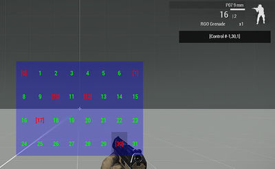
The Checkboxes (also known as textual checkboxes) are a set of state change buttons, ordered by columns and rows. Unlike the Toolbox Control more than one button can become active. Maximum number of checkboxes available for a single control is 32. It is possible to create more than 32 checkboxes, however over-the-limit checkboxes will just become duplicates.
| Properties | ||
|---|---|---|
| Name | Type | Remark |
| colorText | color array | color of the unchecked checkbox text |
| colorTextSelect | color array | color of the checked checkbox text |
| colorBackground | color array | color of the background when checkbox is not in focus (doesn't matter if checked or not) |
| colorSelectedBg | color array | color of the background when checkbox is in focus (doesn't matter if checked or not) |
| font | float | the font to use. See the list of available fonts for possible values |
| sizeEx | float | the font size of text (0 to 1) |
| rows | integer | amount of rows to arrange checkboxes into |
| columns | integer | amount of columns to arrange checkboxes into |
| strings | string array | checkboxes texts to display |
| checked_strings | string array | checkboxes texts to display when checkboxes are checked |
| values | float array | Numerical values associated with items. Can be retrieved or set with lbValue and lbSetValue |
| tooltips | string array | Tooltips for each checkbox |
Example:
class MyCheckBoxes
{
	onLoad = "_this select 0 ctrlSetChecked [1, true]; _this select 0 ctrlSetChecked [7, true]; _this select 0 ctrlSetChecked [15, true];";

	idc = -1;
	type = 7; // CT_CHECKBOXES
	style = 2; // ST_CENTER

	x = 0.25;
	y = 0.25;
	w = 0.5;
	h = 0.5;

	colorText[] = {0, 1, 0, 1};
	colorTextSelect[] = {1, 0, 0, 1};

	colorBackground[] = {0, 0, 1, 0.3};
	colorSelectedBg[] = {0, 0, 0, 0.2};

	font = "RobotoCondensed";
	sizeEx = 0.04;

	onCheckBoxesSelChanged = "hint str _this";

	columns = 8;
	rows = 4;

	strings[] = {"0","1","2","3","4","5","6","7","8","9","10","11","12","13","14","15","16","17","18","19","20","21","22","23","24","25","26","27","28","29","30","31"};
	checked_strings[] = {"[0]","[1]","[2]","[3]","[4]","[5]","[6]","[7]","[8]","[9]","[10]","[11]","[12]","[13]","[14]","[15]","[16]","[17]","[18]","[19]","[20]","[21]","[22]","[23]","[24]","[25]","[26]","[27]","[28]","[29]","[30]","[31]"};
	values[] = {0,1,2,3,4,5,6,7,8,9,10,11,12,13,14,15,16,17,18,19,20,21,22,23,24,25,26,27,28,29,30,31};
	tooltips[] = {"tip0","tip1","tip2","tip3","tip4","tip5","tip6","tip7","tip8","tip9","tip10","tip11","tip12","tip13","tip14","tip15","tip16","tip17","tip18","tip19","tip20","tip21","tip22","tip23","tip24","tip25","tip26","tip27","tip28","tip29","tip30","tip31"};
};
with uiNamespace do
{
	ctrl = findDisplay 46 createDisplay "RscDisplayEmpty" ctrlCreate ["MyCheckBoxes", -1];
};
Script commands for use with CheckBoxes:
- ctrlChecked - returns check status of given checkbox
- ctrlSetChecked - checks given checkbox
- lbCurSel - returns index of focused checkbox
- lbValue - returns value currently set on given checkbox
- lbSetValue - sets value on given checkbox
- lbSetText - sets string on given checkbox
- lbClear - clears all strings from checkbox table
- lbAdd - adds a string to cleared checkbox table
