Eden Editor: Configuring Attributes: Controls: Difference between revisions
Lou Montana (talk | contribs) m (Text replacement - "};</syntaxhighlight>" to "}; </syntaxhighlight>") |
|||
| (9 intermediate revisions by 2 users not shown) | |||
| Line 1: | Line 1: | ||
Entity attributes in [[Eden Editor]] are represented by specific UI controls. By default, the game offers a wide range of pre-define controls. Not all available controls are listed here due to frequent updates. All available controls can be found in | {{TOC|side}} | ||
Entity attributes in [[:Category:Eden Editor|Eden Editor]] are represented by specific UI controls. | |||
By default, the game offers a wide range of pre-define controls. Not all available controls are listed here due to frequent updates. | |||
All available controls can be found in <sqf inline>configFile >> "Cfg3DEN" >> "Attributes"</sqf> but be careful, some of those attributes are not meant to be used with custom attributes. | |||
Trial and error! | |||
== Configuration == | == Configuration == | ||
''Full article - [[Eden Editor: Configuring Attributes]]'' | ''Full article - [[Eden Editor: Configuring Attributes]]'' | ||
<syntaxhighlight lang="cpp"> | <syntaxhighlight lang="cpp"> | ||
| Line 42: | Line 48: | ||
<nowiki>[ | <nowiki>[ | ||
[ | [ | ||
[<W>, <Wn>], | |||
[<M>, <Mn>] | |||
[<I>,<In>], | [<I>, <In>], | ||
[<B>,<Bn>] | [<B>, <Bn>] | ||
], | ], | ||
<isVirtual> | <isVirtual> | ||
| Line 58: | Line 64: | ||
|- | |- | ||
| | | | ||
==== BehaviourGroup ==== | ==== BehaviourGroup ==== | ||
| Drop-down list which shows all [[behaviour]] states | | Drop-down list which shows all [[behaviour]] states | ||
| Line 104: | Line 109: | ||
Additional options available when configuring a control inherited from class Combo (this is a [[Eden_Editor:_Configuring_Attributes#Control|control]] config, not an attribute config): | Additional options available when configuring a control inherited from class Combo (this is a [[Eden_Editor:_Configuring_Attributes#Control|control]] config, not an attribute config): | ||
<syntaxhighlight lang="cpp"> | <syntaxhighlight lang="cpp"> | ||
class Value: Combo | class Value : Combo | ||
{ | { | ||
// Static items | // Static items | ||
| Line 118: | Line 123: | ||
class ItemsConfig | class ItemsConfig | ||
{ | { | ||
path[] = {"CfgNotifications"}; // Path to config container | path[] = { "CfgNotifications" }; // Path to config container | ||
localConfig = 1; // 1 to search local Description.ext as well | localConfig = 1; // 1 to search local Description.ext as well | ||
propertyText = "title"; // item's text | |||
propertyText = "title"; | propertyTextRight = "description"; // item's right text | ||
propertyPicture = "iconPicture"; // item's picture | |||
propertyTextRight = "description"; | propertyColor = "color"; // item's text colour | ||
sort = 1; // whether the list should be sorted or not (1 = sorted/ 0 = unsorted) | |||
propertyPicture = "iconPicture"; | |||
propertyColor = "color"; | |||
}; | }; | ||
}; | }; | ||
| Line 139: | Line 139: | ||
class CustomAttributeWithCombo | class CustomAttributeWithCombo | ||
{ | { | ||
control = "combo"; | |||
property = "UniqueProperty"; | |||
displayName = "Custom Combo Attribute"; | |||
tooltip = "This combo has three values."; | |||
expression = "_this setVariable ['%s', _value];"; | |||
defaultValue = 0; | |||
typeName = "NUMBER"; | |||
class Values | |||
{ | |||
class None | |||
{ | |||
name = "Value 0"; | |||
tooltip = "Some tooltip"; | |||
value = 0; | |||
picture = "\a3\data_f_tank\images\upgradedaudio_ca.paa"; | |||
pictureRight = "\a3\data_f_tacops\logos\arma3_tacops_icon_ca.paa"; | |||
}; | |||
class Info | |||
{ | |||
name = "Value 1"; | |||
value = 1; | |||
}; | |||
class Debug | |||
{ | |||
name = "Value 2"; | |||
value = 2; | |||
}; | |||
}; | |||
}; | }; | ||
</syntaxhighlight> | </syntaxhighlight> | ||
| [[String]] or [[Number]] (depends on original value type) | | [[String]] or [[Number]] (depends on original value type) | ||
|- | |- | ||
| Line 192: | Line 195: | ||
==== Date ==== | ==== Date ==== | ||
| Three drop-down lists for year, month and day selection. Days of the week described and weekends are highlighted. | | Three drop-down lists for year, month and day selection. Days of the week described and weekends are highlighted. | ||
| [[Array]] in format [<year>,<month>,<day>] | | [[Array]] in format [<year>, <month>, <day>] | ||
|- | |- | ||
| | | | ||
| Line 266: | Line 269: | ||
| | | | ||
==== EnableDebugConsole ==== | ==== EnableDebugConsole ==== | ||
| Drop-down menu with [[ | | Drop-down menu with [[Arma 3: Debug Console|Debug Console]] settings | ||
| [[Number]] | | [[Number]] | ||
|- | |- | ||
| Line 357: | Line 360: | ||
| | | | ||
==== Respawn ==== | ==== Respawn ==== | ||
| Drop-down list which shows [[Arma 3 Respawn|respawn]] options | | Drop-down list which shows [[Arma 3: Respawn|respawn]] options | ||
| [[Number]] | | [[Number]] | ||
|- | |- | ||
| Line 496: | Line 499: | ||
| [[String]] | | [[String]] | ||
|} | |} | ||
=== Decorative / Informative Control === | |||
These attribute controls can be used to display additional information to the user. Some of them provide support for structured text so one can display links, highlight important information with color and much more. | |||
{| class="wikitable sortable" | |||
! Class | |||
! class="unsortable" | Description | |||
! Preview | |||
! class="unsortable" | Example Attribute Config | |||
|- | |||
| | |||
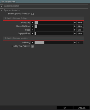
==== SubCategory ==== | |||
| Shows a single line text. | |||
| [[File:A3 EdenEditor Subcategory.png|frameless]] | |||
| <syntaxhighlight lang="cpp"> | |||
class SubCategory | |||
{ | |||
property = "TAG_MyAttribute_Subcategory"; | |||
control = "SubCategory"; | |||
displayName = "Activation Distance Settings"; // Visible text. Despite the attribute code saying the property should be title, displayName is correct | |||
}; | |||
</syntaxhighlight> | |||
|- | |||
| | |||
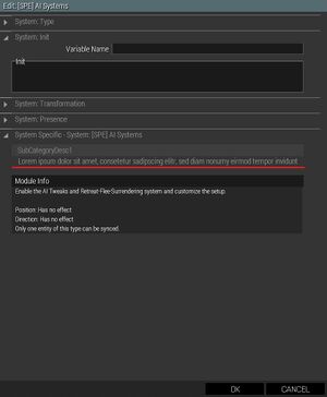
==== SubCategoryDesc1==== | |||
| Shows a headline and a single line description. If the description is too long, it will be cut off. | |||
| [[File:A3 EdenEditor SubCategoryDesc1.jpg|frameless]] | |||
| <syntaxhighlight lang="cpp"> | |||
class SubCategoryDesc1 | |||
{ | |||
displayName = "SubCategoryDesc1"; | |||
property = "TAG_MyAttribute_Subcategory"; | |||
control = "SubCategoryDesc1"; | |||
description = "Lorem ipsum dolor sit amet, consetetur sadipscing elitr, sed diam nonumy eirmod tempor invidunt \ | |||
ut labore et dolore magna aliquyam erat, sed diam voluptua. At vero eos et accusam et."; | |||
}; | |||
</syntaxhighlight> | |||
|- | |||
| | |||
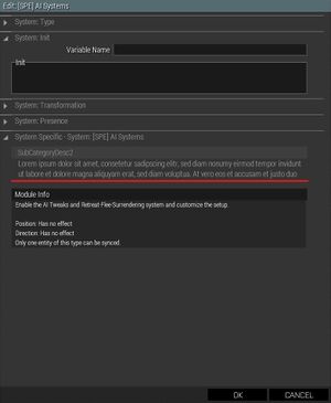
==== SubCategoryDesc2==== | |||
| Shows a headline and a two line description. If the description is too long, it will be cut off. | |||
| [[File:A3 EdenEditor SubCategoryDesc2.jpg|frameless]] | |||
| <syntaxhighlight lang="cpp"> | |||
class SubCategoryDesc2 | |||
{ | |||
displayName = "SubCategoryDesc2"; | |||
property = "TAG_MyAttribute_Subcategory"; | |||
control = "SubCategoryDesc2"; | |||
description = "Lorem ipsum dolor sit amet, consetetur sadipscing elitr, sed diam nonumy eirmod tempor invidunt ut labore et dolore magna aliquyam erat, sed diam voluptua. \ | |||
At vero eos et accusam et justo duo dolores et ea rebum. Stet clita kasd gubergren, no sea takimata sanctus est Lorem ipsum dolor sit amet. \ | |||
Lorem ipsum dolor sit amet, consetetur sadipscing elitr, sed diam."; | |||
}; | |||
</syntaxhighlight> | |||
|- | |||
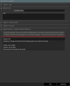
| | |||
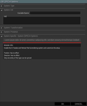
==== SubCategoryNoHeader1 ==== | |||
| Shows a single line description but no headline. Text that is too long is cut off. This control is slighly misconfigured as the text control is taller than the controls group. This will cause unwanted scrolling. | |||
| [[File:A3 EdenEditor SubCategoryNoHeader1.jpg|frameless]] | |||
| <syntaxhighlight lang="cpp"> | |||
class SubCategoryNoHeader1 | |||
{ | |||
property = "TAG_MyAttribute_Subcategory"; | |||
control = "SubCategoryNoHeader1"; | |||
description = "Lorem ipsum dolor sit amet, consetetur sadipscing elitr, sed diam nonumy eirmod tempor invidunt ut labore et dolore magna aliquyam erat, sed diam voluptua. \ | |||
At vero eos et accusam et justo duo dolores et ea rebum. Stet clita kasd gubergren, no sea takimata sanctus est Lorem ipsum dolor sit amet. \ | |||
Lorem ipsum dolor sit amet, consetetur sadipscing elitr, sed diam."; | |||
}; | |||
</syntaxhighlight> | |||
|- | |||
| | |||
==== SubCategoryNoHeader2 ==== | |||
| Shows a two line description but no headline. Text that is too long is cut off. This control is slighly misconfigured as the text control is taller than the controls group. This will cause unwanted scrolling. | |||
| [[File:A3 EdenEditor SubCategoryNoHeader2.jpg|frameless]] | |||
| <syntaxhighlight lang="cpp"> | |||
class SubCategoryNoHeader2 | |||
{ | |||
property = "TAG_MyAttribute_Subcategory"; | |||
control = "SubCategoryNoHeader2"; | |||
description = "Lorem ipsum dolor sit amet, consetetur sadipscing elitr, sed diam nonumy eirmod tempor invidunt ut labore et dolore magna aliquyam erat, sed diam voluptua. \ | |||
At vero eos et accusam et justo duo dolores et ea rebum. Stet clita kasd gubergren, no sea takimata sanctus est Lorem ipsum dolor sit amet. \ | |||
Lorem ipsum dolor sit amet, consetetur sadipscing elitr, sed diam."; | |||
};</syntaxhighlight> | |||
|- | |||
| | |||
==== SubCategoryNoHeader2 with Structured Text ==== | |||
| Colored text with clickable links. | |||
| [[File:A3_EdenEditor_SubCategoryNoHeader2_Structured_Text.jpg|frameless]] | |||
| <syntaxhighlight lang="cpp"> | |||
class SubCategoryNoHeader2 | |||
{ | |||
property = "TAG_MyAttribute_Subcategory"; | |||
control = "SubCategoryNoHeader2"; | |||
description = "Event Handlers are triggered upon certain events. The event handler is added where the entity is local. \ | |||
Event parameters are passed to it via the <t colorLink='#e69710'><a href='https://community.bistudio.com/wiki/Magic_Variables#this'>_this</a> variable. \ | |||
See <t colorLink='#e69710'><a href='https://community.bistudio.com/wiki/Arma_3:_Event_Handlers'>Arma 3 - Event Handlers</a> and \ | |||
<t colorLink='#e69710'><a href='https://community.bistudio.com/wiki/addEventHandler'>addEventHandler</a> for more information."; | |||
};</syntaxhighlight> | |||
|- | |||
| | |||
|} | |||
[[Category:Eden Editor: Modding|Modding Attributes: Controls]] | [[Category:Eden Editor: Modding|Modding Attributes: Controls]] | ||
Latest revision as of 10:46, 12 September 2024
Entity attributes in Eden Editor are represented by specific UI controls. By default, the game offers a wide range of pre-define controls. Not all available controls are listed here due to frequent updates. All available controls can be found in configFile >> "Cfg3DEN" >> "Attributes" but be careful, some of those attributes are not meant to be used with custom attributes. Trial and error!
Configuration
Full article - Eden Editor: Configuring Attributes
class Cfg3DEN
{
	class Object
	{
		class AttributeCategories
		{
			class MyCategory
			{
				class Attributes
				{
					class MyAttribute
					{
						control = "Edit"; // Control name, see the list below
					};
				};
			};
		};
	};
};
List
| Class | Description | Saved Value |
|---|---|---|
ActivationType |
Drop-down list which shows default triggerActivation options | String |
AmmoBox |
Table with all weapons and equipment in the game, filtered by type. | Array in format:
[ [ [<W>, <Wn>], [<M>, <Mn>] [<I>, <In>], [<B>, <Bn>] ], <isVirtual> ] |
BehaviourGroup |
Drop-down list which shows all behaviour states | String |
BehaviourWaypoint |
Drop-down list which shows all waypointBehaviour states | String |
Checkbox |
Simple checkbox | Boolean - true if the checkbox is ticked |
CheckboxNumber |
Simple checkbox with numeric output | Number - 1 if the checkbox is ticked, 0 if it isn't |
CheckboxReversed |
Simple checkbox with reversed output | Boolean - false if the checkbox is ticked |
CheckboxState |
Category toggle. When ticked off, all other attributes in the category will be disabled and greyed out. | Boolean - true if the checkbox is ticked |
CombatModeGroup |
Drop-down list which shows all combatMode states | String |
CombatModeWaypoint |
Drop-down list which shows all waypointCombatMode states | String |
Combo |
Empty drop-down list, used as a base class.
Additional options available when configuring a control inherited from class Combo (this is a control config, not an attribute config): class Value : Combo
{
// Static items
class Items
{
class None
{
text = "None";
data = "";
};
};
// Dynamically loaded items
class ItemsConfig
{
path[] = { "CfgNotifications" }; // Path to config container
localConfig = 1; // 1 to search local Description.ext as well
propertyText = "title"; // item's text
propertyTextRight = "description"; // item's right text
propertyPicture = "iconPicture"; // item's picture
propertyColor = "color"; // item's text colour
sort = 1; // whether the list should be sorted or not (1 = sorted/ 0 = unsorted)
};
};
Attribute Config class CustomAttributeWithCombo
{
control = "combo";
property = "UniqueProperty";
displayName = "Custom Combo Attribute";
tooltip = "This combo has three values.";
expression = "_this setVariable ['%s', _value];";
defaultValue = 0;
typeName = "NUMBER";
class Values
{
class None
{
name = "Value 0";
tooltip = "Some tooltip";
value = 0;
picture = "\a3\data_f_tank\images\upgradedaudio_ca.paa";
pictureRight = "\a3\data_f_tacops\logos\arma3_tacops_icon_ca.paa";
};
class Info
{
name = "Value 1";
value = 1;
};
class Debug
{
name = "Value 2";
value = 2;
};
};
};
|
String or Number (depends on original value type) |
ComboPreview |
Empty drop-down list with preview button, used as a base class. If data of the selected item are found in CfgSounds, CfgEnvSounds, CfgMusic or CfgSFX, clicking on the button will play the sound. | String |
Date |
Three drop-down lists for year, month and day selection. Days of the week described and weekends are highlighted. | Array in format [<year>, <month>, <day>] |
Default |
Base class for other attribute controls | N/A |
Edit |
Single line text input. | String |
EditAB |
Two-dimensional size setting. | String |
EditArray |
Array input. Items must be divided by commas or semicolons. | String |
EditCode |
Single line code input. Uses monospace font and offers scripting help. | String |
EditCodeMulti3 |
Multi line code input. Uses monospace font and offers scripting help. | String |
EditCodeMulti5 |
Multi line code input. Uses monospace font and offers scripting help. | String |
EditCodeShort |
Single line code input with decreased width. Good for shorter values, like numbers. Uses monospace font and offers scripting help. | String |
EditMulti3 |
Multi line text input. | String |
EditMulti5 |
Multi line text input. | String |
EditShort |
Single line text input with decreased width. Good for shorter values, like numbers. | String |
EditXY |
Position setting of X and Y axis. | Array |
EditXYZ |
Position setting of X, Y and Z axis. | Array |
EditZ |
Position setting of Z axis. | Number |
EnableDebugConsole |
Drop-down menu with Debug Console settings | Number |
Face |
Drop-down list which shows all faces from CfgFaces. | String |
GameType |
Drop-down list which shows all game types from CfgMPGameTypes. | String |
GarbageCollectorMode |
Drop-down list which shows corpseManagerMode options | Number |
GuerAllegiance |
Toolbox | |
Lock |
Drop-down list which shows all lock options. | Number |
MarkerBrush |
Drop-down list which shows all marker brushes from CfgMarkerBrushes. | String |
MarkerColor |
Drop-down list which shows all marker colors from CfgMarkerColors. | String |
ModuleInfo |
Non-interactive control. When used on a module which uses module framework, it shows detailed module description, properties and synchronization map. | N/A |
Music |
Drop-down list which shows all music tracks from CfgMusic. | String |
Pitch |
Voice pitch slider, value is in range <0.9; 1.1>, default value is 1, description adds "x" at the end (e.g., "1x") | Number |
PreferencesSavegame |
Drop-down list which shows autosave options | Number |
Respawn |
Drop-down list which shows respawn options | Number |
RespawnTemplates |
Table with available respawn templates. See Arma 3: Respawn for more details. | Array of Strings - classes from CfgRespawnTemplates |
RscTitle |
Drop-down list which shows all UI overlays from RscTitles. | String |
Skill |
Slider in range <0.2; 1> (AI is too dumb with skill 0, so designer shouldn't be unable to set it), with customized tooltip describing specific values | Number |
Slider |
Percentage slider, value is in range <0; 1>, default value is 1, description adds "%" at the end (e.g., "100%") | Number |
SliderMultiplier |
Multiplier slider, value is in range <0.5; 1.5>, default value is 1, description adds "x" at the end (e.g., "1x") | Number |
SliderTime |
Time slider, value is in seconds and in range <0; 3600>, default value is 0, description appears in format "HH:MM:SS" | Number |
SliderTimeDay |
Variation of SliderTime, with range <0; 86399> (0 to 23 h, 59 m, 59 s) and default 43200 (12 h) | Number |
SliderTimeForecast |
Variation of SliderTime, with range <1800; 28800> (30 min to 8 h) and default 3600 (1 h) | Number |
SliderTimeRespawn |
Variation of SliderTime, with range <0; 300> (0 min to 5 min) and default 0 | Number |
Sound |
Drop-down list which shows all sounds from CfgSounds. | String |
SoundEffect |
Drop-down list which shows all sounds from CfgSFX. | String |
SoundEnvironment |
Drop-down list which shows all sounds from CfgEnvSounds. | String |
SoundVoice |
Drop-down list which shows all sounds from CfgSounds. As opposed to "Sound" control, its "No Sound" option has different value. | String |
Speaker |
Drop-down list which shows all voices from CfgVoice. | String |
StructuredText1-9 |
Non-interactive element. Shows text defined by description property in the attribute config (where displayName or tooltip are) | N/A |
Timeout |
Setting of triggerTimeout | Array in format [<min>,<mid>,<max>] |
TriggerActivation |
Drop-down list which shows default triggerActivation options | String |
TriggerActivationOwner |
Drop-down list which shows triggerActivation options when the trigger has owner defined (see connecting) | String |
TriggerType |
Drop-down list which shows default triggerType options | String |
Decorative / Informative Control
These attribute controls can be used to display additional information to the user. Some of them provide support for structured text so one can display links, highlight important information with color and much more.
