CT SHORTCUTBUTTON: Difference between revisions
Killzone Kid (talk | contribs) No edit summary |
m (Added GVI) |
||
| (4 intermediate revisions by 3 users not shown) | |||
| Line 12: | Line 12: | ||
|commands = | |commands = | ||
|events = | |events = | ||
* [[User_Interface_Event_Handlers# | * [[User_Interface_Event_Handlers#Button_Events|Events: Button]] | ||
}} | }} | ||
| Line 95: | Line 95: | ||
|type1=Boolean | |type1=Boolean | ||
|value1=true | |value1=true | ||
|description= | |description= Introduced with {{GVI|arma3|2.10|size=0.75}}. Default: [[false]]. When this attribute set to [[true]] the texture will be rendered in the following way: | ||
* If original texture aspect ratio is 2:1 or more (w >= 2 * h) and button aspect ration is 2:1 or more (w >= 2 * h), the corners of the texture are preserved (rounded corners would scale but not stretch). | * If the original texture aspect ratio is 2:1 or more ({{hl|w >{{=}} 2 * h}}) and the button aspect ration is 2:1 or more ({{hl|w >{{=}} 2 * h}}), the corners of the texture are preserved (rounded corners would scale but not stretch). | ||
* In all other cases the texture is stretched to cover | * In all other cases the texture is stretched to cover the button. | ||
}} | }} | ||
| Line 106: | Line 106: | ||
|type1=Array | |type1=Array | ||
|value1={1,1,1,1} | |value1={1,1,1,1} | ||
|description= | |description=Text color. | ||
}} | }} | ||
| Line 113: | Line 113: | ||
|type1=Array | |type1=Array | ||
|value1={0.95,0.95,0.95,1} | |value1={0.95,0.95,0.95,1} | ||
|description= | |description=When hovering over the button the text color changes from color[] to color2[]. | ||
}} | }} | ||
| Line 127: | Line 127: | ||
|type1=Array | |type1=Array | ||
|value1={1,1,1,1} | |value1={1,1,1,1} | ||
|description= | |description=When hovering over the button the background color changes from colorBackground[] to colorBackground2[]. | ||
}} | }} | ||
| Line 141: | Line 141: | ||
|type1=Array | |type1=Array | ||
|value1={1,1,1,1} | |value1={1,1,1,1} | ||
|description= | |description=Color of the background when the control is focused. | ||
}} | }} | ||
| Line 155: | Line 155: | ||
|type1=Array | |type1=Array | ||
|value1={0,0,0,1} | |value1={0,0,0,1} | ||
|description= | |description=Text color when the control is focused. | ||
}} | }} | ||
| Line 314: | Line 314: | ||
forceMiddle = true; // Since Arma 3 v2.10, default false. When true, text will be forced in the middle of the button vertically | forceMiddle = true; // Since Arma 3 v2.10, default false. When true, text will be forced in the middle of the button vertically | ||
}; | }; | ||
|description=Position of the text. Useful for aligning with [[#ShortcutPos]]. | |description=Position of the text. Useful for aligning with [[#ShortcutPos | ShortcutPos]]. | ||
}} | }} | ||
| Line 465: | Line 465: | ||
The modern Arma 3 button like the ones in the escape display. | The modern Arma 3 button like the ones in the escape display. | ||
<syntaxhighlight lang="cpp"> | <syntaxhighlight lang="cpp"> | ||
class RscButtonMenu: RscShortcutButton | class RscButtonMenu : RscShortcutButton | ||
{ | { | ||
idc = -1; | idc = -1; | ||
| Line 556: | Line 556: | ||
This is an example with an image and text combined in one control. | This is an example with an image and text combined in one control. | ||
<syntaxhighlight lang="cpp"> | <syntaxhighlight lang="cpp"> | ||
class RscButtonMenuSteam: RscButtonMenu | class RscButtonMenuSteam : RscButtonMenu | ||
{ | { | ||
text = "STEAM"; | text = "STEAM"; | ||
Latest revision as of 08:26, 16 October 2024
| Control Types / MACRO (TYPE VALUE) | |
|---|---|
| Text/Image/Video |
CT_STATIC (0) | CT_EDIT (2) | CT_HTML (9) | CT_STRUCTURED_TEXT (13) |
| Buttons |
CT_BUTTON (1) | CT_ACTIVETEXT (11) | CT_SHORTCUTBUTTON (16) | CT_CHECKBOX (77) | CT_XBUTTON (41) |
| Lists |
CT_COMBO (4) | CT_TOOLBOX (6) | CT_CHECKBOXES (7) | CT_TREE (12) | CT_CONTROLS_TABLE (19) | CT_XCOMBO (44) | CT_LISTBOX (5) | CT_LISTNBOX (102) | CT_LISTNBOX_CHECKABLE (104) | CT_XLISTBOX (45) |
| 3D Objects |
CT_OBJECT (80) | CT_OBJECT_ZOOM (81) | CT_OBJECT_CONTAINER (82) | CT_OBJECT_CONT_ANIM (83) |
| Maps |
CT_MAP (100) | CT_MAP_MAIN (101) |
| Meta |
CT_SLIDER (3) | CT_XSLIDER (43) | CT_PROGRESS (8) | CT_CONTROLS_GROUP (15) | CT_WEBBROWSER (106) | CT_EXTENSION (107) |
| Menu |
CT_CONTEXT_MENU (14) | CT_MENU (46) | CT_MENU_STRIP (47) |
| Unknown |
CT_STATIC_SKEW (10) | CT_HITZONES (17) | CT_VEHICLETOGGLES (18) | CT_XKEYDESC (40) | CT_ANIMATED_TEXTURE (45) | CT_LINEBREAK (98) | CT_USER (99) | CT_ITEMSLOT (103) | CT_VEHICLE_DIRECTION (105) |
Introduction
A more customizable and modern version of CT_BUTTON that also supports Structured Text and an image with text at the same time (see below).
Related commands & functions
Related User Interface Eventhandlers
Alphabetical Order
#define CT_SHORTCUTBUTTON 16
A
action
- Type
- String
- Description
- SQS code executed when button is clicked.
action = "if (profilenamespace getvariable ['BIS_fnc_init_recompileEditor',false]) then {[1] call (uinamespace getvariable 'BIS_fnc_recompile')}";
animTextureDefault
- Type
- String
- Description
- n/a
animTextureDefault = "\A3\ui_f\data\GUI\RscCommon\RscShortcutButton\normal_ca.paa";
animTextureDisabled
- Type
- String
- Description
- n/a
animTextureDisabled = "\A3\ui_f\data\GUI\RscCommon\RscShortcutButton\normal_ca.paa";
animTextureFocused
- Type
- String
- Description
- n/a
animTextureFocused = "#(argb,8,8,3)color(1,1,1,1)";
animTextureNormal
- Type
- String
- Description
- n/a
animTextureNormal = "#(argb,8,8,3)color(1,1,1,1)";
animTextureOver
- Type
- String
- Description
- n/a
animTextureOver = "#(argb,8,8,3)color(1,1,1,1)";
animTexturePressed
- Type
- String
- Description
- n/a
animTexturePressed = "#(argb,8,8,3)color(1,1,1,1)";
Attributes
- Type
- Class
- Description
- Attributes of the text (Only 'font' has effect). See Structured Text control text attributes.
class Attributes
{
	font = "PuristaLight";
	color = "#E5E5E5";
	align = "left";
	shadow = "false";
};
AttributesImage
- Type
- Class
- Description
- n/a
class AttributesImage
{
	font = "RobotoCondensed";
	color = "#E5E5E5";
	align = "left";
};
autoAdjustTexture
- Type
- Boolean
- Description
- Introduced with
 2.10. Default: false. When this attribute set to true the texture will be rendered in the following way:
- If the original texture aspect ratio is 2:1 or more (w >= 2 * h) and the button aspect ration is 2:1 or more (w >= 2 * h), the corners of the texture are preserved (rounded corners would scale but not stretch).
- In all other cases the texture is stretched to cover the button.
autoAdjustTexture = true;
C
color
- Type
- Array
- Description
- Text color.
color[] = {1,1,1,1};
color2
- Type
- Array
- Description
- When hovering over the button the text color changes from color[] to color2[].
color2[] = {0.95,0.95,0.95,1};
color2Secondary
- Type
- Array
- Description
- n/a
color2Secondary[] = {0,0,0,1};
colorBackground2
- Type
- Array
- Description
- When hovering over the button the background color changes from colorBackground[] to colorBackground2[].
colorBackground2[] = {1,1,1,1};
colorBackgroundActive
- Type
- Array
- Description
- n/a
colorBackgroundActive[] = {"(profilenamespace getvariable ['GUI_BCG_RGB_R',0.77])","(profilenamespace getvariable ['GUI_BCG_RGB_G',0.51])","(profilenamespace getvariable ['GUI_BCG_RGB_B',0.08])",1};
colorBackgroundFocused
- Type
- Array
- Description
- Color of the background when the control is focused.
colorBackgroundFocused[] = {1,1,1,1};
colorDisabledSecondary
- Type
- Array
- Description
- n/a
colorDisabledSecondary[] = {1,1,1,0.25};
colorFocused
- Type
- Array
- Description
- Text color when the control is focused.
colorFocused[] = {0,0,0,1};
colorFocusedSecondary
- Type
- Array
- Description
- n/a
colorFocusedSecondary[] = {0,0,0,1};
colorSecondary
- Type
- Array
- Description
- n/a
colorSecondary[] = {1,1,1,1};
D
default
- Type
- Number
- Description
- If set to 1, this control is focused when the GUI is opened.
default = 1;
F
fontSecondary
- Type
- String
- Description
- n/a
fontSecondary = "PuristaLight";
H
HitZone
- Type
- Class
- Description
- n/a
class HitZone
{
	left = 0;
	top = 0;
	right = 0;
	bottom = 0;
};
K
KeyHints
- Type
- Class
- Description
- n/a
class KeyHints
{
	class A
	{
		key = "0x00050000 + 0";
		hint = "";
	};
};
P
period
- Type
- Number
- Description
- Blinking period.
period = 1.2;
periodFocus
- Type
- Number
- Description
- Blinking period when focused.
periodFocus = 1.2;
periodOver
- Type
- Number
- Description
- Blinking period when mouse is hovering over the button.
periodOver = 1.2;
S
ShortcutPos
- Type
- Class
- Description
- Position of the texture used on the button.
class ShortcutPos
{
	left = "5.25 * (((safezoneW / safezoneH) min 1.2) / 40)";
	top = 0;
	w = "1 * (((safezoneW / safezoneH) min 1.2) / 40)";
	h = "1 * ((((safezoneW / safezoneH) min 1.2) / 1.2) / 25)";
};
shortcuts
- Type
- Array
- Description
- Key shortcuts. often over-ridden/ignored by engine.
shortcuts[] = {"0x00050000 + 1"};
shpw
- Type
- Number
- Description
- Typo for show. See common attributes.
shpw = 0;
sizeExSecondary
- Type
- String
- Description
- n/a
sizeExSecondary = "(((((safezoneW / safezoneH) min 1.2) / 1.2) / 25) * 1)";
soundClick
- Type
- Array
- Description
- n/a
soundClick[] = {"\A3\ui_f\data\sound\RscButtonMenu\soundClick",0.09,1};
soundEnter
- Type
- Array
- Description
- n/a
soundEnter[] = {"\A3\ui_f\data\sound\RscButtonMenu\soundEnter",0.09,1};
soundEscape
- Type
- Array
- Description
- n/a
soundEscape[] = {"\A3\ui_f\data\sound\RscButtonMenu\soundEscape",0.09,1};
soundPush
- Type
- Array
- Description
- n/a
soundPush[] = {"\A3\ui_f\data\sound\RscButton\soundPush",0.09,1};
T
TextPos
- Type
- Class
- Description
- Position of the text. Useful for aligning with ShortcutPos.
class TextPos
{
	left = 0;
	top = "(1*(safezoneH / 40) - (0.028*SafezoneH)) / 2";
	right = 0.005;
	bottom = 0;
	forceMiddle = true; // Since Arma 3 v2.10, default false. When true, text will be forced in the middle of the button vertically
};
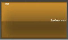
textSecondary
- Type
- String
- Description
- Sets the secondary text of the button.
textSecondary = "";
textureNoShortcut
- Type
- String
- Description
- A custom Texture to be displayed alongside text. Position can be set in the ShortcutPos (texture) and TextPos (text) class.
textureNoShortcut = "#(argb,8,8,3)color(0,0,0,0)";
U
url
- Type
- String
- Description
- Link to open when clicked.
url = "https://steamcommunity.com/workshop/browse?appid=107410";
Default Classes
RscShortcutButton
An older version of the shortcut button.
class RscShortcutButton
{
	deletable = 0;
	fade = 0;
	type = CT_SHORTCUTBUTTON;
	x = 0.1;
	y = 0.1;
	class HitZone
	{
		left = 0;
		top = 0;
		right = 0;
		bottom = 0;
	};
	class ShortcutPos
	{
		left = 0;
		top = ((GUI_GRID_HAbs / 20) - GUI_TEXT_SIZE_MEDIUM) / 2;
		w = GUI_TEXT_SIZE_MEDIUM * (3/4);
		h = GUI_TEXT_SIZE_MEDIUM;
	};
	class TextPos
	{
		left = GUI_TEXT_SIZE_MEDIUM * (3/4);
		top = ((GUI_GRID_HAbs / 20) - GUI_TEXT_SIZE_MEDIUM) / 2;
		right = 0.005;
		bottom = 0;
	};
	shortcuts[] = {};
	textureNoShortcut = "#(argb,8,8,3)color(0,0,0,0)";
	color[] = {1,1,1,1};
	colorFocused[] = {1,1,1,1};
	color2[] = {0.95,0.95,0.95,1};
	colorDisabled[] = {1,1,1,0.25};
	colorBackground[] =
	{
		"(profilenamespace getvariable ['GUI_BCG_RGB_R',0.13])",
		"(profilenamespace getvariable ['GUI_BCG_RGB_G',0.54])",
		"(profilenamespace getvariable ['GUI_BCG_RGB_B',0.21])",
		1
	};
	colorBackgroundFocused[] =
	{
		"(profilenamespace getvariable ['GUI_BCG_RGB_R',0.13])",
		"(profilenamespace getvariable ['GUI_BCG_RGB_G',0.54])",
		"(profilenamespace getvariable ['GUI_BCG_RGB_B',0.21])",
		1
	};
	colorBackground2[] = {1,1,1,1};
	soundEnter[] =
	{
		"\A3\ui_f\data\sound\RscButton\soundEnter",
		0.09,
		1
	};
	soundPush[] =
	{
		"\A3\ui_f\data\sound\RscButton\soundPush",
		0.09,
		1
	};
	soundClick[] =
	{
		"\A3\ui_f\data\sound\RscButton\soundClick",
		0.09,
		1
	};
	soundEscape[] =
	{
		"\A3\ui_f\data\sound\RscButton\soundEscape",
		0.09,
		1
	};
	class Attributes
	{
		font = "RobotoCondensed";
		color = "#E5E5E5";
		align = "left";
		shadow = "true";
	};
	idc = -1;
	style = ST_LEFT;
	default = 0;
	shadow = 1;
	w = 0.183825;
	h = (GUI_GRID_HAbs / 20);
	textSecondary = "";
	colorSecondary[] = {1,1,1,1};
	colorFocusedSecondary[] = {1,1,1,1};
	color2Secondary[] = {0.95,0.95,0.95,1};
	colorDisabledSecondary[] = {1,1,1,0.25};
	sizeExSecondary = GUI_TEXT_SIZE_MEDIUM;
	fontSecondary = "RobotoCondensed";
	animTextureDefault = "\A3\ui_f\data\GUI\RscCommon\RscShortcutButton\normal_ca.paa";
	animTextureNormal = "\A3\ui_f\data\GUI\RscCommon\RscShortcutButton\normal_ca.paa";
	animTextureDisabled = "\A3\ui_f\data\GUI\RscCommon\RscShortcutButton\normal_ca.paa";
	animTextureOver = "\A3\ui_f\data\GUI\RscCommon\RscShortcutButton\over_ca.paa";
	animTextureFocused = "\A3\ui_f\data\GUI\RscCommon\RscShortcutButton\focus_ca.paa";
	animTexturePressed = "\A3\ui_f\data\GUI\RscCommon\RscShortcutButton\down_ca.paa";
	periodFocus = 1.2;
	periodOver = 0.8;
	period = 0.4;
	font = "RobotoCondensed";
	size = GUI_TEXT_SIZE_MEDIUM;
	sizeEx = GUI_TEXT_SIZE_MEDIUM;
	text = "";
	url = "";
	action = "";
	class AttributesImage
	{
		font = "RobotoCondensed";
		color = "#E5E5E5";
		align = "left";
	};
};
RscButtonMenu
The modern Arma 3 button like the ones in the escape display.
class RscButtonMenu : RscShortcutButton
{
	idc = -1;
	type = CT_SHORTCUTBUTTON;
	style = ST_CENTER + ST_FRAME + ST_HUD_BACKGROUND;
	default = 0;
	shadow = 0;
	x = 0;
	y = 0;
	w = 0.095589;
	h = 0.039216;
	animTextureNormal = "#(argb,8,8,3)color(1,1,1,1)";
	animTextureDisabled = "#(argb,8,8,3)color(1,1,1,1)";
	animTextureOver = "#(argb,8,8,3)color(1,1,1,1)";
	animTextureFocused = "#(argb,8,8,3)color(1,1,1,1)";
	animTexturePressed = "#(argb,8,8,3)color(1,1,1,1)";
	animTextureDefault = "#(argb,8,8,3)color(1,1,1,1)";
	colorBackground[] = {0,0,0,0.8};
	colorBackgroundFocused[] = {1,1,1,1};
	colorBackground2[] = {0.75,0.75,0.75,1};
	color[] = {1,1,1,1};
	colorFocused[] = {0,0,0,1};
	color2[] = {0,0,0,1};
	colorText[] = {1,1,1,1};
	colorDisabled[] = {1,1,1,0.25};
	textSecondary = "";
	colorSecondary[] = {1,1,1,1};
	colorFocusedSecondary[] = {0,0,0,1};
	color2Secondary[] = {0,0,0,1};
	colorDisabledSecondary[] = {1,1,1,0.25};
	sizeExSecondary = GUI_TEXT_SIZE_MEDIUM;
	fontSecondary = "PuristaLight";
	period = 1.2;
	periodFocus = 1.2;
	periodOver = 1.2;
	size = GUI_TEXT_SIZE_MEDIUM;
	sizeEx = GUI_TEXT_SIZE_MEDIUM;
	tooltipColorText[] = {1,1,1,1};
	tooltipColorBox[] = {1,1,1,1};
	tooltipColorShade[] = {0,0,0,0.65};
	class TextPos
	{
		left = 0.25 * GUI_GRID_W;
		top = (GUI_GRID_H - GUI_TEXT_SIZE_MEDIUM) / 2;
		right = 0.005;
		bottom = 0;
	};
	class Attributes
	{
		font = "PuristaLight";
		color = "#E5E5E5";
		align = "left";
		shadow = "false";
	};
	class ShortcutPos
	{
		left = 5.25 * GUI_GRID_W;
		top = 0;
		w = 1 * GUI_GRID_W;
		h = 1 * GUI_GRID_H;
	};
	soundEnter[] =
	{
		"\A3\ui_f\data\sound\RscButtonMenu\soundEnter",
		0.09,
		1
	};
	soundPush[] =
	{
		"\A3\ui_f\data\sound\RscButtonMenu\soundPush",
		0.09,
		1
	};
	soundClick[] =
	{
		"\A3\ui_f\data\sound\RscButtonMenu\soundClick",
		0.09,
		1
	};
	soundEscape[] =
	{
		"\A3\ui_f\data\sound\RscButtonMenu\soundEscape",
		0.09,
		1
	};
};
Other examples
This is an example with an image and text combined in one control.
class RscButtonMenuSteam : RscButtonMenu
{
	text = "STEAM";
	colorBackground[] = {0.03137255,0.72156864,0.91764706,1.0};
	textureNoShortcut = "\A3\Ui_f\data\GUI\RscCommon\RscButtonMenuSteam\steam_ca.paa";
	class TextPos
	{
		left = 0.0325;
		top = "(((((safezoneW / safezoneH) min 1.2) / 1.2) / 25) - (((((safezoneW / safezoneH) min 1.2) / 1.2) / 25) * 1)) / 2";
		right = 0.005;
		bottom = 0.0;
	};
	class ShortcutPos
	{
		left = 0.005;
		top = 0.005;
		w = 0.0225;
		h = 0.03;
	};
};


