CT SHORTCUTBUTTON: Difference between revisions
m (removed link to button commands category) |
(description for color attributes) |
||
| (7 intermediate revisions by 3 users not shown) | |||
| Line 5: | Line 5: | ||
|macro = CT_SHORTCUTBUTTON | |macro = CT_SHORTCUTBUTTON | ||
|value = 16 | |value = 16 | ||
|description = A more customizable and modern version of [[CT_BUTTON]] that also supports [[Structured Text]]. | |description = A more customizable and modern version of [[CT_BUTTON]] that also supports [[Structured Text]] and an image with text at the same time (see [[#Other examples|below]]). | ||
|gallery=File:A3 console mission.jpg{{!}}The escape menu with shortcutbuttons in the bottom left. | |gallery=File:A3 console mission.jpg{{!}}The escape menu with shortcutbuttons in the bottom left. | ||
File:CT SHORTCUTBUTTON steam.png{{!}}ShortcutButton with the steam logo (texture) and text. | File:CT SHORTCUTBUTTON steam.png{{!}}ShortcutButton with the steam logo (texture) and text. | ||
File:CT SHORTCUTBUTTON secondaryText.jpg{{!}}ShortcutButton with secondary text. | File:CT SHORTCUTBUTTON secondaryText.jpg{{!}}ShortcutButton with secondary text. | ||
File:CT SHORTCUT BUTTON-Steam.png{{!}}Image and text on the same button. | |||
|commands = | |commands = | ||
|events = | |events = | ||
* [[User_Interface_Event_Handlers# | * [[User_Interface_Event_Handlers#Button_Events|Events: Button]] | ||
}} | }} | ||
| Line 75: | Line 76: | ||
shadow = "false"; | shadow = "false"; | ||
}; | }; | ||
|description=Attributes of the text. See [[CT_STRUCTURED_TEXT#Attributes|Structured Text control text attributes]]. | |description=Attributes of the text (Only 'font' has effect). See [[CT_STRUCTURED_TEXT#Attributes|Structured Text control text attributes]]. | ||
}} | }} | ||
| Line 89: | Line 90: | ||
|description= | |description= | ||
}} | }} | ||
{{CT|attribute | |||
|name=autoAdjustTexture | |||
|type1=Boolean | |||
|value1=true | |||
|description= Since Arma 3 v2.10. Default: [[false]]. When this attribute set to [[true]] the texture will be rendered in the following way: | |||
* If original texture aspect ratio is 2:1 or more (w >= 2 * h) and button aspect ration is 2:1 or more (w >= 2 * h), the corners of the texture are preserved (rounded corners would scale but not stretch). | |||
* In all other cases the texture is stretched to cover given button control. | |||
}} | |||
=== C === | === C === | ||
| Line 95: | Line 106: | ||
|type1=Array | |type1=Array | ||
|value1={1,1,1,1} | |value1={1,1,1,1} | ||
|description= | |description=Text color. | ||
}} | }} | ||
| Line 102: | Line 113: | ||
|type1=Array | |type1=Array | ||
|value1={0.95,0.95,0.95,1} | |value1={0.95,0.95,0.95,1} | ||
|description= | |description=When hovering over the button the text color changes from color[] to color2[]. | ||
}} | }} | ||
| Line 116: | Line 127: | ||
|type1=Array | |type1=Array | ||
|value1={1,1,1,1} | |value1={1,1,1,1} | ||
|description= | |description=When hovering over the button the background color changes from colorBackground[] to colorBackground2[]. | ||
}} | }} | ||
| Line 130: | Line 141: | ||
|type1=Array | |type1=Array | ||
|value1={1,1,1,1} | |value1={1,1,1,1} | ||
|description= | |description=Color of the background when the control is focused. | ||
}} | }} | ||
| Line 144: | Line 155: | ||
|type1=Array | |type1=Array | ||
|value1={0,0,0,1} | |value1={0,0,0,1} | ||
|description= | |description=Text color when the control is focused. | ||
}} | }} | ||
| Line 301: | Line 312: | ||
right = 0.005; | right = 0.005; | ||
bottom = 0; | bottom = 0; | ||
forceMiddle = true; // Since Arma 3 v2.10, default false. When true, text will be forced in the middle of the button vertically | |||
}; | }; | ||
|description=Position of the text. Useful for aligning with [[#ShortcutPos]]. | |description=Position of the text. Useful for aligning with [[#ShortcutPos | ShortcutPos]]. | ||
}} | }} | ||
| Line 453: | Line 465: | ||
The modern Arma 3 button like the ones in the escape display. | The modern Arma 3 button like the ones in the escape display. | ||
<syntaxhighlight lang="cpp"> | <syntaxhighlight lang="cpp"> | ||
class RscButtonMenu: RscShortcutButton | class RscButtonMenu : RscShortcutButton | ||
{ | { | ||
idc = -1; | idc = -1; | ||
| Line 544: | Line 556: | ||
This is an example with an image and text combined in one control. | This is an example with an image and text combined in one control. | ||
<syntaxhighlight lang="cpp"> | <syntaxhighlight lang="cpp"> | ||
class RscButtonMenuSteam: RscButtonMenu | class RscButtonMenuSteam : RscButtonMenu | ||
{ | { | ||
text = "STEAM"; | text = "STEAM"; | ||
Latest revision as of 11:31, 10 March 2024
| Control Types / MACRO (TYPE VALUE) | |
|---|---|
| Text/Image/Video |
CT_STATIC (0) | CT_EDIT (2) | CT_HTML (9) | CT_STRUCTURED_TEXT (13) |
| Buttons |
CT_BUTTON (1) | CT_ACTIVETEXT (11) | CT_SHORTCUTBUTTON (16) | CT_CHECKBOX (77) | CT_XBUTTON (41) |
| Lists |
CT_COMBO (4) | CT_TOOLBOX (6) | CT_CHECKBOXES (7) | CT_TREE (12) | CT_CONTROLS_TABLE (19) | CT_XCOMBO (44) | CT_LISTBOX (5) | CT_LISTNBOX (102) | CT_LISTNBOX_CHECKABLE (104) CT_XLISTBOX (45) |
| 3D Objects |
CT_OBJECT (80) | CT_OBJECT_ZOOM (81) | CT_OBJECT_CONTAINER (82) | CT_OBJECT_CONT_ANIM (83) |
| Maps |
CT_MAP (100) | CT_MAP_MAIN (101) |
| Meta |
CT_SLIDER (3) | CT_XSLIDER (43) | CT_PROGRESS (8) | CT_CONTROLS_GROUP (15) |
| Menu |
CT_CONTEXT_MENU (14) | CT_MENU (46) | CT_MENU_STRIP (47) |
| Unknown |
CT_STATIC_SKEW (10) | CT_HITZONES (17) | CT_VEHICLETOGGLES (18) | CT_XKEYDESC (40) | CT_ANIMATED_TEXTURE (45) | CT_LINEBREAK (98) | CT_USER (99) | CT_ITEMSLOT (103) | CT_VEHICLE_DIRECTION (105) |
Introduction
A more customizable and modern version of CT_BUTTON that also supports Structured Text and an image with text at the same time (see below).
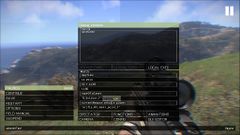
The escape menu with shortcutbuttons in the bottom left.
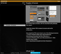
ShortcutButton with the steam logo (texture) and text.
ShortcutButton with secondary text.

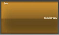
Image and text on the same button.


Related commands & functions
Related User Interface Eventhandlers
Alphabetical Order
#define CT_SHORTCUTBUTTON 16
A
action
- Type
- String
- Description
- SQS code executed when button is clicked.
action = "if (profilenamespace getvariable ['BIS_fnc_init_recompileEditor',false]) then {[1] call (uinamespace getvariable 'BIS_fnc_recompile')}";
animTextureDefault
- Type
- String
- Description
- n/a
animTextureDefault = "\A3\ui_f\data\GUI\RscCommon\RscShortcutButton\normal_ca.paa";
animTextureDisabled
- Type
- String
- Description
- n/a
animTextureDisabled = "\A3\ui_f\data\GUI\RscCommon\RscShortcutButton\normal_ca.paa";
animTextureFocused
- Type
- String
- Description
- n/a
animTextureFocused = "#(argb,8,8,3)color(1,1,1,1)";
animTextureNormal
- Type
- String
- Description
- n/a
animTextureNormal = "#(argb,8,8,3)color(1,1,1,1)";
animTextureOver
- Type
- String
- Description
- n/a
animTextureOver = "#(argb,8,8,3)color(1,1,1,1)";
animTexturePressed
- Type
- String
- Description
- n/a
animTexturePressed = "#(argb,8,8,3)color(1,1,1,1)";
Attributes
- Type
- Class
- Description
- Attributes of the text (Only 'font' has effect). See Structured Text control text attributes.
class Attributes
{
	font = "PuristaLight";
	color = "#E5E5E5";
	align = "left";
	shadow = "false";
};
AttributesImage
- Type
- Class
- Description
- n/a
class AttributesImage
{
	font = "RobotoCondensed";
	color = "#E5E5E5";
	align = "left";
};
autoAdjustTexture
- Type
- Boolean
- Description
- Since Arma 3 v2.10. Default: false. When this attribute set to true the texture will be rendered in the following way:
- If original texture aspect ratio is 2:1 or more (w >= 2 * h) and button aspect ration is 2:1 or more (w >= 2 * h), the corners of the texture are preserved (rounded corners would scale but not stretch).
- In all other cases the texture is stretched to cover given button control.
autoAdjustTexture = true;
C
color
- Type
- Array
- Description
- Text color.
color[] = {1,1,1,1};
color2
- Type
- Array
- Description
- When hovering over the button the text color changes from color[] to color2[].
color2[] = {0.95,0.95,0.95,1};
color2Secondary
- Type
- Array
- Description
- n/a
color2Secondary[] = {0,0,0,1};
colorBackground2
- Type
- Array
- Description
- When hovering over the button the background color changes from colorBackground[] to colorBackground2[].
colorBackground2[] = {1,1,1,1};
colorBackgroundActive
- Type
- Array
- Description
- n/a
colorBackgroundActive[] = {"(profilenamespace getvariable ['GUI_BCG_RGB_R',0.77])","(profilenamespace getvariable ['GUI_BCG_RGB_G',0.51])","(profilenamespace getvariable ['GUI_BCG_RGB_B',0.08])",1};
colorBackgroundFocused
- Type
- Array
- Description
- Color of the background when the control is focused.
colorBackgroundFocused[] = {1,1,1,1};
colorDisabledSecondary
- Type
- Array
- Description
- n/a
colorDisabledSecondary[] = {1,1,1,0.25};
colorFocused
- Type
- Array
- Description
- Text color when the control is focused.
colorFocused[] = {0,0,0,1};
colorFocusedSecondary
- Type
- Array
- Description
- n/a
colorFocusedSecondary[] = {0,0,0,1};
colorSecondary
- Type
- Array
- Description
- n/a
colorSecondary[] = {1,1,1,1};
D
default
- Type
- Number
- Description
- If set to 1, this control is focused when the GUI is opened.
default = 1;
F
fontSecondary
- Type
- String
- Description
- n/a
fontSecondary = "PuristaLight";
H
HitZone
- Type
- Class
- Description
- n/a
class HitZone
{
	left = 0;
	top = 0;
	right = 0;
	bottom = 0;
};
K
KeyHints
- Type
- Class
- Description
- n/a
class KeyHints
{
	class A
	{
		key = "0x00050000 + 0";
		hint = "";
	};
};
P
period
- Type
- Number
- Description
- Blinking period.
period = 1.2;
periodFocus
- Type
- Number
- Description
- Blinking period when focused.
periodFocus = 1.2;
periodOver
- Type
- Number
- Description
- Blinking period when mouse is hovering over the button.
periodOver = 1.2;
S
ShortcutPos
- Type
- Class
- Description
- Position of the texture used on the button.
class ShortcutPos
{
	left = "5.25 * (((safezoneW / safezoneH) min 1.2) / 40)";
	top = 0;
	w = "1 * (((safezoneW / safezoneH) min 1.2) / 40)";
	h = "1 * ((((safezoneW / safezoneH) min 1.2) / 1.2) / 25)";
};
shortcuts
- Type
- Array
- Description
- Key shortcuts. often over-ridden/ignored by engine.
shortcuts[] = {"0x00050000 + 1"};
shpw
- Type
- Number
- Description
- Typo for show. See common attributes.
shpw = 0;
sizeExSecondary
- Type
- String
- Description
- n/a
sizeExSecondary = "(((((safezoneW / safezoneH) min 1.2) / 1.2) / 25) * 1)";
soundClick
- Type
- Array
- Description
- n/a
soundClick[] = {"\A3\ui_f\data\sound\RscButtonMenu\soundClick",0.09,1};
soundEnter
- Type
- Array
- Description
- n/a
soundEnter[] = {"\A3\ui_f\data\sound\RscButtonMenu\soundEnter",0.09,1};
soundEscape
- Type
- Array
- Description
- n/a
soundEscape[] = {"\A3\ui_f\data\sound\RscButtonMenu\soundEscape",0.09,1};
soundPush
- Type
- Array
- Description
- n/a
soundPush[] = {"\A3\ui_f\data\sound\RscButton\soundPush",0.09,1};
T
TextPos
- Type
- Class
- Description
- Position of the text. Useful for aligning with ShortcutPos.
class TextPos
{
	left = 0;
	top = "(1*(safezoneH / 40) - (0.028*SafezoneH)) / 2";
	right = 0.005;
	bottom = 0;
	forceMiddle = true; // Since Arma 3 v2.10, default false. When true, text will be forced in the middle of the button vertically
};
textSecondary
- Type
- String
- Description
- Sets the secondary text of the button.
textSecondary = "";
textureNoShortcut
- Type
- String
- Description
- A custom Texture to be displayed alongside text. Position can be set in the ShortcutPos (texture) and TextPos (text) class.
textureNoShortcut = "#(argb,8,8,3)color(0,0,0,0)";
U
url
- Type
- String
- Description
- Link to open when clicked.
url = "https://steamcommunity.com/workshop/browse?appid=107410";
Default Classes
RscShortcutButton
An older version of the shortcut button.
class RscShortcutButton
{
	deletable = 0;
	fade = 0;
	type = CT_SHORTCUTBUTTON;
	x = 0.1;
	y = 0.1;
	class HitZone
	{
		left = 0;
		top = 0;
		right = 0;
		bottom = 0;
	};
	class ShortcutPos
	{
		left = 0;
		top = ((GUI_GRID_HAbs / 20) - GUI_TEXT_SIZE_MEDIUM) / 2;
		w = GUI_TEXT_SIZE_MEDIUM * (3/4);
		h = GUI_TEXT_SIZE_MEDIUM;
	};
	class TextPos
	{
		left = GUI_TEXT_SIZE_MEDIUM * (3/4);
		top = ((GUI_GRID_HAbs / 20) - GUI_TEXT_SIZE_MEDIUM) / 2;
		right = 0.005;
		bottom = 0;
	};
	shortcuts[] = {};
	textureNoShortcut = "#(argb,8,8,3)color(0,0,0,0)";
	color[] = {1,1,1,1};
	colorFocused[] = {1,1,1,1};
	color2[] = {0.95,0.95,0.95,1};
	colorDisabled[] = {1,1,1,0.25};
	colorBackground[] =
	{
		"(profilenamespace getvariable ['GUI_BCG_RGB_R',0.13])",
		"(profilenamespace getvariable ['GUI_BCG_RGB_G',0.54])",
		"(profilenamespace getvariable ['GUI_BCG_RGB_B',0.21])",
		1
	};
	colorBackgroundFocused[] =
	{
		"(profilenamespace getvariable ['GUI_BCG_RGB_R',0.13])",
		"(profilenamespace getvariable ['GUI_BCG_RGB_G',0.54])",
		"(profilenamespace getvariable ['GUI_BCG_RGB_B',0.21])",
		1
	};
	colorBackground2[] = {1,1,1,1};
	soundEnter[] =
	{
		"\A3\ui_f\data\sound\RscButton\soundEnter",
		0.09,
		1
	};
	soundPush[] =
	{
		"\A3\ui_f\data\sound\RscButton\soundPush",
		0.09,
		1
	};
	soundClick[] =
	{
		"\A3\ui_f\data\sound\RscButton\soundClick",
		0.09,
		1
	};
	soundEscape[] =
	{
		"\A3\ui_f\data\sound\RscButton\soundEscape",
		0.09,
		1
	};
	class Attributes
	{
		font = "RobotoCondensed";
		color = "#E5E5E5";
		align = "left";
		shadow = "true";
	};
	idc = -1;
	style = ST_LEFT;
	default = 0;
	shadow = 1;
	w = 0.183825;
	h = (GUI_GRID_HAbs / 20);
	textSecondary = "";
	colorSecondary[] = {1,1,1,1};
	colorFocusedSecondary[] = {1,1,1,1};
	color2Secondary[] = {0.95,0.95,0.95,1};
	colorDisabledSecondary[] = {1,1,1,0.25};
	sizeExSecondary = GUI_TEXT_SIZE_MEDIUM;
	fontSecondary = "RobotoCondensed";
	animTextureDefault = "\A3\ui_f\data\GUI\RscCommon\RscShortcutButton\normal_ca.paa";
	animTextureNormal = "\A3\ui_f\data\GUI\RscCommon\RscShortcutButton\normal_ca.paa";
	animTextureDisabled = "\A3\ui_f\data\GUI\RscCommon\RscShortcutButton\normal_ca.paa";
	animTextureOver = "\A3\ui_f\data\GUI\RscCommon\RscShortcutButton\over_ca.paa";
	animTextureFocused = "\A3\ui_f\data\GUI\RscCommon\RscShortcutButton\focus_ca.paa";
	animTexturePressed = "\A3\ui_f\data\GUI\RscCommon\RscShortcutButton\down_ca.paa";
	periodFocus = 1.2;
	periodOver = 0.8;
	period = 0.4;
	font = "RobotoCondensed";
	size = GUI_TEXT_SIZE_MEDIUM;
	sizeEx = GUI_TEXT_SIZE_MEDIUM;
	text = "";
	url = "";
	action = "";
	class AttributesImage
	{
		font = "RobotoCondensed";
		color = "#E5E5E5";
		align = "left";
	};
};
RscButtonMenu
The modern Arma 3 button like the ones in the escape display.
class RscButtonMenu : RscShortcutButton
{
	idc = -1;
	type = CT_SHORTCUTBUTTON;
	style = ST_CENTER + ST_FRAME + ST_HUD_BACKGROUND;
	default = 0;
	shadow = 0;
	x = 0;
	y = 0;
	w = 0.095589;
	h = 0.039216;
	animTextureNormal = "#(argb,8,8,3)color(1,1,1,1)";
	animTextureDisabled = "#(argb,8,8,3)color(1,1,1,1)";
	animTextureOver = "#(argb,8,8,3)color(1,1,1,1)";
	animTextureFocused = "#(argb,8,8,3)color(1,1,1,1)";
	animTexturePressed = "#(argb,8,8,3)color(1,1,1,1)";
	animTextureDefault = "#(argb,8,8,3)color(1,1,1,1)";
	colorBackground[] = {0,0,0,0.8};
	colorBackgroundFocused[] = {1,1,1,1};
	colorBackground2[] = {0.75,0.75,0.75,1};
	color[] = {1,1,1,1};
	colorFocused[] = {0,0,0,1};
	color2[] = {0,0,0,1};
	colorText[] = {1,1,1,1};
	colorDisabled[] = {1,1,1,0.25};
	textSecondary = "";
	colorSecondary[] = {1,1,1,1};
	colorFocusedSecondary[] = {0,0,0,1};
	color2Secondary[] = {0,0,0,1};
	colorDisabledSecondary[] = {1,1,1,0.25};
	sizeExSecondary = GUI_TEXT_SIZE_MEDIUM;
	fontSecondary = "PuristaLight";
	period = 1.2;
	periodFocus = 1.2;
	periodOver = 1.2;
	size = GUI_TEXT_SIZE_MEDIUM;
	sizeEx = GUI_TEXT_SIZE_MEDIUM;
	tooltipColorText[] = {1,1,1,1};
	tooltipColorBox[] = {1,1,1,1};
	tooltipColorShade[] = {0,0,0,0.65};
	class TextPos
	{
		left = 0.25 * GUI_GRID_W;
		top = (GUI_GRID_H - GUI_TEXT_SIZE_MEDIUM) / 2;
		right = 0.005;
		bottom = 0;
	};
	class Attributes
	{
		font = "PuristaLight";
		color = "#E5E5E5";
		align = "left";
		shadow = "false";
	};
	class ShortcutPos
	{
		left = 5.25 * GUI_GRID_W;
		top = 0;
		w = 1 * GUI_GRID_W;
		h = 1 * GUI_GRID_H;
	};
	soundEnter[] =
	{
		"\A3\ui_f\data\sound\RscButtonMenu\soundEnter",
		0.09,
		1
	};
	soundPush[] =
	{
		"\A3\ui_f\data\sound\RscButtonMenu\soundPush",
		0.09,
		1
	};
	soundClick[] =
	{
		"\A3\ui_f\data\sound\RscButtonMenu\soundClick",
		0.09,
		1
	};
	soundEscape[] =
	{
		"\A3\ui_f\data\sound\RscButtonMenu\soundEscape",
		0.09,
		1
	};
};
Other examples
This is an example with an image and text combined in one control.
class RscButtonMenuSteam : RscButtonMenu
{
	text = "STEAM";
	colorBackground[] = {0.03137255,0.72156864,0.91764706,1.0};
	textureNoShortcut = "\A3\Ui_f\data\GUI\RscCommon\RscButtonMenuSteam\steam_ca.paa";
	class TextPos
	{
		left = 0.0325;
		top = "(((((safezoneW / safezoneH) min 1.2) / 1.2) / 25) - (((((safezoneW / safezoneH) min 1.2) / 1.2) / 25) * 1)) / 2";
		right = 0.005;
		bottom = 0.0;
	};
	class ShortcutPos
	{
		left = 0.005;
		top = 0.005;
		w = 0.0225;
		h = 0.03;
	};
};