|
|
| Line 1: |
Line 1: |
| {{SideTOC}} | | {{CT|intro |
| == Attributes == | | |macro = CT_XLISTBOX |
| {{Informative|TokenNames common to most controls, such as x, y, w, h, text, idc... can be found [[Arma:_GUI_Configuration#Common_Properties|'''here''']].}}
| | |value = 42 |
| | |description = Sideways listbox with only one entry visible at a time. More similar to [[CT_COMBO]]. |
| | |gallery=File:WuChaoRen ctXListBox.png{{!}}A [[CT_XLISTBOX]]. |
| | |commands = |
| | * [[:Category:Command_Group:_GUI_Control_-_ListBox|Commands: Listbox]] |
| | |events = |
| | * [[User_Interface_Event_Handlers#Listbox_events|Events: Listbox]] |
| | }} |
|
| |
|
| The following tokenNames are valid for:
| | {{CT|abc start}} |
| *CT_LISTBOX=5
| | === A === |
| *CT_XLISTBOX=42
| | {{CT|attribute |
| *CT_LISTNBOX=102
| | |name=arrowEmpty |
| *CT_XCOMBO=44
| | |type1=String |
| | |value1="\A3\ui_f\data\gui\cfg\slider\arrowEmpty_ca.paa" |
| | |description= |
| | }} |
|
| |
|
| For listBoxes, the usage of 'ST_' style constants (ST_MULTI & ST_TITLE_BAR) behave differently than expected for other controls, so use the corresponding 'LB_' (LB_TEXTURES & LB_MULTI) list box style variants instead.
| | {{CT|attribute |
| | |name=arrowFull |
| | |type1=String |
| | |value1="\A3\ui_f\data\gui\cfg\slider\arrowFull_ca.paa" |
| | |description= |
| | }} |
|
| |
|
| style = LB_TEXTURES; // solid scrollbar
| | === B === |
| style = LB_MULTI; // multiple item selection
| | {{CT|attribute |
| | |name=border |
| | |type1=String |
| | |value1="\A3\ui_f\data\gui\cfg\slider\border_ca.paa" |
| | |description= |
| | }} |
|
| |
|
| {| class="wikitable" border="1" align="left" cellpadding="3" cellspacing="0" |
| | === C === |
| ! colspan="3" bgcolor="#bbbbff" | Properties
| | {{CT|attribute |
| ! colspan="3" bgcolor="#bbbbff" | Applies to
| | |name=color |
| |-
| | |type1=Array |
| ! bgcolor="#ddddff" | Name
| | |value1={1,1,1,0.6} |
| ! bgcolor="#ddddff" | Type
| | |description= |
| ! bgcolor="#ddddff" | Remark
| | }} |
| ! bgcolor="#ddddff" | 5
| |
| ! bgcolor="#ddddff" | 42
| |
| ! bgcolor="#ddddff" | 102
| |
| |-
| |
| | '''active'''
| |
| | [[Boolean]]
| |
| |
| |
| | x
| |
| |
| |
| |
| |
| |-
| |
| | '''autoScroll...'''
| |
| | [[Integer]]s
| |
| | applies to Speed,Delay,Rewind
| |
| | x
| |
| |
| |
| | x
| |
| |-
| |
| | '''arrowEmpty/Full'''
| |
| | color
| |
| |
| |
| | x
| |
| | x
| |
| | x
| |
| |-
| |
| | '''border'''
| |
| | texture
| |
| |
| |
| |
| |
| | x
| |
| |
| |
| |-
| |
| | '''canDrag'''
| |
| | [[Boolean]]
| |
| |
| |
| | x
| |
| |
| |
| | x
| |
| |-
| |
| | '''colorScrollbar'''
| |
| | color
| |
| |
| |
| | x
| |
| |
| |
| |
| |
| |-
| |
| | '''color'''
| |
| | color
| |
| |
| |
| |
| |
| |
| |
| | x
| |
| |-
| |
| | '''colorPlayerItem'''
| |
| | color
| |
| |
| |
| |
| |
| |
| |
| | x
| |
| |-
| |
| | '''colorActive'''
| |
| | color
| |
| |
| |
| |
| |
| | x
| |
| |
| |
| |-
| |
| | '''colorDisabled'''
| |
| | color
| |
| |
| |
| |
| |
| | x
| |
| |
| |
| |-
| |
| | '''colorSelect'''
| |
| | color
| |
| |
| |
| | x
| |
| | x
| |
| | x
| |
| |-
| |
| | '''colorSelect2'''
| |
| | color
| |
| |
| |
| | x
| |
| |
| |
| | x
| |
| |-
| |
| | '''colorSelectBackground'''
| |
| | color
| |
| |
| |
| | x
| |
| |
| |
| | x
| |
| |-
| |
| | '''colorSelectBackground2'''
| |
| | color
| |
| |
| |
| | x
| |
| |
| |
| | x
| |
| |-
| |
| | '''columns'''
| |
| | [[Float]] array
| |
| | define the left starting position of each column. The values are offsets ratios (not spacing ratios). Tip: Use {-0.01} in first column to fix unwanted offset, if desired.
| |
| |
| |
| |
| |
| | x
| |
| |-
| |
| | '''disabled/enabled'''
| |
| | [[Boolean]]
| |
| |
| |
| | x
| |
| |
| |
| |
| |
| |-|
| |
| | '''disabledCtrlColor'''
| |
| | color
| |
| |
| |
| | x
| |
| |
| |
| |
| |
| |-
| |
| | '''drawSideArrows'''
| |
| | [[Boolean]]
| |
| | Each row can be linked to 2 arrow buttons which are shown on the left and right of the row.
| |
| {{Important| <tt>drawSideArrows</tt> attribute is irrelevant and does not control the appearance of the left and right arrows/buttons despite the intention, and it could be ignored all together. Instead, <tt>idcLeft</tt> and <tt>idcRight</tt> attributes control these arrows/buttons in the following manner: If any of the two are set to -1, the arrows/buttons are not shown. Otherwise, provided both idcs are pointing to the valid controls, the arrows/buttons are shown}} | |
| |
| |
| |
| |
| | x
| |
| |-
| |
| | '''idcLeft/Right'''
| |
| | [[Integer]]
| |
| | the IDC of the control to be used for the left/right button. | |
| |
| |
| |
| |
| | x
| |
| |-
| |
| | '''mainCollumW'''
| |
| | [[Float]]
| |
| | width of the left column 0..1; default 0.4 - <u>Only relevant to config keys dialog (type = 5; idc = 102)</u>
| |
| | x
| |
| |
| |
| |
| |
| |-
| |
| | '''secndCollumW'''
| |
| | [[Float]] | |
| | width of the right column 0..1; default 0.6 - <u>Only relevant to config keys dialog (type = 5; idc = 102)</u>
| |
| | x
| |
| |
| |
| |
| |
| |- | |
| | '''disabledKeyColor'''
| |
| | color
| |
| | color of the disabled key binding; default {0.3,0.3,0.3,1} - <u>Only relevant to config keys dialog (type = 5; idc = 102)</u>
| |
| | x
| |
| |
| |
| |
| |
| |-
| |
| | '''collisionColor'''
| |
| | color
| |
| | color of the collision key binding; default {1,0,0,1} - <u>Only relevant to config keys dialog (type = 5; idc = 102)</u>
| |
| | x
| |
| |
| |
| |
| |
| |-
| |
| | '''LineSpacing'''
| |
| | [[Float]]
| |
| |
| |
| |
| |
| |
| |
| | x
| |
| |-
| |
| | '''maxHistoryDelay'''
| |
| | [[Float]]
| |
| |
| |
| | x
| |
| |
| |
| | x
| |
| |-
| |
| | '''period'''
| |
| | [[Float]]
| |
| | Flash period
| |
| | x
| |
| |
| |
| | x
| |
| |-
| |
| | '''rowHeight'''
| |
| | [[Float]]
| |
| | the height of a single row in the elapsed box.
| |
| | x
| |
| |
| |
| | x
| |
| |-
| |
| | '''rows'''
| |
| | [[Integer]]
| |
| |
| |
| | x
| |
| |
| |
| |
| |
| |-
| |
| | '''SoundSelect'''
| |
| | class
| |
| |
| |
| | x
| |
| | x
| |
| | x
| |
| |-
| |
| | '''ListScrollBar''' (Prior to Arma 3 use ScrollBar)
| |
| | class
| |
| | Note: scrollbars might not show if h and w properties of the ListBox are not 0. see also [[DialogControls-Sliders]]
| |
| | x
| |
| |
| |
| | x
| |
| |-
| |
| | '''xColumn1,2,3'''
| |
| | [[Float]]
| |
| |
| |
| |
| |
| |
| |
| | x
| |
| |-
| |
| | '''disableOverflow''' || [[Boolean]] || Don't allow text to continue in next column || || || x
| |
| |-
| |
| | '''selectWithRMB''' || [[Boolean]] || Enable row selection with the right mouse button (Since {{arma3}} v2.00) || x || || x
| |
| |- | |
| | '''Items''' || class || Default entries for the listbox columns.
| |
| <syntaxhighlight lang="cpp">
| |
| class Items
| |
| {
| |
| class Presence
| |
| {
| |
| text = "This is column1"; // lbText/lnbText
| |
| value = 1; // lbValue/lnbValue
| |
| data = "value"; // lbData/lnbData
| |
| };
| |
| class Name
| |
| {
| |
| text = "This is column 2";
| |
| value = -1;
| |
| };
| |
| }; | |
| </syntaxhighlight>
| |
| |
| |
| |
| |
| | x
| |
| |-
| |
| |}<br clear="all">
| |
|
| |
|
| RscListNBox
| | {{CT|attribute |
| | |name=colorActive |
| | |type1=Array |
| | |value1={1,1,1,1} |
| | |description= |
| | }} |
|
| |
|
| *Using -1 for idcLeft/idcRight will use the full row width. Using a valid idc will reserve sides for arrows and link with those controls.
| | {{CT|attribute |
| | |name=colorPicture |
| | |type1=Array |
| | |value1={1,1,1,1} |
| | |description= |
| | }} |
|
| |
|
| *idcLeft/idcRight bug?: Using -1 for either idc will link to first control with an idc using -1, instead of treating it as an unused idc. Workaround: number every idc in dialog rather than leaving any idc as -1.
| | {{CT|attribute |
| | |name=colorPictureDisabled |
| | |type1=Array |
| | |value1={1,1,1,0.25} |
| | |description= |
| | }} |
|
| |
|
| ==RscListBox==
| | {{CT|attribute |
| <syntaxhighlight lang="cpp">class RscListBox
| | |name=colorPictureRight |
| { | | |type1=Array |
| access = 0;
| | |value1={1,1,1,1} |
| type = 5;
| | |description= |
| style = 0;
| | }} |
| w = 0.4;
| |
| h = 0.4;
| |
| font = "TahomaB";
| |
| sizeEx = 0.04;
| |
| rowHeight = 0;
| |
| colorText[] = {1,1,1,1};
| |
| colorScrollbar[] = {1,1,1,1};
| |
| colorSelect[] = {0,0,0,1};
| |
| colorSelect2[] = {1,0.5,0,1};
| |
| colorSelectBackground[] = {0.6,0.6,0.6,1};
| |
| colorSelectBackground2[] = {0.2,0.2,0.2,1};
| |
| colorBackground[] = {0,0,0,1};
| |
| maxHistoryDelay = 1.0;
| |
| soundSelect[] = {"",0.1,1};
| |
| period = 1;
| |
| autoScrollSpeed = -1;
| |
| autoScrollDelay = 5;
| |
| autoScrollRewind = 0;
| |
| arrowEmpty = "#(argb,8,8,3)color(1,1,1,1)";
| |
| arrowFull = "#(argb,8,8,3)color(1,1,1,1)";
| |
| shadow = 0;
| |
| class ListScrollBar : ScrollBar //ListScrollBar is class name required for Arma 3
| |
| {
| |
| color[] = {1,1,1,0.6};
| |
| colorActive[] = {1,1,1,1};
| |
| colorDisabled[] = {1,1,1,0.3};
| |
| thumb = "#(argb,8,8,3)color(1,1,1,1)";
| |
| arrowEmpty = "#(argb,8,8,3)color(1,1,1,1)";
| |
| arrowFull = "#(argb,8,8,3)color(1,1,1,1)";
| |
| border = "#(argb,8,8,3)color(1,1,1,1)";
| |
| shadow = 0;
| |
| };
| |
| };</syntaxhighlight> | |
|
| |
|
| ==RscXListBox==
| | {{CT|attribute |
| <syntaxhighlight lang="cpp">class RscXListBox
| | |name=colorPictureRightDisabled |
| { | | |type1=Array |
| type = 42;
| | |value1={1,1,1,0.25} |
| color[] = {1,1,1,0.6};
| | |description= |
| colorActive[] = {1,1,1,1};
| | }} |
| colorDisabled[] = {1,1,1,0.3};
| |
| arrowEmpty = "#(argb,8,8,3)color(1,1,1,1)";
| |
| arrowFull = "#(argb,8,8,3)color(1,0.5,0,1)";
| |
| border = "#(argb,8,8,3)color(0,0,0,1)";
| |
| colorSelect[] = {1,1,1,1};
| |
| colorText[] = {1,1,1,0.8};
| |
| soundSelect[] = {"",0.1,1};
| |
| };</syntaxhighlight> | |
|
| |
|
| ==RscListNBox==
| | {{CT|attribute |
| <syntaxhighlight lang="cpp">class RscListNBox
| | |name=colorPictureRightSelected |
| { | | |type1=Array |
| access = 0;
| | |value1={1,1,1,1} |
| type = CT_LISTNBOX;// 102;
| | |description= |
| style =ST_MULTI;
| | }} |
| w = 0.4; h = 0.4;
| |
| font = "TahomaB";
| |
| sizeEx = 0.04;
| |
| colorText[] = {0.8784, 0.8471, 0.651, 1};
| |
| colorBackground[] = {0, 0, 0, 1};
| |
| autoScrollSpeed = -1;
| |
| autoScrollDelay = 5;
| |
| autoScrollRewind = 0;
| |
| arrowEmpty = "#(argb,8,8,3)color(1,1,1,1)";
| |
| arrowFull = "#(argb,8,8,3)color(1,1,1,1)";
| |
| columns[] = {0.3, 0.6, 0.7};
| |
| color[] = {1, 1, 1, 1};
| |
| colorScrollbar[] = {0.95, 0.95, 0.95, 1};
| |
| colorSelect[] = {0.95, 0.95, 0.95, 1};
| |
| colorSelect2[] = {0.95, 0.95, 0.95, 1};
| |
| colorSelectBackground[] = {0, 0, 0, 1};
| |
| colorSelectBackground2[] = {0.8784, 0.8471, 0.651, 1};
| |
| drawSideArrows = 0;
| |
| idcLeft = -1;
| |
| idcRight = -1;
| |
| maxHistoryDelay = 1;
| |
| rowHeight = 0;
| |
| soundSelect[] = {"", 0.1, 1};
| |
| period = 1;
| |
| shadow = 2;
| |
| class ScrollBar
| |
| {
| |
| arrowEmpty = "#(argb,8,8,3)color(1,1,1,1)";
| |
| arrowFull = "#(argb,8,8,3)color(1,1,1,1)";
| |
| border = "#(argb,8,8,3)color(1,1,1,1)";
| |
| color[] = {1,1,1,0.6};
| |
| colorActive[] = {1,1,1,1};
| |
| colorDisabled[] = {1,1,1,0.3};
| |
| thumb = "#(argb,8,8,3)color(1,1,1,1)";
| |
| };
| |
| };</syntaxhighlight> | |
|
| |
|
| ==Templates== | | {{CT|attribute |
| ===RscListBox (A3 1.28 Template)=== | | |name=colorPictureSelected |
| [[file:WuChaoRen_ctListBox.png]]<br><br>
| | |type1=Array |
| <syntaxhighlight lang="cpp">class _CT_LISTBOX
| | |value1={1,1,1,1} |
| { | | |description= |
| access = 0; // Control access (0 - ReadAndWrite, 1 - ReadAndCreate, 2 - ReadOnly, 3 - ReadOnlyVerified)
| | }} |
| idc = CT_LISTBOX; // Control identification (without it, the control won't be displayed)
| |
| type = CT_LISTBOX; // Type is 5
| |
| style = ST_LEFT + LB_TEXTURES; // Style
| |
| default = 0; // Control selected by default (only one within a display can be used)
| |
| blinkingPeriod = 0; // Time in which control will fade out and back in. Use 0 to disable the effect.
| |
|
| |
|
| x = 1 * GUI_GRID_CENTER_W + GUI_GRID_CENTER_X; // Horizontal coordinates
| | {{CT|attribute |
| y = 11 * GUI_GRID_CENTER_H + GUI_GRID_CENTER_Y; // Vertical coordinates
| | |name=colorSelect |
| w = 10 * GUI_GRID_CENTER_W; // Width
| | |type1=Array |
| h = 3 * GUI_GRID_CENTER_H; // Height
| | |value1={0.95,0.95,0.95,1} |
| | |description= |
| | }} |
|
| |
|
| colorBackground[] = {0.2,0.2,0.2,1}; // Fill color
| | {{CT|attribute |
| colorSelectBackground[] = {1,0.5,0,1}; // Selected item fill color
| | |name=cycle |
| colorSelectBackground2[] = {0,0,0,1}; // Selected item fill color (oscillates between this and colorSelectBackground)
| | |type1=Number |
| | |value1=1 |
| | |description= |
| | }} |
|
| |
|
| sizeEx = GUI_GRID_CENTER_H; // Text size
| | === I === |
| font = GUI_FONT_NORMAL; // Font from CfgFontFamilies
| | {{CT|attribute |
| shadow = 0; // Shadow (0 - none, 1 - directional, color affected by colorShadow, 2 - black outline)
| | |name=Items |
| colorText[] = {1,1,1,1}; // Text and frame color
| | |type1=Class |
| colorDisabled[] = {1,1,1,0.5}; // Disabled text color
| | |value1=class Items |
| colorSelect[] = {1,1,1,1}; // Text selection color
| | { |
| colorSelect2[] = {1,1,1,1}; // Text selection color (oscillates between this and colorSelect)
| | class Item0 |
| colorShadow[] = {0,0,0,0.5}; // Text shadow color (used only when shadow is 1)
| | { |
| | | text = "LOL"; |
| pictureColor[] = {1,0.5,0,1}; // Picture color
| | picture = "\a3\Ui_f\data\Map\Markers\Military\warning_CA.paa"; |
| pictureColorSelect[] = {1,1,1,1}; // Selected picture color
| | color[] = {1,0,1,1}; |
| pictureColorDisabled[] = {1,1,1,0.5}; // Disabled picture color
| | colorPicture[] = {0,1,1,1}; |
| | | data = "WTF"; |
| tooltip = "CT_LISTBOX"; // Tooltip text
| | value = 42; |
| tooltipColorShade[] = {0,0,0,1}; // Tooltip background color
| | default = 0; |
| tooltipColorText[] = {1,1,1,1}; // Tooltip text color
| | }; |
| tooltipColorBox[] = {1,1,1,1}; // Tooltip frame color
| | class AnotherItem |
| | { |
| | text = "O RLY"; |
| | default = 1; |
| | }; |
| | }; |
| | |description=List of default items. Supports most [[:Category:Command_Group:_GUI_Control_-_ListBox|Listbox commands]] as a config entry. |
| | }} |
|
| |
|
| period = 1; // Oscillation time between colorSelect/colorSelectBackground2 and colorSelect2/colorSelectBackground when selected
| | === S === |
| | {{CT|attribute |
| | |name=soundSelect |
| | |type1=Array |
| | |value1={"\A3\ui_f\data\sound\RscListbox\soundSelect",0.09,1} |
| | |description= |
| | }} |
|
| |
|
| rowHeight = 1.5 * GUI_GRID_CENTER_H; // Row height
| | {{CT|abc end}} |
| itemSpacing = 0; // Height of empty space between items
| |
| maxHistoryDelay = 1; // Time since last keyboard type search to reset it
| |
| canDrag = 1; // 1 (true) to allow item dragging
| |
|
| |
|
| soundSelect[] = {"\A3\ui_f\data\sound\RscListbox\soundSelect",0.09,1}; // Sound played when an item is selected
| | {{CT|examples}} |
| | | === RscXListBox === |
| // Scrollbar configuration (applied only when LB_TEXTURES style is used)
| | <syntaxhighlight lang="cpp"> |
| class ListScrollBar //In older games this class is "ScrollBar"
| | class RscXListBox |
| {
| | { |
| width = 0; // width of ListScrollBar
| | deletable = 0; |
| height = 0; // height of ListScrollBar
| | fade = 0; |
| scrollSpeed = 0.01; // scroll speed of ListScrollBar
| | idc = -1; |
| | | type = CT_XLISTBOX; |
| arrowEmpty = "\A3\ui_f\data\gui\cfg\scrollbar\arrowEmpty_ca.paa"; // Arrow
| | x = 0.1; |
| arrowFull = "\A3\ui_f\data\gui\cfg\scrollbar\arrowFull_ca.paa"; // Arrow when clicked on
| | y = 0.1; |
| border = "\A3\ui_f\data\gui\cfg\scrollbar\border_ca.paa"; // Slider background (stretched vertically)
| | color[] = {1,1,1,0.6}; |
| thumb = "\A3\ui_f\data\gui\cfg\scrollbar\thumb_ca.paa"; // Dragging element (stretched vertically)
| | colorActive[] = {1,1,1,1}; |
| | colorDisabled[] = {1,1,1,0.25}; |
| | colorSelect[] = {0.95,0.95,0.95,1}; |
| | colorText[] = {1,1,1,1}; |
| | soundSelect[] = |
| | { |
| | "\A3\ui_f\data\sound\RscListbox\soundSelect", |
| | 0.09, |
| | 1 |
| | }; |
| | colorPicture[] = {1,1,1,1}; |
| | colorPictureSelected[] = {1,1,1,1}; |
| | colorPictureDisabled[] = {1,1,1,0.25}; |
| | colorPictureRight[] = {1,1,1,1}; |
| | colorPictureRightSelected[] = {1,1,1,1}; |
| | colorPictureRightDisabled[] = {1,1,1,0.25}; |
| | tooltipColorText[] = {1,1,1,1}; |
| | tooltipColorBox[] = {1,1,1,1}; |
| | tooltipColorShade[] = {0,0,0,0.65}; |
| | style = ST_CENTER + LB_TEXTURES + SL_HORZ; |
| | shadow = 2; |
| | arrowEmpty = "\A3\ui_f\data\gui\cfg\slider\arrowEmpty_ca.paa"; |
| | arrowFull = "\A3\ui_f\data\gui\cfg\slider\arrowFull_ca.paa"; |
| | border = "\A3\ui_f\data\gui\cfg\slider\border_ca.paa"; |
| | w = 0.14706; |
| | h = 0.039216; |
| | font = "RobotoCondensed"; |
| | sizeEx = GUI_TEXT_SIZE_MEDIUM; |
| | }; |
| | </syntaxhighlight> |
|
| |
|
| color[] = {1,1,1,1}; // Scrollbar color
| | == Other examples == |
| };
| |
| | |
| onCanDestroy = "systemChat str ['onCanDestroy',_this]; true";
| |
| onDestroy = "systemChat str ['onDestroy',_this]; false";
| |
| onSetFocus = "systemChat str ['onSetFocus',_this]; false";
| |
| onKillFocus = "systemChat str ['onKillFocus',_this]; false";
| |
| onKeyDown = "systemChat str ['onKeyDown',_this]; false";
| |
| onKeyUp = "systemChat str ['onKeyUp',_this]; false";
| |
| onMouseButtonDown = "systemChat str ['onMouseButtonDown',_this]; false";
| |
| onMouseButtonUp = "systemChat str ['onMouseButtonUp',_this]; false";
| |
| onMouseButtonClick = "systemChat str ['onMouseButtonClick',_this]; false";
| |
| onMouseButtonDblClick = "systemChat str ['onMouseButtonDblClick',_this]; false";
| |
| onMouseZChanged = "systemChat str ['onMouseZChanged',_this]; false";
| |
| onMouseMoving = "";
| |
| onMouseHolding = "";
| |
| | |
| onLBSelChanged = "systemChat str ['onLBSelChanged',_this]; false";
| |
| onLBDblClick = "systemChat str ['onLBDblClick',_this]; false";
| |
| onLBDrag = "systemChat str ['onLBDrag',_this]; false";
| |
| onLBDragging = "systemChat str ['onLBDragging',_this]; false";
| |
| onLBDrop = "systemChat str ['onLBDrop',_this]; false";
| |
| };</syntaxhighlight>
| |
| | |
| ===RscXListBox (A3 1.28 Template)===
| |
| [[File:WuChaoRen_ctXListBox.png]]<br><br>
| |
| <syntaxhighlight lang="cpp">class _CT_XLISTBOX | | <syntaxhighlight lang="cpp">class _CT_XLISTBOX |
| { | | { |
| Line 512: |
Line 236: |
| onLBDblClick = "systemChat str ['onLBDblClick',_this]; false"; | | onLBDblClick = "systemChat str ['onLBDblClick',_this]; false"; |
| };</syntaxhighlight> | | };</syntaxhighlight> |
|
| |
| ===RscListNBox (A3 1.28 Template)===
| |
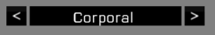
| [[File:WuChaoRen 000.png]] [[File:WuChaoRen 001.png]] [[File:WuChaoRen 002.png]] [[File:WuChaoRen 003.png]]<br><br>
| |
| <syntaxhighlight lang="cpp">class _CT_LISTNBOX_RIGHT: _CT_BUTTON
| |
| {
| |
| idc = 1000;
| |
| text = "<";
| |
| borderSize = 0;
| |
| colorShadow[] = {0,0,0,0};
| |
| };
| |
| class _CT_LISTNBOX_LEFT: _CT_LISTNBOX_RIGHT
| |
| {
| |
| idc = 1001;
| |
| text = ">";
| |
| };
| |
| class _CT_LISTNBOX
| |
| {
| |
| access = 0; // Control access (0 - ReadAndWrite, 1 - ReadAndCreate, 2 - ReadOnly, 3 - ReadOnlyVerified)
| |
| idc = CT_LISTNBOX; // Control identification (without it, the control won't be displayed)
| |
| type = CT_LISTNBOX; // Type 102
| |
| style = ST_LEFT + LB_TEXTURES; // Style
| |
| default = 0; // Control selected by default (only one within a display can be used)
| |
| blinkingPeriod = 0; // Time in which control will fade out and back in. Use 0 to disable the effect.
| |
|
| |
| x = 29 * GUI_GRID_CENTER_W + GUI_GRID_CENTER_X; // Horizontal coordinates
| |
| y = 15 * GUI_GRID_CENTER_H + GUI_GRID_CENTER_Y; // Vertical coordinates
| |
| w = 10 * GUI_GRID_CENTER_W; // Width
| |
| h = 3 * GUI_GRID_CENTER_H; // Height
| |
|
| |
| colorSelectBackground[] = {1,0.5,0,1}; // Selected item fill color
| |
| colorSelectBackground2[] = {0,0,0,1}; // Selected item fill color (oscillates between this and colorSelectBackground)
| |
|
| |
| sizeEx = GUI_GRID_CENTER_H; // Text size
| |
| font = GUI_FONT_NORMAL; // Font from CfgFontFamilies
| |
| shadow = 0; // Shadow (0 - none, 1 - directional, color affected by colorShadow, 2 - black outline)
| |
| colorText[] = {1,1,1,1}; // Text and frame color
| |
| colorDisabled[] = {1,1,1,0.5}; // Disabled text color
| |
| colorSelect[] = {1,1,1,1}; // Text selection color
| |
| colorSelect2[] = {1,1,1,1}; // Text selection color (oscillates between this and colorSelect)
| |
| colorShadow[] = {0,0,0,0.5}; // Text shadow color (used only when shadow is 1)
| |
|
| |
| tooltip = "CT_LISTNBOX"; // Tooltip text
| |
| tooltipColorShade[] = {0,0,0,1}; // Tooltip background color
| |
| tooltipColorText[] = {1,1,1,1}; // Tooltip text color
| |
| tooltipColorBox[] = {1,1,1,1}; // Tooltip frame color
| |
|
| |
| columns[] = {0.1,0.4}; // Horizontal coordinates of columns (relative to list width, in range from 0 to 1)
| |
|
| |
| drawSideArrows = 1; // 1 to draw buttons linked by idcLeft and idcRight on both sides of selected line. They are resized to line height
| |
| idcLeft = 1000; // Left button IDC
| |
| idcRight = 1001; // Right button IDC
| |
|
| |
| period = 1; // Oscillation time between colorSelect/colorSelectBackground2 and colorSelect2/colorSelectBackground when selected
| |
|
| |
| rowHeight = GUI_GRID_CENTER_H; // Row height
| |
| maxHistoryDelay = 1; // Time since last keyboard type search to reset it
| |
|
| |
| soundSelect[] = {"\A3\ui_f\data\sound\RscListbox\soundSelect",0.09,1}; // Sound played when an item is selected
| |
|
| |
| // Scrollbar configuration (applied only when LB_TEXTURES style is used)
| |
| class ListScrollBar
| |
| {
| |
| width = 0; // width of ListScrollBar
| |
| height = 0; // height of ListScrollBar
| |
| scrollSpeed = 0.01; // scrollSpeed of ListScrollBar
| |
|
| |
| arrowEmpty = "\A3\ui_f\data\gui\cfg\scrollbar\arrowEmpty_ca.paa"; // Arrow
| |
| arrowFull = "\A3\ui_f\data\gui\cfg\scrollbar\arrowFull_ca.paa"; // Arrow when clicked on
| |
| border = "\A3\ui_f\data\gui\cfg\scrollbar\border_ca.paa"; // Slider background (stretched vertically)
| |
| thumb = "\A3\ui_f\data\gui\cfg\scrollbar\thumb_ca.paa"; // Dragging element (stretched vertically)
| |
|
| |
| color[] = {1,1,1,1}; // Scrollbar color
| |
| };
| |
|
| |
| onCanDestroy = "systemChat str ['onCanDestroy',_this]; true";
| |
| onDestroy = "systemChat str ['onDestroy',_this]; false";
| |
| onSetFocus = "systemChat str ['onSetFocus',_this]; false";
| |
| onKillFocus = "systemChat str ['onKillFocus',_this]; false";
| |
| onKeyDown = "systemChat str ['onKeyDown',_this]; false";
| |
| onKeyUp = "systemChat str ['onKeyUp',_this]; false";
| |
| onMouseButtonDown = "systemChat str ['onMouseButtonDown',_this]; false";
| |
| onMouseButtonUp = "systemChat str ['onMouseButtonUp',_this]; false";
| |
| onMouseButtonClick = "systemChat str ['onMouseButtonClick',_this]; false";
| |
| onMouseButtonDblClick = "systemChat str ['onMouseButtonDblClick',_this]; false";
| |
| onMouseZChanged = "systemChat str ['onMouseZChanged',_this]; false";
| |
| onMouseMoving = "";
| |
| onMouseHolding = "";
| |
|
| |
| onLBSelChanged = "systemChat str ['onLBSelChanged',_this]; false";
| |
| onLBDblClick = "systemChat str ['onLBDblClick',_this]; false";
| |
| };</syntaxhighlight>
| |
|
| |
| ===RscXComboBox (A3 1.28 Template)===
| |
| [[File:WuChaoRen004.png]]<br><br>
| |
| <syntaxhighlight lang="cpp">class _CT_XCOMBO // Xbox combo box, cannot be controlled with mouse
| |
| {
| |
| access = 0; // Control access (0 - ReadAndWrite, 1 - ReadAndCreate, 2 - ReadOnly, 3 - ReadOnlyVerified)
| |
| idc = CT_XCOMBO; // Control identification (without it, the control won't be displayed)
| |
| type = CT_XCOMBO; // Type is 44
| |
| style = ST_LEFT + LB_TEXTURES; // Style
| |
| default = 0; // Control selected by default (only one within a display can be used)
| |
| blinkingPeriod = 0; // Time in which control will fade out and back in. Use 0 to disable the effect.
| |
|
| |
| x = 12 * GUI_GRID_CENTER_W + GUI_GRID_CENTER_X; // Horizontal coordinates
| |
| y = 22 * GUI_GRID_CENTER_H + GUI_GRID_CENTER_Y; // Vertical coordinates
| |
| w = 10 * GUI_GRID_CENTER_W; // Width
| |
| h = 1 * GUI_GRID_CENTER_H; // Height
| |
|
| |
| colorSelectBackground2[] = {0,0,0,1}; // Selected fill color (oscillates between this and List >> colorSelectBackground)
| |
|
| |
| colorBorder[] = {1,0,1,1}; // arrow color
| |
| colorSelectBorder[] = {1,1,1,1}; // Selected arrow color
| |
| colorDisabledBorder[] = {0,1,1,1}; // arrow color when disabled
| |
|
| |
| sizeEx = GUI_GRID_CENTER_H; // Text size
| |
| font = GUI_FONT_NORMAL; // Font from CfgFontFamilies
| |
| shadow = 0; // Shadow (0 - none, 1 - N/A, 2 - black outline)
| |
| colorText[] = {1,1,1,1}; // Text color
| |
| colorSelect[] = {1,1,1,1}; // Selected text color
| |
| colorSelect2[] = {1,1,1,1}; // Selected text color (oscillates between this and colorSelect)
| |
| colorDisabled[] = {1,1,1,0.5}; // Disabled text color
| |
|
| |
| tooltip = "CT_XCOMBO"; // Tooltip text
| |
| tooltipColorShade[] = {0,0,0,1}; // Tooltip background color
| |
| tooltipColorText[] = {1,1,1,1}; // Tooltip text color
| |
| tooltipColorBox[] = {1,1,1,1}; // Tooltip frame color
| |
|
| |
| soundExpand[] = {"\A3\ui_f\data\sound\RscCombo\soundExpand",0.1,1}; // Sound played when the list is expanded
| |
| soundCollapse[] = {"\A3\ui_f\data\sound\RscCombo\soundCollapse",0.1,1}; // Sound played when the list is collapsed
| |
| soundSelect[] = {"\A3\ui_f\data\sound\RscCombo\soundSelect",0.1,1}; // Sound played when an item is selected
| |
|
| |
| // List title (not moved when display is dragged)
| |
| class Title
| |
| {
| |
| text = "CT_XCOMBO";
| |
| x = 12 * GUI_GRID_CENTER_W + GUI_GRID_CENTER_X; // Horizontal coordinates
| |
| y = 21 * GUI_GRID_CENTER_H + GUI_GRID_CENTER_Y; // Vertical coordinates
| |
| w = 10 * GUI_GRID_CENTER_W; // Width
| |
| h = 1 * GUI_GRID_CENTER_H; // Height
| |
|
| |
| colorBackground[] = {0.2,0.2,0.2,1}; // Fill color
| |
| colorSelectBackground[] = {1,0.5,0,1}; // Selected item fill color
| |
|
| |
| colorBorder[] = {0,0,0,1}; // Border color
| |
| colorSelectBorder[] = {0,0,0,1}; // Selected border color
| |
| colorDisabledBorder[] = {1,1,1,1}; // Disabled border color
| |
|
| |
| font = GUI_FONT_NORMAL; // Font from CfgFontFamilies
| |
| size = GUI_GRID_CENTER_H; // Text size
| |
| colorText[] = {1,1,1,1}; // Text color
| |
| colorSelect[] = {1,1,1,1}; // Selected text color
| |
| colorDisabled[] = {1,1,1,0.5}; // Disabled text color
| |
| };
| |
| // Item list displayed when arrow right is pressed while the control is in focus (not moved when display is dragged)
| |
| class List
| |
| {
| |
| x = 22 * GUI_GRID_CENTER_W + GUI_GRID_CENTER_X; // Horizontal coordinates
| |
| y = 22 * GUI_GRID_CENTER_H + GUI_GRID_CENTER_Y; // Vertical coordinates
| |
| w = 10 * GUI_GRID_CENTER_W; // Width
| |
| h = 5 * GUI_GRID_CENTER_H; // Height
| |
|
| |
| colorBackground[] = {0.2,0.2,0.2,1}; // List fill color
| |
| colorSelectBackground[] = {1,0.5,0,1}; // Selected item fill color (oscillates between this and colorSelectBackground2 in control root)
| |
|
| |
| colorBorder[] = {1,1,1,1}; // List scrollbar color (combined with Scrollbar >> color)
| |
|
| |
| rowHeight = 1 * GUI_GRID_CENTER_H; // Row height
| |
| sizeEx = GUI_GRID_CENTER_H; // Text size
| |
| colorText[] = {1,1,1,1}; // Text color
| |
| colorSelect[] = {1,1,1,1}; // Selected text color (oscillates between this and colorSelect2 in control root)
| |
| };
| |
| // Scrollbar configuration (applied only when LB_TEXTURES style is used)
| |
| class ScrollBar
| |
| {
| |
| width = 0; // width of scrollBar
| |
| height = 0; // height of scrollbar
| |
| scrollSpeed = 0.01; // speed of scroll bar
| |
|
| |
| arrowEmpty = "\A3\ui_f\data\gui\cfg\scrollbar\arrowEmpty_ca.paa"; // Arrow
| |
| arrowFull = "\A3\ui_f\data\gui\cfg\scrollbar\arrowFull_ca.paa"; // Arrow when clicked on
| |
| border = "\A3\ui_f\data\gui\cfg\scrollbar\border_ca.paa"; // Slider background (stretched vertically)
| |
| thumb = "\A3\ui_f\data\gui\cfg\scrollbar\thumb_ca.paa"; // Dragging element (stretched vertically)
| |
|
| |
| color[] = {1,1,1,1}; // Scrollbar color (combined with List >> colorBorder)
| |
| };
| |
|
| |
| onCanDestroy = "systemChat str ['onCanDestroy',_this]; true";
| |
| onDestroy = "systemChat str ['onDestroy',_this]; false";
| |
| onMouseEnter = "systemChat str ['onMouseEnter',_this]; false";
| |
| onMouseExit = "systemChat str ['onMouseExit',_this]; false";
| |
| onSetFocus = "systemChat str ['onSetFocus',_this]; false";
| |
| onKillFocus = "systemChat str ['onKillFocus',_this]; false";
| |
| onKeyDown = "systemChat str ['onKeyDown',_this]; false";
| |
| onKeyUp = "systemChat str ['onKeyUp',_this]; false";
| |
| onMouseButtonDown = "systemChat str ['onMouseButtonDown',_this]; false";
| |
| onMouseButtonUp = "systemChat str ['onMouseButtonUp',_this]; false";
| |
| onMouseButtonClick = "systemChat str ['onMouseButtonClick',_this]; false";
| |
| onMouseButtonDblClick = "systemChat str ['onMouseButtonDblClick',_this]; false";
| |
| onMouseZChanged = "systemChat str ['onMouseZChanged',_this]; false";
| |
| onMouseMoving = "";
| |
| onMouseHolding = "";
| |
|
| |
| onLBSelChanged = "systemChat str ['onLBSelChanged',_this]; false";
| |
| onLBDblClick = "systemChat str ['onLBDblClick',_this]; false";
| |
| onLBListSelChanged = "systemChat str ['onLBListSelChanged',_this]; false";
| |
| };</syntaxhighlight>
| |
|
| |
| ==Scripting Examples==
| |
| ===CT_LISTBOX===
| |
| (A3 1.28)lb command family overview.
| |
| <code>
| |
| //lb command family can be used with CT_COMBO, CT_LISTBOX, CT_XLISTBOX & CT_XCOMBO
| |
| [[private]] ["_current","_data","_pic","_value","_size","_color"];
| |
| {
| |
| _ctrl = _x;
| |
| {
| |
| _ctrl [[lbAdd]] [[getText]] (_x >> "displayName");
| |
| _ctrl [[lbSetPicture]] [_foreachindex,[[getText]] (_x >> "texture")];
| |
| _ctrl [[lbSetTooltip]] [_foreachindex,[[getText]] (_x >> "displayName")];
| |
| } [[forEach]] ("[[isClass]] _x" [[configClasses]] ([[configFile]] >> "CfgRanks"));
| |
| _ctrl [[lbSetCurSel]] 0;
| |
| [[File:WuChaoRen_lbCommand001.png]]
| |
| _current = [[lbCurSel]] _ctrl;
| |
| _ctrl [[lbSetData]] [_current,"hi"];
| |
| _data = _ctrl [[lbData]] _current;
| |
| _pic = _ctrl [[lbPicture]] _current;
| |
| _ctrl [[lbSetValue]] [_current, 1];
| |
| _value = _ctrl [[lbValue]] _current;
| |
| _size = [[lbSize]] _ctrl;
| |
| _color = _ctrl [[lbColor]] _current;
| |
| _ctrl [[lbSetColor]] [_current, [(_color [[select]] 0) / 2, (_color [[select]] 1) / 4, 0, 1]];
| |
| [[File:WuChaoRen_lbColor.png]]
| |
| [[lbSort]] [_ctrl, "DESC"];
| |
| [[lbSortByValue]] _ctrl;
| |
| [[File:WuChaoRen_lbSortByValue.png]]
| |
| [[if]] (_ctrl [[lbIsSelected]] _current) [[then]] {
| |
| _ctrl [[lbDelete]] _current;
| |
| [[File:WuChaoRen_lbDelete.png]]
| |
| [[lbClear]] _ctrl;
| |
| [[File:WuChaoRen_lbClear.png]]
| |
| };
| |
| } [[forEach]] [
| |
| _CT_COMBO,
| |
| _CT_LISTBOX,
| |
| _CT_XLISTBOX,
| |
| _CT_XCOMBO
| |
| ];
| |
| </code>
| |
| ===CT_LISTNBOX===
| |
| (A3 1.28)As for invisible data processing, [[lnbAddArray]], [[lnbAddColumn]], [[lnbData]], [[lnbGetColumnsPosition]], [[lnbSetColumnsPos]], [[lnbSetData]], [[lnbSetText]], [[lnbSetValue]], [[lnbText]] and [[lnbValue]] store data types into exact position of the listNbox with different spaces. Accessing data with coordinate command at nearly the same syntax:
| |
| <code>
| |
| //Set same value to one position of a [[Control]]
| |
| _ctrl [[lnbSetData]] [ [0,0],"#1"];
| |
| [[lnbSetColumnsPos]] [102, [0,1], 1];
| |
| _ctrl [[lnbSetText]] [ [0,1], "#1"];
| |
| _ctrl [[lnbSetValue]] [ [0,0],1];
| |
| //Accessing the value disregard affecting one another.
| |
| _ctrl [[lnbData]] [0,0]; //"#1"
| |
| [[lnbGetColumnsPosition]] _ctrl //[1];
| |
| _ctrl [[lnbText]] [0,0];//"#1"
| |
| _ctrl [[lnbValue]] [0,0];//1
| |
| </code>
| |
| For a direct visible control over CT_LISTNBOX:
| |
| <code>
| |
| 0 = [_CT_LISTNBOX] [[spawn]] {
| |
| [[private]] ["_CT_LISTNBOX","_color","_current","_pic"];
| |
| [[disableSerialization]];
| |
| _CT_LISTNBOX = _this [[select]] 0;
| |
| {
| |
| _CT_LISTNBOX [[lnbAddRow]] [<nowiki/>[[getText]] (_x >> "displayNameShort"),[[getText]] (_x >> "displayName")];
| |
| _CT_LISTNBOX [[lnbSetPicture]] [ [_foreachIndex,0],[[getText]] (_x >> "texture")];
| |
| } [[forEach]] ("[[isClass]] _x" [[configClasses]] ([[configFile]] >> "CfgRanks"));
| |
| _CT_LISTNBOX [[lnbSetCurSelRow]] 0;
| |
| [[Image:WuChaoRen_000.png]]
| |
| _current = [[lnbCurSelRow]] _CT_LISTNBOX;
| |
| _color = _CT_LISTNBOX [[lnbColor]] [_current,0];
| |
| _CT_LISTNBOX [[lnbSetColor]] [ [_current,1], [(_color [[select]] 0)/2,0,0,1] ];
| |
| [[Image:WuChaoRen_001.png]]
| |
| _CT_LISTNBOX [[lnbDeleteColumn]] 0;
| |
| [[Image:WuChaoRen_002.png]]
| |
| _CT_LISTNBOX [[lnbDeleteRow]] 1;
| |
| [[Image:WuChaoRen_003.png]]
| |
| [[sleep]] 1;
| |
| [[lnbClear]] _CT_LISTNBOX;//Clear all items but control still remains just invisible.
| |
| };
| |
| </code>
| |
| A combined use of both invisible and visible data processing commands alive the [[Control]].
| |
|
| |
| [[Category: Dialogs|ListBoxes]]
| |