CT CHECKBOXES: Difference between revisions
Killzone Kid (talk | contribs) (Redirected page to DialogControls-CheckBoxes) |
Lou Montana (talk | contribs) m (Text replacement - "<tt>([a-zA-Z0-9\. _"\\']+)<\/tt>" to "{{hl|$1}}") |
||
| (4 intermediate revisions by 2 users not shown) | |||
| Line 1: | Line 1: | ||
# | [[Category: Control Types]] | ||
{{CT|intro | |||
|macro = CT_CHECKBOXES | |||
|value = 7 | |||
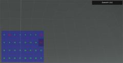
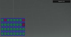
|description = The Checkboxes (also known as textual checkboxes) are a set of state change buttons, ordered by columns and rows. Unlike the Toolbox Control more than one button can become active. Maximum number of checkboxes available for a single control is 32. It is possible to create more than 32 checkboxes, however over-the-limit checkboxes will just become duplicates. {{hl|CT_CHECKBOXES}} fully inherits from [[CT_TOOLBOX]], the difference is that with CheckBoxes one can make multiple selections or have no item selected. When CheckBoxes style is {{hl|ST_PICTURE}}, the {{hl|strings}} property is treated as array of textures, and {{hl|checked_strings}} property is ignored.<br> | |||
|gallery= | |||
Image:CCheckBoxes.jpg | |||
Image:CCheckBoxes picture.jpg | |||
|commands = | |||
* [[:Category:Command_Group:_GUI_Control_-_ListBox|Commands: Listbox]] | |||
* [[ctrlSetChecked]] | |||
* [[ctrlChecked]] | |||
|events = | |||
* [[User_Interface_Event_Handlers#Listbox_events|Events: Listbox]] | |||
* [[User_Interface_Event_Handlers#Checkbox_events|Events: Checkbox]] | |||
}} | |||
{{CT|abc start}} | |||
=== C === | |||
{{CT|attribute | |||
|name=checked_strings | |||
|type1=Array | |||
|value1={"CHECKED"} | |||
|description=Checkboxes texts to display when checkboxes are checked | |||
}} | |||
{{CT|attribute | |||
|name=color | |||
|type1=Array | |||
|value1={0,0,0,0} | |||
|description= | |||
}} | |||
{{CT|attribute | |||
|name=colorBackground | |||
|type1=Array | |||
|value1={0,0,0,0} | |||
|description=Color of the background when checkbox is not in focus (doesn't matter if checked or not). | |||
}} | |||
{{CT|attribute | |||
|name=colorDisable | |||
|type1=Array | |||
|value1={0.4,0.4,0.4,1} | |||
|description= | |||
}} | |||
{{CT|attribute | |||
|name=colorSelect | |||
|type1=Array | |||
|value1={0,0,0,1} | |||
|description= | |||
}} | |||
{{CT|attribute | |||
|name=colorSelectedBg | |||
|type1=Array | |||
|value1={"(profilenamespace getvariable ['GUI_BCG_RGB_R',0.13])","(profilenamespace getvariable ['GUI_BCG_RGB_G',0.54])","(profilenamespace getvariable ['GUI_BCG_RGB_B',0.21])",1} | |||
|description=Color of the background when checkbox is in focus (doesn't matter if checked or not). | |||
}} | |||
{{CT|attribute | |||
|name=colorText | |||
|type1=Array | |||
|value1={0.4,0.4,0.4,1} | |||
|description=Color of the unchecked checkbox text | |||
}} | |||
{{CT|attribute | |||
|name=colorTextDisable | |||
|type1=Array | |||
|value1={0.4,0.4,0.4,1} | |||
|description= | |||
}} | |||
{{CT|attribute | |||
|name=colorTextSelect | |||
|type1=Array | |||
|value1={0,0.8,0,1} | |||
|description=Color of the checked checkbox text | |||
}} | |||
{{CT|attribute | |||
|name=columns | |||
|type1=Number | |||
|value1=1 | |||
|description=Amount of columns to arrange checkboxes into | |||
}} | |||
=== R === | |||
{{CT|attribute | |||
|name=rows | |||
|type1=Number | |||
|value1=1 | |||
|description=Amount of rows to arrange checkboxes into. | |||
}} | |||
=== S === | |||
{{CT|attribute | |||
|name=strings | |||
|type1=Array | |||
|value1={"UNCHECKED"} | |||
|description=Checkboxes texts to display | |||
}} | |||
=== T === | |||
{{CT|attribute | |||
|name=tooltips | |||
|type1=Array | |||
|value1={"tip0","tip1","tip2","tip3","tip4","tip5","tip6","tip7","tip8","tip9","tip10","tip11","tip12","tip13","tip14","tip15","tip16","tip17","tip18","tip19","tip20","tip21","tip22","tip23","tip24","tip25","tip26","tip27","tip28","tip29","tip30","tip31"}; | |||
|description=Tooltips for each checkbox. | |||
}} | |||
=== V === | |||
{{CT|attribute | |||
|name=values | |||
|type1=Array | |||
|value1={1,2,3,4} | |||
|description=Numerical values associated with items. Can be retrieved or set with [[lbValue]] and [[lbSetValue]]. | |||
}} | |||
{{CT|abc end}} | |||
{{CT|examples}} | |||
Neither the export nor the configFile contains a base class for this control type. | |||
== Example Classes == | |||
<syntaxhighlight lang="cpp"> | |||
class MyCheckBoxes | |||
{ | |||
onLoad = "_this select 0 ctrlSetChecked [1, true]; _this select 0 ctrlSetChecked [7, true]; _this select 0 ctrlSetChecked [15, true];"; | |||
idc = -1; | |||
type = 7; // CT_CHECKBOXES | |||
style = 2; // ST_CENTER | |||
x = 0.25; | |||
y = 0.25; | |||
w = 0.5; | |||
h = 0.5; | |||
colorText[] = {0, 1, 0, 1}; | |||
colorTextSelect[] = {1, 0, 0, 1}; | |||
colorBackground[] = {0, 0, 1, 0.3}; | |||
colorSelectedBg[] = {0, 0, 0, 0.2}; | |||
font = "RobotoCondensed"; | |||
sizeEx = 0.04; | |||
onCheckBoxesSelChanged = "hint str _this"; | |||
columns = 8; | |||
rows = 4; | |||
strings[] = {"0","1","2","3","4","5","6","7","8","9","10","11","12","13","14","15","16","17","18","19","20","21","22","23","24","25","26","27","28","29","30","31"}; | |||
checked_strings[] = {"[0]","[1]","[2]","[3]","[4]","[5]","[6]","[7]","[8]","[9]","[10]","[11]","[12]","[13]","[14]","[15]","[16]","[17]","[18]","[19]","[20]","[21]","[22]","[23]","[24]","[25]","[26]","[27]","[28]","[29]","[30]","[31]"}; | |||
values[] = {0,1,2,3,4,5,6,7,8,9,10,11,12,13,14,15,16,17,18,19,20,21,22,23,24,25,26,27,28,29,30,31}; | |||
tooltips[] = {"tip0","tip1","tip2","tip3","tip4","tip5","tip6","tip7","tip8","tip9","tip10","tip11","tip12","tip13","tip14","tip15","tip16","tip17","tip18","tip19","tip20","tip21","tip22","tip23","tip24","tip25","tip26","tip27","tip28","tip29","tip30","tip31"}; | |||
}; | |||
</syntaxhighlight> | |||
Latest revision as of 23:55, 15 November 2021
| Control Types / MACRO (TYPE VALUE) | |
|---|---|
| Text/Image/Video |
CT_STATIC (0) | CT_EDIT (2) | CT_HTML (9) | CT_STRUCTURED_TEXT (13) |
| Buttons |
CT_BUTTON (1) | CT_ACTIVETEXT (11) | CT_SHORTCUTBUTTON (16) | CT_CHECKBOX (77) | CT_XBUTTON (41) |
| Lists |
CT_COMBO (4) | CT_TOOLBOX (6) | CT_CHECKBOXES (7) | CT_TREE (12) | CT_CONTROLS_TABLE (19) | CT_XCOMBO (44) | CT_LISTBOX (5) | CT_LISTNBOX (102) | CT_LISTNBOX_CHECKABLE (104) | CT_XLISTBOX (45) |
| 3D Objects |
CT_OBJECT (80) | CT_OBJECT_ZOOM (81) | CT_OBJECT_CONTAINER (82) | CT_OBJECT_CONT_ANIM (83) |
| Maps |
CT_MAP (100) | CT_MAP_MAIN (101) |
| Meta |
CT_SLIDER (3) | CT_XSLIDER (43) | CT_PROGRESS (8) | CT_CONTROLS_GROUP (15) | CT_WEBBROWSER (106) | CT_EXTENSION (107) |
| Menu |
CT_CONTEXT_MENU (14) | CT_MENU (46) | CT_MENU_STRIP (47) |
| Unknown |
CT_STATIC_SKEW (10) | CT_HITZONES (17) | CT_VEHICLETOGGLES (18) | CT_XKEYDESC (40) | CT_ANIMATED_TEXTURE (45) | CT_LINEBREAK (98) | CT_USER (99) | CT_ITEMSLOT (103) | CT_VEHICLE_DIRECTION (105) |
Introduction
The Checkboxes (also known as textual checkboxes) are a set of state change buttons, ordered by columns and rows. Unlike the Toolbox Control more than one button can become active. Maximum number of checkboxes available for a single control is 32. It is possible to create more than 32 checkboxes, however over-the-limit checkboxes will just become duplicates. CT_CHECKBOXES fully inherits from CT_TOOLBOX, the difference is that with CheckBoxes one can make multiple selections or have no item selected. When CheckBoxes style is ST_PICTURE, the strings property is treated as array of textures, and checked_strings property is ignored.
Related commands & functions
Related User Interface Eventhandlers
Alphabetical Order
#define CT_CHECKBOXES 7
C
checked_strings
- Type
- Array
- Description
- Checkboxes texts to display when checkboxes are checked
checked_strings[] = {"CHECKED"};
color
- Type
- Array
- Description
- n/a
color[] = {0,0,0,0};
colorBackground
- Type
- Array
- Description
- Color of the background when checkbox is not in focus (doesn't matter if checked or not).
colorBackground[] = {0,0,0,0};
colorDisable
- Type
- Array
- Description
- n/a
colorDisable[] = {0.4,0.4,0.4,1};
colorSelect
- Type
- Array
- Description
- n/a
colorSelect[] = {0,0,0,1};
colorSelectedBg
- Type
- Array
- Description
- Color of the background when checkbox is in focus (doesn't matter if checked or not).
colorSelectedBg[] = {"(profilenamespace getvariable ['GUI_BCG_RGB_R',0.13])","(profilenamespace getvariable ['GUI_BCG_RGB_G',0.54])","(profilenamespace getvariable ['GUI_BCG_RGB_B',0.21])",1};
colorText
- Type
- Array
- Description
- Color of the unchecked checkbox text
colorText[] = {0.4,0.4,0.4,1};
colorTextDisable
- Type
- Array
- Description
- n/a
colorTextDisable[] = {0.4,0.4,0.4,1};
colorTextSelect
- Type
- Array
- Description
- Color of the checked checkbox text
colorTextSelect[] = {0,0.8,0,1};
columns
- Type
- Number
- Description
- Amount of columns to arrange checkboxes into
columns = 1;
R
rows
- Type
- Number
- Description
- Amount of rows to arrange checkboxes into.
rows = 1;
S
strings
- Type
- Array
- Description
- Checkboxes texts to display
strings[] = {"UNCHECKED"};
T
tooltips
- Type
- Array
- Description
- Tooltips for each checkbox.
tooltips[] = {"tip0","tip1","tip2","tip3","tip4","tip5","tip6","tip7","tip8","tip9","tip10","tip11","tip12","tip13","tip14","tip15","tip16","tip17","tip18","tip19","tip20","tip21","tip22","tip23","tip24","tip25","tip26","tip27","tip28","tip29","tip30","tip31"};;
V
values
- Type
- Array
- Description
- Numerical values associated with items. Can be retrieved or set with lbValue and lbSetValue.
values[] = {1,2,3,4};
Default Classes
Neither the export nor the configFile contains a base class for this control type.
Example Classes
class MyCheckBoxes
{
	onLoad = "_this select 0 ctrlSetChecked [1, true]; _this select 0 ctrlSetChecked [7, true]; _this select 0 ctrlSetChecked [15, true];";

	idc = -1;
	type = 7; // CT_CHECKBOXES
	style = 2; // ST_CENTER

	x = 0.25;
	y = 0.25;
	w = 0.5;
	h = 0.5;

	colorText[] = {0, 1, 0, 1};
	colorTextSelect[] = {1, 0, 0, 1};

	colorBackground[] = {0, 0, 1, 0.3};
	colorSelectedBg[] = {0, 0, 0, 0.2};

	font = "RobotoCondensed";
	sizeEx = 0.04;

	onCheckBoxesSelChanged = "hint str _this";

	columns = 8;
	rows = 4;

	strings[] = {"0","1","2","3","4","5","6","7","8","9","10","11","12","13","14","15","16","17","18","19","20","21","22","23","24","25","26","27","28","29","30","31"};
	checked_strings[] = {"[0]","[1]","[2]","[3]","[4]","[5]","[6]","[7]","[8]","[9]","[10]","[11]","[12]","[13]","[14]","[15]","[16]","[17]","[18]","[19]","[20]","[21]","[22]","[23]","[24]","[25]","[26]","[27]","[28]","[29]","[30]","[31]"};
	values[] = {0,1,2,3,4,5,6,7,8,9,10,11,12,13,14,15,16,17,18,19,20,21,22,23,24,25,26,27,28,29,30,31};
	tooltips[] = {"tip0","tip1","tip2","tip3","tip4","tip5","tip6","tip7","tip8","tip9","tip10","tip11","tip12","tip13","tip14","tip15","tip16","tip17","tip18","tip19","tip20","tip21","tip22","tip23","tip24","tip25","tip26","tip27","tip28","tip29","tip30","tip31"};
};

