CT COMBO: Difference between revisions
(page overhaul) Tag: Removed redirect |
Lou Montana (talk | contribs) m (Text replacement - " ( *class [a-zA-Z0-9_]+): *([a-zA-Z0-9_]+ *) " to " $1 : $2 ") |
||
| (9 intermediate revisions by 3 users not shown) | |||
| Line 1: | Line 1: | ||
{{CT | [[Category: Control Types]] | ||
{{CT/intro | |||
|macro = CT_COMBO | |macro = CT_COMBO | ||
|value = 4 | |value = 4 | ||
|description = A drop down menu. | |description = A drop down menu. Compared to a [[CT_LISTBOX]] or [[CT_TOOLBOX]] it can display many items without taking a lot of space. Disadvantage is that the user has to interact first with the control so see multiple entries. | ||
[[File:CT COMBO.jpg]] | |gallery = | ||
File:CT COMBO.jpg {{!}} A normal [[CT_COMBO]] | |||
File:CT COMBO PICTURE RIGHT.jpg {{!}} A [[CT_COMBO]] can have a picture on the right and on the left | |||
File:CT COMBO TOOLTIP.jpg {{!}} Tooltips are also no problem | |||
|commands = | |commands = | ||
* [[:Category:Command_Group:_GUI_Control_-_ListBox|Commands: Listbox]] | * [[:Category:Command_Group:_GUI_Control_-_ListBox|Commands: Listbox]] | ||
| Line 10: | Line 16: | ||
}} | }} | ||
{{CT | {{CT/abc start}} | ||
=== A === | === A === | ||
{{CT | {{CT/attribute | ||
|name=arrowEmpty | |name=arrowEmpty | ||
|type1=String | |type1=String | ||
| Line 19: | Line 25: | ||
}} | }} | ||
{{CT | {{CT/attribute | ||
|name=arrowFull | |name=arrowFull | ||
|type1=String | |type1=String | ||
| Line 27: | Line 33: | ||
=== C === | === C === | ||
{{CT | {{CT/attribute | ||
|name=colorActive | |name=colorActive | ||
|type1=Array | |type1=Array | ||
| Line 34: | Line 40: | ||
}} | }} | ||
{{CT | {{CT/attribute | ||
|name=colorPicture | |name=colorPicture | ||
|type1=Array | |type1=Array | ||
| Line 41: | Line 47: | ||
}} | }} | ||
{{CT | {{CT/attribute | ||
|name=colorPictureDisabled | |name=colorPictureDisabled | ||
|type1=Array | |type1=Array | ||
| Line 48: | Line 54: | ||
}} | }} | ||
{{CT | {{CT/attribute | ||
|name=colorPictureRight | |name=colorPictureRight | ||
|type1=Array | |type1=Array | ||
| Line 55: | Line 61: | ||
}} | }} | ||
{{CT | {{CT/attribute | ||
|name=colorPictureRightDisabled | |name=colorPictureRightDisabled | ||
|type1=Array | |type1=Array | ||
| Line 62: | Line 68: | ||
}} | }} | ||
{{CT | {{CT/attribute | ||
|name=colorPictureRightSelected | |name=colorPictureRightSelected | ||
|type1=Array | |type1=Array | ||
| Line 69: | Line 75: | ||
}} | }} | ||
{{CT | {{CT/attribute | ||
|name=colorPictureSelect | |name=colorPictureSelect | ||
|type1=Array | |type1=Array | ||
| Line 76: | Line 82: | ||
}} | }} | ||
{{CT | {{CT/attribute | ||
|name=colorPictureSelected | |name=colorPictureSelected | ||
|type1=Array | |type1=Array | ||
| Line 83: | Line 89: | ||
}} | }} | ||
{{CT | {{CT/attribute | ||
|name=colorScrollbar | |name=colorScrollbar | ||
|type1=Array | |type1=Array | ||
| Line 90: | Line 96: | ||
}} | }} | ||
{{CT | {{CT/attribute | ||
|name=colorSelect | |name=colorSelect | ||
|type1=Array | |type1=Array | ||
| Line 97: | Line 103: | ||
}} | }} | ||
{{CT | {{CT/attribute | ||
|name=colorSelect2Right | |name=colorSelect2Right | ||
|type1=Array | |type1=Array | ||
| Line 104: | Line 110: | ||
}} | }} | ||
{{CT | {{CT/attribute | ||
|name=colorSelectBackground | |name=colorSelectBackground | ||
|type1=Array | |type1=Array | ||
| Line 111: | Line 117: | ||
}} | }} | ||
{{CT | {{CT/attribute | ||
|name=colorSelectRight | |name=colorSelectRight | ||
|type1=Array | |type1=Array | ||
| Line 118: | Line 124: | ||
}} | }} | ||
{{CT | {{CT/attribute | ||
|name=colorTextRight | |name=colorTextRight | ||
|type1=Array | |type1=Array | ||
| Line 125: | Line 131: | ||
}} | }} | ||
{{CT | {{CT/attribute | ||
|name=ComboScrollBar | |name=ComboScrollBar | ||
|type1=Class | |type1=Class | ||
| Line 150: | Line 156: | ||
=== E === | === E === | ||
{{CT | {{CT/attribute | ||
|name=ExtendedTooltip | |name=ExtendedTooltip | ||
|type1=Class | |type1=Class | ||
| Line 183: | Line 189: | ||
=== F === | === F === | ||
{{CT | {{CT/attribute | ||
|name=from | |name=from | ||
|type1=Number | |type1=Number | ||
|value1=1982 | |value1=1982 | ||
|description=Probably used in conjunction with {{ | |description=Probably used in conjunction with {{hl|to}} | ||
}} | }} | ||
=== G === | === G === | ||
{{CT | {{CT/attribute | ||
|name=gridType | |name=gridType | ||
|type1=String | |type1=String | ||
| Line 199: | Line 205: | ||
=== I === | === I === | ||
{{CT | {{CT/attribute | ||
|name=Items | |name=Items | ||
|type1=Class | |type1=Class | ||
| Line 216: | Line 222: | ||
|description=List of entries. | |description=List of entries. | ||
{{{!}}class="wikitable" border="1" align="left" cellpadding="3" cellspacing="0" {{!}} | {{{!}}class="wikitable" border="1" align="left" cellpadding="3" cellspacing="0" {{!}} | ||
! colspan="3 | ! colspan="3" {{!}} Items | ||
{{!}}- | {{!}}- | ||
! | ! Name | ||
! | ! Type | ||
! | ! Remark | ||
{{!}}- | {{!}}- | ||
{{!}} '''text''' | {{!}} '''text''' | ||
| Line 258: | Line 264: | ||
=== M === | === M === | ||
{{CT | {{CT/attribute | ||
|name=maxHistoryDelay | |name=maxHistoryDelay | ||
|type1=Number | |type1=Number | ||
| Line 266: | Line 272: | ||
=== R === | === R === | ||
{{CT | {{CT/attribute | ||
|name=rows | |name=rows | ||
|type1=Number | |type1=Number | ||
| Line 274: | Line 280: | ||
=== S === | === S === | ||
{{CT | {{CT/attribute | ||
|name=soundCollapse | |name=soundCollapse | ||
|type1=Array | |type1=Array | ||
| Line 281: | Line 287: | ||
}} | }} | ||
{{CT | {{CT/attribute | ||
|name=soundExpand | |name=soundExpand | ||
|type1=Array | |type1=Array | ||
| Line 288: | Line 294: | ||
}} | }} | ||
{{CT | {{CT/attribute | ||
|name=soundSelect | |name=soundSelect | ||
|type1=Array | |type1=Array | ||
| Line 296: | Line 302: | ||
=== T === | === T === | ||
{{CT | {{CT/attribute | ||
|name=to | |name=to | ||
|type1=Number | |type1=Number | ||
|value1=2050 | |value1=2050 | ||
|description=Probably used in conjunction with {{ | |description=Probably used in conjunction with {{hl|from}} | ||
}} | }} | ||
=== W === | === W === | ||
{{CT | {{CT/attribute | ||
|name=wholeHeight | |name=wholeHeight | ||
|type1=Number | |type1=Number | ||
| Line 313: | Line 319: | ||
}} | }} | ||
{{CT | {{CT/abc end}} | ||
{{CT | {{CT/examples}} | ||
=== | === RscCombo === | ||
<syntaxhighlight lang="cpp"> | <syntaxhighlight lang="cpp"> | ||
class RscCombo | class RscCombo | ||
| Line 360: | Line 366: | ||
}; | }; | ||
maxHistoryDelay = 1; | maxHistoryDelay = 1; | ||
class ComboScrollBar: ScrollBar | class ComboScrollBar : ScrollBar | ||
{ | { | ||
color[] = {1,1,1,1}; | color[] = {1,1,1,1}; | ||
Latest revision as of 11:58, 6 December 2023
| Control Types / MACRO (TYPE VALUE) | |
|---|---|
| Text/Image/Video |
CT_STATIC (0) | CT_EDIT (2) | CT_HTML (9) | CT_STRUCTURED_TEXT (13) |
| Buttons |
CT_BUTTON (1) | CT_ACTIVETEXT (11) | CT_SHORTCUTBUTTON (16) | CT_CHECKBOX (77) | CT_XBUTTON (41) |
| Lists |
CT_COMBO (4) | CT_TOOLBOX (6) | CT_CHECKBOXES (7) | CT_TREE (12) | CT_CONTROLS_TABLE (19) | CT_XCOMBO (44) | CT_LISTBOX (5) | CT_LISTNBOX (102) | CT_LISTNBOX_CHECKABLE (104) CT_XLISTBOX (45) |
| 3D Objects |
CT_OBJECT (80) | CT_OBJECT_ZOOM (81) | CT_OBJECT_CONTAINER (82) | CT_OBJECT_CONT_ANIM (83) |
| Maps |
CT_MAP (100) | CT_MAP_MAIN (101) |
| Meta |
CT_SLIDER (3) | CT_XSLIDER (43) | CT_PROGRESS (8) | CT_CONTROLS_GROUP (15) |
| Menu |
CT_CONTEXT_MENU (14) | CT_MENU (46) | CT_MENU_STRIP (47) |
| Unknown |
CT_STATIC_SKEW (10) | CT_HITZONES (17) | CT_VEHICLETOGGLES (18) | CT_XKEYDESC (40) | CT_ANIMATED_TEXTURE (45) | CT_LINEBREAK (98) | CT_USER (99) | CT_ITEMSLOT (103) | CT_VEHICLE_DIRECTION (105) |
Introduction
A drop down menu. Compared to a CT_LISTBOX or CT_TOOLBOX it can display many items without taking a lot of space. Disadvantage is that the user has to interact first with the control so see multiple entries.
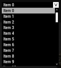
A normal CT_COMBO
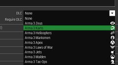
A CT_COMBO can have a picture on the right and on the left
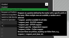
Tooltips are also no problem


Related commands & functions
Related User Interface Eventhandlers
Alphabetical Order
#define CT_COMBO 4
A
arrowEmpty
- Type
- String
- Description
- Texture of the collapsed control.
arrowEmpty = "\A3\ui_f\data\GUI\RscCommon\rsccombo\arrow_combo_ca.paa";
arrowFull
- Type
- String
- Description
- Texture of the expanded control.
arrowFull = "\A3\ui_f\data\GUI\RscCommon\rsccombo\arrow_combo_active_ca.paa";
C
colorActive
- Type
- Array
- Description
- n/a
colorActive[] = {1,0,0,1};
colorPicture
- Type
- Array
- Description
- n/a
colorPicture[] = {1,1,1,1};
colorPictureDisabled
- Type
- Array
- Description
- n/a
colorPictureDisabled[] = {1,1,1,0.25};
colorPictureRight
- Type
- Array
- Description
- n/a
colorPictureRight[] = {1,1,1,1};
colorPictureRightDisabled
- Type
- Array
- Description
- n/a
colorPictureRightDisabled[] = {1,1,1,0.25};
colorPictureRightSelected
- Type
- Array
- Description
- n/a
colorPictureRightSelected[] = {1,1,1,1};
colorPictureSelect
- Type
- Array
- Description
- n/a
colorPictureSelect[] = {1,1,1,1};
colorPictureSelected
- Type
- Array
- Description
- n/a
colorPictureSelected[] = {1,1,1,1};
colorScrollbar
- Type
- Array
- Description
- n/a
colorScrollbar[] = {1,0,0,1};
colorSelect
- Type
- Array
- Description
- n/a
colorSelect[] = {0,0,0,1};
colorSelect2Right
- Type
- Array
- Description
- n/a
colorSelect2Right[] = {0,0,0,1};
colorSelectBackground
- Type
- Array
- Description
- n/a
colorSelectBackground[] = {1,1,1,0.7};
colorSelectRight
- Type
- Array
- Description
- n/a
colorSelectRight[] = {0,0,0,1};
colorTextRight
- Type
- Array
- Description
- n/a
colorTextRight[] = {1,1,1,1};
ComboScrollBar
- Type
- Class
- Description
- The scrollbar that is visible when there are more elements than wholeHeight can display.
class ComboScrollBar
{
	color[] = {1,1,1,1};
	colorActive[] = {1,1,1,1};
	colorDisabled[] = {1,1,1,0.3};
	thumb = "\A3\ui_f\data\gui\cfg\scrollbar\thumb_ca.paa";
	arrowEmpty = "\A3\ui_f\data\gui\cfg\scrollbar\arrowEmpty_ca.paa";
	arrowFull = "\A3\ui_f\data\gui\cfg\scrollbar\arrowFull_ca.paa";
	border = "\A3\ui_f\data\gui\cfg\scrollbar\border_ca.paa";
	shadow = 0;
	scrollSpeed = 0.06;
	width = 0;
	height = 0;
	autoScrollEnabled = 0;
	autoScrollSpeed = -1;
	autoScrollDelay = 5;
	autoScrollRewind = 0;
};
E
ExtendedTooltip
- Type
- Class
- Description
- n/a
class ExtendedTooltip
{
	size = "0.028 * SafezoneH";
	colorPremium[] = {1,0.502,0,1};
	deletable = 0;
	fade = 0;
	access = 0;
	type = 13;
	idc = -1;
	style = 0;
	colorText[] = {1,1,1,1};
	class Attributes
	{
		font = "RobotoCondensed";
		color = "#ffffff";
		colorLink = "#D09B43";
		align = "left";
		shadow = 1;
	};
	x = 0;
	y = 0;
	h = 0.035;
	w = 0.1;
	text = "";
	shadow = 1;
};
F
from
- Type
- Number
- Description
- Probably used in conjunction with to
from = 1982;
G
gridType
- Type
- String
- Description
- n/a
gridType = "scaling";
I
Items
- Type
- Class
- Description
- List of entries.
| Items | ||
|---|---|---|
| Name | Type | Remark |
| text | String | Displayed text (equal to lbAdd) |
| value | Number | Value of the entry (equal to lbSetValue) |
| data | String | Data of the entry (equal to lbSetData) |
| picture | String | Picture displayed on the left (equal to lbSetPicture) |
| pictureRight | String | Picture displayed on the right (equal to lbSetPictureRight) |
| default | Number | Sets this entry as the by default selected (equal to lbSetCurSel) |
| color | Color (RGBA) | Text color of the entry (equal to lbSetColor) |
| tooltip | String | Tooltip of the entry (equal to lbSetTooltip) |
class Items
{
	class Alphabet
	{
		text = "Sort alphabetically";
		default = 1;
	};
	class Mod
	{
		text = "Sort by mod";
	};
};
M
maxHistoryDelay
- Type
- Number
- Description
- n/a
maxHistoryDelay = 1;
R
rows
- Type
- Number
- Description
- n/a
rows = 2;
S
soundCollapse
- Type
- Array
- Description
- Sound played when the combobox is collapsed.
soundCollapse[] = {"\A3\ui_f\data\sound\RscCombo\soundCollapse",0.1,1};
soundExpand
- Type
- Array
- Description
- Sound played when the combobox is expanded
soundExpand[] = {"\A3\ui_f\data\sound\RscCombo\soundExpand",0.1,1};
soundSelect
- Type
- Array
- Description
- Sound played when an item from the combobox is selected.
soundSelect[] = {"\A3\ui_f\data\sound\RscCombo\soundSelect",0.1,1};
T
to
- Type
- Number
- Description
- Probably used in conjunction with from
to = 2050;
W
wholeHeight
Number example:
wholeHeight = 0.45;
String example:
wholeHeight = "12 * 5 * (pixelH * pixelGrid * 0.50)";
RscCombo
class RscCombo
{
	deletable = 0;
	fade = 0;
	access = 0;
	type = CT_COMBO;
	colorSelect[] = {0,0,0,1};
	colorText[] = {1,1,1,1};
	colorBackground[] = {0,0,0,1};
	colorScrollbar[] = {1,0,0,1};
	colorDisabled[] = {1,1,1,0.25};
	colorPicture[] = {1,1,1,1};
	colorPictureSelected[] = {1,1,1,1};
	colorPictureDisabled[] = {1,1,1,0.25};
	colorPictureRight[] = {1,1,1,1};
	colorPictureRightSelected[] = {1,1,1,1};
	colorPictureRightDisabled[] = {1,1,1,0.25};
	colorTextRight[] = {1,1,1,1};
	colorSelectRight[] = {0,0,0,1};
	colorSelect2Right[] = {0,0,0,1};
	tooltipColorText[] = {1,1,1,1};
	tooltipColorBox[] = {1,1,1,1};
	tooltipColorShade[] = {0,0,0,0.65};
	soundSelect[] =
	{
		"\A3\ui_f\data\sound\RscCombo\soundSelect",
		0.1,
		1
	};
	soundExpand[] =
	{
		"\A3\ui_f\data\sound\RscCombo\soundExpand",
		0.1,
		1
	};
	soundCollapse[] =
	{
		"\A3\ui_f\data\sound\RscCombo\soundCollapse",
		0.1,
		1
	};
	maxHistoryDelay = 1;
	class ComboScrollBar : ScrollBar
	{
		color[] = {1,1,1,1};
	};
	style = ST_MULTI + ST_NO_RECT;
	font = "RobotoCondensed";
	sizeEx = GUI_TEXT_SIZE_MEDIUM;
	shadow = 0;
	x = 0;
	y = 0;
	w = 0.12;
	h = 0.035;
	colorSelectBackground[] = {1,1,1,0.7};
	arrowEmpty = "\A3\ui_f\data\GUI\RscCommon\rsccombo\arrow_combo_ca.paa";
	arrowFull = "\A3\ui_f\data\GUI\RscCommon\rsccombo\arrow_combo_active_ca.paa";
	wholeHeight = 0.45;
	colorActive[] = {1,0,0,1};
};