CT TREE: Difference between revisions
Lou Montana (talk | contribs) m (Text replacement - "<tt>([^ ]*=[^ ]*)<\/tt>" to "{{hl|c= $1}}") |
Lou Montana (talk | contribs) m (Text replacement - "{{Feature|Informative|" to "{{Feature|informative|") |
||
| (6 intermediate revisions by 3 users not shown) | |||
| Line 12: | Line 12: | ||
* [[:Category:Command_Group:_GUI_Control_-_Tree_View|Commands: Tree View]] | * [[:Category:Command_Group:_GUI_Control_-_Tree_View|Commands: Tree View]] | ||
|events = | |events = | ||
* [[User_Interface_Event_Handlers# | * [[User_Interface_Event_Handlers#Tree_Events|Events: Tree View]] | ||
}} | }} | ||
| Line 21: | Line 21: | ||
|type1=Number | |type1=Number | ||
|value1=0 | |value1=0 | ||
|description=Shows a border around the control. | |description=Shows a border around the control. Setting the size to 0 will not hide the border. Set the {{hl|colorBorder}} to transparent instead. | ||
}} | }} | ||
| Line 37: | Line 37: | ||
|type1=Array | |type1=Array | ||
|value1={0,0,0,0} | |value1={0,0,0,0} | ||
|description=With {{ | |description=With {{hl|borderSize {{=}} 1}} determines the color of that border. | ||
}} | }} | ||
| Line 55: | Line 55: | ||
|type1=Array | |type1=Array | ||
|value1={0.2,0.3,0.7,1} | |value1={0.2,0.3,0.7,1} | ||
|description=Background color of all subsequently selected entries when {{ | |description=Background color of all subsequently selected entries when {{hl|multiselectEnabled {{=}} 1;}}. | ||
}} | }} | ||
| Line 62: | Line 62: | ||
|type1=Array | |type1=Array | ||
|value1={0,0.5,0.5,1} | |value1={0,0.5,0.5,1} | ||
|description=Background color of the first selected entry with {{ | |description=Background color of the first selected entry with {{hl|multiselectEnabled {{=}} 1;}}. | ||
}} | }} | ||
| Line 69: | Line 69: | ||
|type1=Array | |type1=Array | ||
|value1={0,0,0,1} | |value1={0,0,0,1} | ||
|description=Text color of secondarly selected entries with {{ | |description=Text color of secondarly selected entries with {{hl|multiselectEnabled {{=}} 1;}}. | ||
}} | }} | ||
| Line 125: | Line 125: | ||
|type1=Array | |type1=Array | ||
|value1={"(profilenamespace getvariable ['GUI_BCG_RGB_R',0.77])","(profilenamespace getvariable ['GUI_BCG_RGB_G',0.51])","(profilenamespace getvariable ['GUI_BCG_RGB_B',0.08])",1} | |value1={"(profilenamespace getvariable ['GUI_BCG_RGB_R',0.77])","(profilenamespace getvariable ['GUI_BCG_RGB_G',0.51])","(profilenamespace getvariable ['GUI_BCG_RGB_B',0.08])",1} | ||
|description=Entry's background when {{ | |description=Entry's background when {{hl|multiselectEnabled {{=}} 0;}}. | ||
}} | }} | ||
| Line 139: | Line 139: | ||
|type1=Array | |type1=Array | ||
|value1={0,0,0,1} | |value1={0,0,0,1} | ||
|description=Text color of a selected entry with {{ | |description=Text color of a selected entry with {{hl|multiselectEnabled {{=}} 0;}}. | ||
}} | }} | ||
| Line 222: | Line 222: | ||
|value1=1 | |value1=1 | ||
|description=Enable/disable multi selection with CTRL or SHIFT to select all entries up to the first selected entry. | |description=Enable/disable multi selection with CTRL or SHIFT to select all entries up to the first selected entry. | ||
{{Feature| | {{Feature|informative|Commands to retrieve all selected entries in a multi selection tv are only available after {{GVI|arma3|2.01}}.}} | ||
}} | }} | ||
| Line 287: | Line 287: | ||
borderSize = 0; | borderSize = 0; | ||
expandOnDoubleclick = 1; | expandOnDoubleclick = 1; | ||
class ScrollBar: ScrollBar | class ScrollBar : ScrollBar | ||
{ | { | ||
}; | }; | ||
| Line 386: | Line 386: | ||
colorSelectBackground[] = {0,0,0,0.5}; | colorSelectBackground[] = {0,0,0,0.5}; | ||
colorLines[] = {0,0,0,0}; | colorLines[] = {0,0,0,0}; | ||
class ScrollBar: ScrollBar | class ScrollBar : ScrollBar | ||
{ | { | ||
}; | }; | ||
| Line 412: | Line 412: | ||
== Scripting Example == | == Scripting Example == | ||
< | {| class="valign-top" | ||
_CT_TREE | | <sqf> | ||
_CT_TREE | private ["_count", "_current", "_data", "_text", "_value", "_pic"]; | ||
_CT_TREE | _CT_TREE tvAdd [[], "Parent_A"]; | ||
_CT_TREE | _CT_TREE tvAdd [[0], "Child_A"]; | ||
_CT_TREE | _CT_TREE tvAdd [[0,0], "Grandchild_A"]; | ||
[[ | _CT_TREE tvAdd [[], "Parent_B"]; | ||
_count = _CT_TREE | _CT_TREE tvAdd [[1], "Child_B"]; | ||
_CT_TREE | </sqf> | ||
[[ | | [[File:WuChaoRen_CTTree001.png]] | ||
_current = | |- | ||
_CT_TREE | | <sqf> | ||
_data = _CT_TREE | _count = _CT_TREE tvCount []; // return 2 | ||
_text = _CT_TREE | _CT_TREE tvSetCurSel [0,0,0]; // select grandchild_A | ||
_CT_TREE | </sqf> | ||
_value = _CT_TREE | | [[File:WuChaoRen_CTTree003.png]] | ||
_CT_TREE | |- | ||
_pic = _CT_TREE | | <sqf> | ||
[[ | _current = tvCurSel _CT_TREE; // return [0,0,0] | ||
_CT_TREE | _CT_TREE tvSetData [_current, "I'm grandchild_A"]; | ||
[[ | _data = _CT_TREE tvData _current; // "I'm grandchild_A" | ||
_CT_TREE | _text = _CT_TREE tvText _current; // "Grandchild_A" | ||
_CT_TREE | _CT_TREE tvSetValue [_current,14]; | ||
[[ | _value = _CT_TREE tvValue _current; // 14 | ||
_CT_TREE | _CT_TREE tvSetPicture [_current, getText (configFile >> "CfgWeapons" >> "optic_NVS" >> "picture")]; | ||
_pic = _CT_TREE tvPicture _current; | |||
_CT_TREE | </sqf> | ||
[[ | | [[File:WuChaoRen_CTTree004.png]] | ||
|- | |||
| <sqf>_CT_TREE tvExpand [1];</sqf> | |||
| [[File:WuChaoRen_CTTree005.png]] | |||
|- | |||
| <sqf> | |||
_CT_TREE tvSort [[], false]; | |||
_CT_TREE tvSortByValue [[], false]; | |||
</sqf> | |||
| [[File:WuChaoRen_CTTree006.png]] | |||
|- | |||
| <sqf> | |||
_CT_TREE tvDelete [0,0]; // remove child_b | |||
tvClear 12; | |||
_CT_TREE tvCollapse []; | |||
</sqf> | |||
| [[File:WuChaoRen_CTTree002.png]] | |||
|} | |||
[[Category: Control Types]] | [[Category: Control Types]] | ||
Latest revision as of 00:24, 2 February 2024
| Control Types / MACRO (TYPE VALUE) | |
|---|---|
| Text/Image/Video |
CT_STATIC (0) | CT_EDIT (2) | CT_HTML (9) | CT_STRUCTURED_TEXT (13) |
| Buttons |
CT_BUTTON (1) | CT_ACTIVETEXT (11) | CT_SHORTCUTBUTTON (16) | CT_CHECKBOX (77) | CT_XBUTTON (41) |
| Lists |
CT_COMBO (4) | CT_TOOLBOX (6) | CT_CHECKBOXES (7) | CT_TREE (12) | CT_CONTROLS_TABLE (19) | CT_XCOMBO (44) | CT_LISTBOX (5) | CT_LISTNBOX (102) | CT_LISTNBOX_CHECKABLE (104) | CT_XLISTBOX (45) |
| 3D Objects |
CT_OBJECT (80) | CT_OBJECT_ZOOM (81) | CT_OBJECT_CONTAINER (82) | CT_OBJECT_CONT_ANIM (83) |
| Maps |
CT_MAP (100) | CT_MAP_MAIN (101) |
| Meta |
CT_SLIDER (3) | CT_XSLIDER (43) | CT_PROGRESS (8) | CT_CONTROLS_GROUP (15) | CT_WEBBROWSER (106) | CT_EXTENSION (107) |
| Menu |
CT_CONTEXT_MENU (14) | CT_MENU (46) | CT_MENU_STRIP (47) |
| Unknown |
CT_STATIC_SKEW (10) | CT_HITZONES (17) | CT_VEHICLETOGGLES (18) | CT_XKEYDESC (40) | CT_ANIMATED_TEXTURE (45) | CT_LINEBREAK (98) | CT_USER (99) | CT_ITEMSLOT (103) | CT_VEHICLE_DIRECTION (105) |
Introduction
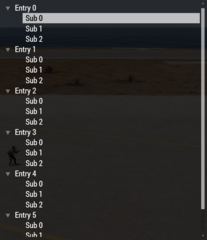
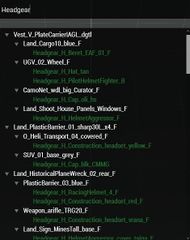
The CT_TREE, also referred to as tree view (tv), is a control with similar functionality as the CT_LISTBOX. In addition to that it supports multiple levels of entries as well as a search functionality.
Since ![]() 2.01: Multiple selections are now also supported via commands.
2.01: Multiple selections are now also supported via commands.
Related commands & functions
Related User Interface Eventhandlers
Alphabetical Order
#define CT_TREE 12
B
borderSize
- Type
- Number
- Description
- Shows a border around the control. Setting the size to 0 will not hide the border. Set the colorBorder to transparent instead.
borderSize = 0;
C
colorArrow
- Type
- Array
- Description
- Has no effect but without it an error is thrown.
colorArrow[] = {1,1,1,1};
colorBorder
- Type
- Array
- Description
- With borderSize = 1 determines the color of that border.
colorBorder[] = {0,0,0,0};
colorLines
- Type
- Array
- Description
- These lines connect the different entries for better clarity.
colorLines[] = {0,0,0,0};
colorMarked
- Type
- Array
- Description
- Background color of all subsequently selected entries when multiselectEnabled = 1;.
colorMarked[] = {0.2,0.3,0.7,1};
colorMarkedSelected
- Type
- Array
- Description
- Background color of the first selected entry with multiselectEnabled = 1;.
colorMarkedSelected[] = {0,0.5,0.5,1};
colorMarkedText
- Type
- Array
- Description
- Text color of secondarly selected entries with multiselectEnabled = 1;.
colorMarkedText[] = {0,0,0,1};
colorPicture
- Type
- Array
- Description
- Left picture color of an unselected entry.
colorPicture[] = {1,1,1,1};
colorPictureDisabled
- Type
- Array
- Description
- Left picture color when control is disabled.
colorPictureDisabled[] = {1,1,1,0.25};
colorPictureRight
- Type
- Array
- Description
- Right picture color of an unselected entry.
colorPictureRight[] = {1,1,1,1};
colorPictureRightDisabled
- Type
- Array
- Description
- Right picture color when control is disabled.
colorPictureRightDisabled[] = {1,1,1,0.25};
colorPictureRightSelected
- Type
- Array
- Description
- Right picture color of an selected entry.
colorPictureRightSelected[] = {0,0,0,1};
colorPictureSelected
- Type
- Array
- Description
- Left picture color of an selected entry.
colorPictureSelected[] = {1,1,1,1};
colorSearch
- Type
- Array
- Description
- Color of the entries that fit the search of the idcSearch listbox.
colorSearch[] = {"(profilenamespace getvariable ['GUI_BCG_RGB_R',0.77])","(profilenamespace getvariable ['GUI_BCG_RGB_G',0.51])","(profilenamespace getvariable ['GUI_BCG_RGB_B',0.08])",1};
colorSelect
- Type
- Array
- Description
- Entry's background when multiselectEnabled = 0;.
colorSelect[] = {"(profilenamespace getvariable ['GUI_BCG_RGB_R',0.77])","(profilenamespace getvariable ['GUI_BCG_RGB_G',0.51])","(profilenamespace getvariable ['GUI_BCG_RGB_B',0.08])",1};
colorSelectBackground
- Type
- Array
- Description
- n/a
colorSelectBackground[] = {0,0,0,0.5};
colorSelectText
- Type
- Array
- Description
- Text color of a selected entry with multiselectEnabled = 0;.
colorSelectText[] = {0,0,0,1};
D
defaultItem
- Type
- Array
- Description
- n/a
defaultItem[] = {"BLU_F","Infantry"};
disableKeyboardSearch
- Type
- Number
- Description
- n/a
disableKeyboardSearch = 1;
disableSearchHighlight
- Type
- Number
- Description
- n/a
disableSearchHighlight = 1;
E
expandedTexture
- Type
- String
- Description
- "Arrow" texture on the left side, if non is given ("") a minus with box will be displayed.
expandedTexture = "A3\ui_f\data\gui\rsccommon\rsctree\expandedTexture_ca.paa";
expandOnDoubleclick
- Type
- Number
- Description
- Enable/disable expanding and collapsing with double-click.
expandOnDoubleclick = 1;
H
- Type
- String
- Description
- "Arrow" texture on the left side, if non is given ("") a plus with box will be displayed.
hiddenTexture = "A3\ui_f\data\gui\rsccommon\rsctree\hiddenTexture_ca.paa";
I
iconFolder
- Type
- String
- Description
- n/a
iconFolder = "\a3\3DEN\Data\Cfg3DEN\Layer\icon_ca.paa";
iconFolderDefault
- Type
- String
- Description
- n/a
iconFolderDefault = "\a3\3DEN\Data\Cfg3DEN\Layer\iconDefault_ca.paa";
idcSearch
idcSearch = 283;
M
maxHistoryDelay
- Type
- Number
- Description
- n/a
maxHistoryDelay = 1;
multiselectEnabled
- Type
- Number
- Description
- Enable/disable multi selection with CTRL or SHIFT to select all entries up to the first selected entry.
multiselectEnabled = 1;
Default Classes
RscExample
class RscTree
{
	deletable = 0;
	fade = 0;
	access = 0;
	type = CT_TREE;
	colorBackground[] = {0,0,0,0};
	colorSelect[] = {1,1,1,0.7};
	colorDisabled[] = {1,1,1,0.25};
	colorText[] = {1,1,1,1};
	colorSelectText[] = {0,0,0,1};
	colorBorder[] = {0,0,0,0};
	colorSearch[] =
	{
		"(profilenamespace getvariable ['GUI_BCG_RGB_R',0.13])",
		"(profilenamespace getvariable ['GUI_BCG_RGB_G',0.54])",
		"(profilenamespace getvariable ['GUI_BCG_RGB_B',0.21])",
		"(profilenamespace getvariable ['GUI_BCG_RGB_A',0.8])"
	};
	colorMarked[] = {0.2,0.3,0.7,1};
	colorMarkedText[] = {0,0,0,1};
	colorMarkedSelected[] = {0,0.5,0.5,1};
	multiselectEnabled = 0;
	colorPicture[] = {1,1,1,1};
	colorPictureSelected[] = {0,0,0,1};
	colorPictureDisabled[] = {1,1,1,0.25};
	colorPictureRight[] = {1,1,1,1};
	colorPictureRightSelected[] = {0,0,0,1};
	colorPictureRightDisabled[] = {1,1,1,0.25};
	colorArrow[] = {1,1,1,1};
	maxHistoryDelay = 1;
	shadow = 0;
	style = ST_LEFT;
	font = "RobotoCondensed";
	sizeEx = GUI_TEXT_SIZE_MEDIUM;
	expandedTexture = "A3\ui_f\data\gui\rsccommon\rsctree\expandedTexture_ca.paa";
	hiddenTexture = "A3\ui_f\data\gui\rsccommon\rsctree\hiddenTexture_ca.paa";
	x = 0;
	y = 0;
	w = 0.1;
	h = 0.2;
	rowHeight = 0.0439091;
	colorSelectBackground[] = {0,0,0,0.5};
	colorLines[] = {0,0,0,0};
	borderSize = 0;
	expandOnDoubleclick = 1;
	class ScrollBar : ScrollBar
	{
	};
};
Other examples
RscTree with search functionality
class Dialog
{
	idd = -1;
	class Controls
	{
		class _CT_EDIT
		{
			idc = 100;
			type = 2;
			style = "512";
			x = GUI_GRID_CENTER_X + 10 * GUI_GRID_CENTER_W;
			y = GUI_GRID_CENTER_Y + 0 * GUI_GRID_CENTER_H;
			w = 20 * GUI_GRID_CENTER_W;
			h = 2 * GUI_GRID_CENTER_H;
			font = "PuristaMedium";
			sizeEx = 0.04;
			autocomplete = "";
			canModify = true;
			maxChars = 100;
			forceDrawCaret = false;
			colorSelection[] = {0,1,0,1};
			colorText[] = {1,1,1,1};
			colorDisabled[] = {1,0,0,1};
			colorBackground[] = {0,0,0,0.8};
			text = "";
			tooltip = "Type to search";
		};
		class _CT_TREE
		{
			/* Common properties */
			idc = 200;
			/* Add some entries */
			onLoad = "params ['_tv'];\
					_classes = 'true' configClasses (configFile >> 'CfgVehicles');\
					for '_i' from 0 to 10 do\
					{\
						_tv tvAdd [[], configName selectRandom _classes];\
						for '_j' from 0 to 10 do\
						{\
							_tv tvAdd [[_i], configName selectRandom _classes];\
							for '_k' from 0 to 10 do\
							{\
								_tv tvAdd [[_i, _j], configName selectRandom _classes];\
							};\
						};\
					};";
			moving = 0;
			type = CT_TREE;
			style = ST_LEFT;
			x = GUI_GRID_CENTER_X + 10 * GUI_GRID_CENTER_W;
			y = GUI_GRID_CENTER_Y + 3 * GUI_GRID_CENTER_H;
			w = 20 * GUI_GRID_CENTER_W;
			h = 23 * GUI_GRID_CENTER_H;
			sizeEx = GUI_TEXT_SIZE_MEDIUM;
			font = "RobotoCondensed";
			colorText[] = {1,1,1,1};
			colorBackground[] = {0,0,0,0.8};
			colorDisabled[] = {1,1,1,0.25};
			shadow = 0;
			access = 0;

			/* CT_TREE specific properties */
			idcSearch = 100;
			colorSelect[] = {1,1,1,0.7};
			colorSelectText[] = {0,0,0,1};
			colorBorder[] = {0,0,0,0};
			colorSearch[] =
			{
				"(profilenamespace getvariable ['GUI_BCG_RGB_R',0.13])",
				"(profilenamespace getvariable ['GUI_BCG_RGB_G',0.54])",
				"(profilenamespace getvariable ['GUI_BCG_RGB_B',0.21])",
				"(profilenamespace getvariable ['GUI_BCG_RGB_A',0.8])"
			};
			colorMarked[] = {0.2,0.3,0.7,1};
			colorMarkedText[] = {0,0,0,1};
			colorMarkedSelected[] = {0,0.5,0.5,1};
			multiselectEnabled = 0;
			colorPicture[] = {1,1,1,1};
			colorPictureSelected[] = {0,0,0,1};
			colorPictureDisabled[] = {1,1,1,0.25};
			colorPictureRight[] = {1,1,1,1};
			colorPictureRightSelected[] = {0,0,0,1};
			colorPictureRightDisabled[] = {1,1,1,0.25};
			colorArrow[] = {1,1,1,1};
			maxHistoryDelay = 1;
			colorSelectBackground[] = {0,0,0,0.5};
			colorLines[] = {0,0,0,0};
			class ScrollBar : ScrollBar
			{
			};
			expandedTexture = "A3\ui_f\data\gui\rsccommon\rsctree\expandedTexture_ca.paa";
			hiddenTexture = "A3\ui_f\data\gui\rsccommon\rsctree\hiddenTexture_ca.paa";
			rowHeight = 0.0439091;
			borderSize = 0;
			expandOnDoubleclick = 1;

			/* CT_TREE user interface eventhandlers */
			onTreeSelChanged = "systemChat str ['onTreeSelChanged',_this]; false";
			onTreeLButtonDown = "systemChat str ['onTreeLButtonDown',_this]; false";
			onTreeDblClick = "systemChat str ['onTreeDblClick',_this]; false";
			onTreeExpanded = "systemChat str ['onTreeExpanded',_this]; false";
			onTreeCollapsed = "systemChat str ['onTreeCollapsed',_this]; false";
			onTreeMouseMove = "systemChat str ['onTreeMouseMove',_this]; false";
			onTreeMouseHold = "systemChat str ['onTreeMouseHold',_this]; false";
			onTreeMouseExit = "systemChat str ['onTreeMouseExit',_this]; false";
		};
	};
};
Scripting Example
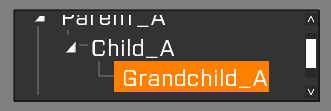
| |
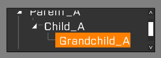
| |
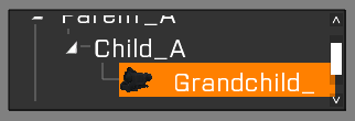
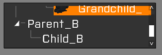
_current = tvCurSel _CT_TREE; // return [0,0,0]
_CT_TREE tvSetData [_current, "I'm grandchild_A"];
_data = _CT_TREE tvData _current; // "I'm grandchild_A"
_text = _CT_TREE tvText _current; // "Grandchild_A"
_CT_TREE tvSetValue [_current,14];
_value = _CT_TREE tvValue _current; // 14
_CT_TREE tvSetPicture [_current, getText (configFile >> "CfgWeapons" >> "optic_NVS" >> "picture")];
_pic = _CT_TREE tvPicture _current; |
|
| |
| |

|
